Scatter/Line Chart
Creating scatter or line charts is a standard method for visualizing the relationship between two sets of data points. These charts are useful in displaying trends, patterns, and correlations between variables.
Table of contents
Scatter charts plot individual data points on the horizontal (X) and vertical (Y) axes to observe relationships between variables. Line charts connect data points with lines to show trends over intervals. Bar charts are useful for visually comparing different categories of data and seeing which category has the highest or lowest value.
Use the Scatter/Line Chart function by browsing in the top ribbon:
| Plot \(\rightarrow\) Scatter/Line Chart |
Input
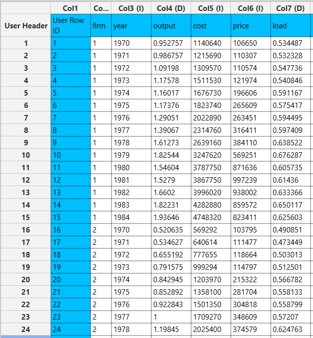
Data table with numerical values (at least two columns).
Configuration
| Select Chart Type | Select the type of chart between Bar Chart, XY Line Chart, and Scatter Chart. |
| Chart Title | Type the chart title (optional). |
| X Axis Title | Type the horizontal axis title (optional). |
| Y Axis Title | Type the vertical axis title (optional). |
| Add Column Pair(s) | Select the input coulmns that will be displayed on the chart. |
| Select X Column | Select the column name from the dropdown list that refers to the horizontal axis. |
| Select Y Column | Select the column name from the dropdown list that refers to the vertical axis. |
| XY Pair Title | A name is automatically produced for each pair of selected columns, to be displayed on the chart’s legend: “Column name 1 vs. Column name 2”. You have the option to type a new name. |
| Remove Selected Column Pair(s) | Click on any pair of columns presented in the Selected Pairs field to remove it from the chart. |
| Selected Pairs | (Automatically detected) The list of pairs of data columns displayed on the chart. |
Output
Depending on the input a bar chart, a line, or a scatter plot.
Example
Input
Import the data set with numerical values into the left-hand spreadsheet of the tab.
Configuration
- Select
Plot\(\rightarrow\)Scatter/Line Chart. - Select between a
Bar Chart, anXY Chartand aScatter Chartfrom the dropdown menu [1]. - Select the columns that are going to be included in the graph by clicking on the
Add Column Pairs(s)[2] and then in the window that will pop up select the data that will be included on the X axis by clicking on the correct column name in theSelect X Columndropdown list [3]. Do likewise for the Y axis column in theSelect Y Columndropdown list [4] and then click on theAddbutton [5]. - You can add more pairs of data columns following the above step. Click on the
Add & Closebutton [6] when done. - After the data for the graph are chosen, add the
Chart Title[7], and titles for the X and Y axes by typing in theX Axis Title[8] andY Axis Title[9] fields, respectively. - Click on the
Executebutton [10] to create the plot.

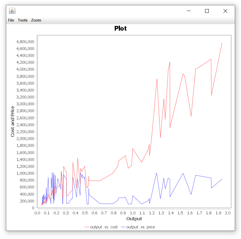
Output
The scatter, line or bar chart will be displayed in a new window. In this case, a line plot is selected where two pairs or data columns are visualized.
Save Plot
By browsing the ribbon of the chart window, you can either save it in PNG [1] or JPEG [2] format or print it [3].
| File \(\rightarrow\) Save as \(\rightarrow\) png… or jpeg… |
| File \(\rightarrow\) Print |

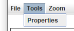
Format Plot
By browsing the ribbon of the chart window, you can also format the plot by clicking on the Tools option and then Properties:
| Tools \(\rightarrow\) Properties |
The options available are for editing the plot title, its appearance as well as other options. A pop-up window is presented to perform the necessary changes.
In the Title tab, you can insert or edit the title of the plot in the Text box [1] and change the Font [2] and/or Color [3].

In the Plot tab you can change the Outline stroke [1], the Outline paint [2], and the Background paint [3].

In the Other tab you can change the Background paint [1].

When you’re finished editing, click OK to save your changes.
Version History
Introduced in Isalos Analytics Platform v0.1.18
Instructions last updated on June 2024