Post DoE Analysis
Post DoE Analysis provides a comprehensive set of tools to evaluate and interpret experimental results obtained through Design of Experiments (DoE) methodologies. With this module, users can easily identify the most influential factors, explore the impact of individual variables, and study interactions between them and optimize responses based on one or multiple objectives. Available visualization options include:
- Pareto Chart for ranking and visualizing the relative importance of effects.
- Main Effects Plots show how changes in a single factor influence the response and test whether the relationship between the dependent variable and each factor is linear.
- Interaction Plots to illustrate how two factors jointly affect the outcome and test whether there is interaction between two factors.
- Combined Main Effects + Interaction Plots for a holistic view of factor influences.
- Desirability & Response Profiles to visualize how predicted responses and composite desirability change across factor ranges. These profiles support multi-objective optimization by revealing trade-offs between responses and highlighting factor settings that maximize overall desirability.
The tool supports both factorial/screening designs and response surface designs, making it adaptable to a wide variety of experimental setups. For screening and factorial designs only, users may choose to include center points in the design. This does not mean the addition of extra experimental points in the design but rather that center points already included in the design will be handled differently. This is done by adding an extra 0/1 indicator variable, where a value of 1 identifies center points. Including this variable allows the algorithm to capture a portion of unexplained variability that is not accounted for by the main effects and interaction terms. This indicator is not included in the Pareto plots or in the main effect and interaction plots; it is only used internally to improve the explanation of variability. In contrast, for response surface designs, this option is not available, since the inclusion of curvature and quadratic terms already incorporates the information provided by center points.
Pareto Analysis
Pareto Analysis is used to visualize the relative importance of model terms (main effects, quadratic terms and interactions) and to identify which factors have a statistically significant impact on the response. The construction of the plot depends on whether the error term in the model has available degrees of freedom.
-
Error with Degrees of Freedom In this case, a Pareto Plot of standardized effects is created. Each effect is divided by its estimated standard error to obtain a standardized effect size. The plot ranks these standardized effects in descending order of magnitude, making it easy to identify the most influential terms. A significance line is drawn to indicate the threshold value above which an effect is considered statistically significant, based on the Level of Significance specified by the user.
-
Error with No Degrees of Freedom When no residual degrees of freedom are available, standard errors for the effects cannot be estimated directly. In this case, a Pareto Plot of raw effects is generated, showing the absolute effect size for each term. To assess significance, Lenth’s Pseudo Standard Error (PSE) is calculated and used together with a t-distribution, where the degrees of freedom are defined as the number of effects divided by three. The resulting threshold is then applied to determine significance, again using the Level of Significance specified by the user.
Use the Pareto Analysis tool by browsing in the top ribbon:
| DOE \(\rightarrow\) Post DoE Analysis \(\rightarrow\) Pareto Analysis |
Input
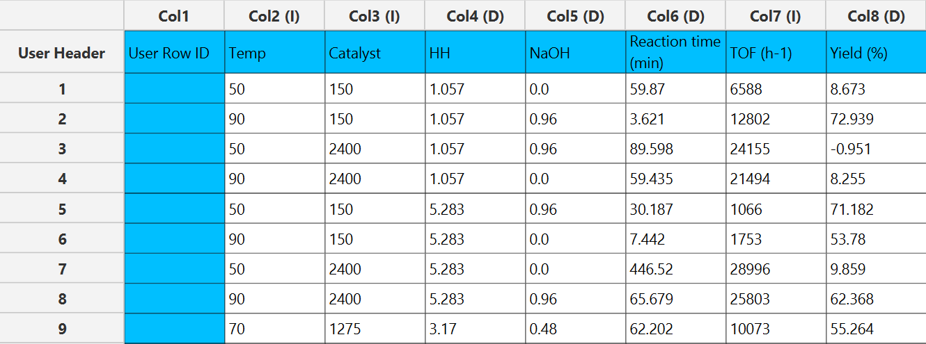
All variables must be specified in the datasheet. The input to the algorithm consists of the results of a Design of Experiments (DoE) method, with the addition of the response calculated for each experimental run. The response variable must be strictly numerical. Experimental factors may be numerical or categorical. Categorical factors are permitted only when they contain exactly two levels. Additionally, categorical factors can only be included when the model does not contain quadratic terms. Each row corresponds to a single observation from the experiment.
Configuration
| Dependent Variable | Select the column that corresponds to values of the dependent variable. |
| Analysis Type | Select the desired analysis type for the analysis. Available options include: Main Effects, Main Effects + Two-Factor, Main Effects + Two Factor + Three Factor, Main Effects + Quadratic, Main Effects + Two-Factor + Quadratic, Main Effects + Two Factor + Three Factor + Quadratic. For screening/factorial designs, it is recommended not to include quadratic terms, while for response surface designs, quadratic terms should typically be included. If there are categorical factors in the analysis then quadratic factors cannot be selected. |
| Level Of Significance | Specify the level of significance for the analysis. Values should range from 0 to 1 with the default value being 0.05. |
| Factors/Covariates/Excluded Columns | Select manually the columns that correspond to factors and the columns that correspond to covariates through the dialog window: Use the buttons to move columns between the Factors and Covariates list and Excluded Columns list. Single-arrow buttons will move all selected columns and double-arrow buttons will move all columns. At least one factor column should be specified. |
| DOE type | Select whether you have performed a Factorial/Screening or a Response Surface Design. If categorical factors are selected the only acceptable option is Factorial/Screening. |
| Include Center Points | If you have performed a Factorial/Screening design, select whether to include center points in the analysis. |
Output
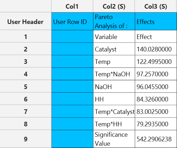
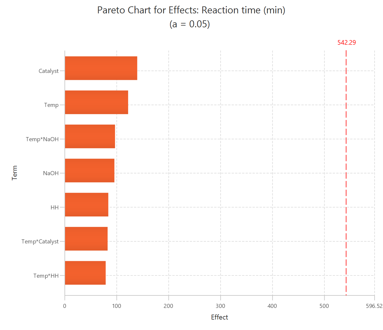
The output spreadsheet contains the same table of effects in descending order. In addition, a pop-up window displays the Pareto chart, where a significance line is shown based on the user-specified level of significance.
Example
Input
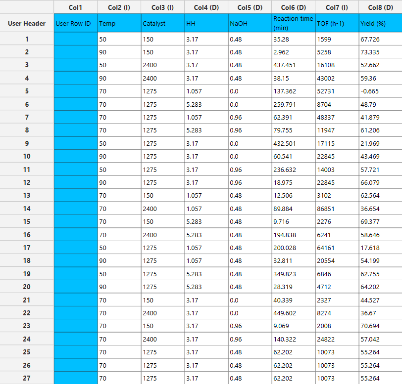
In the input datasheet minimum requirement is to specify two columns, one factor and one dependent variable, as shown below.
Configuration
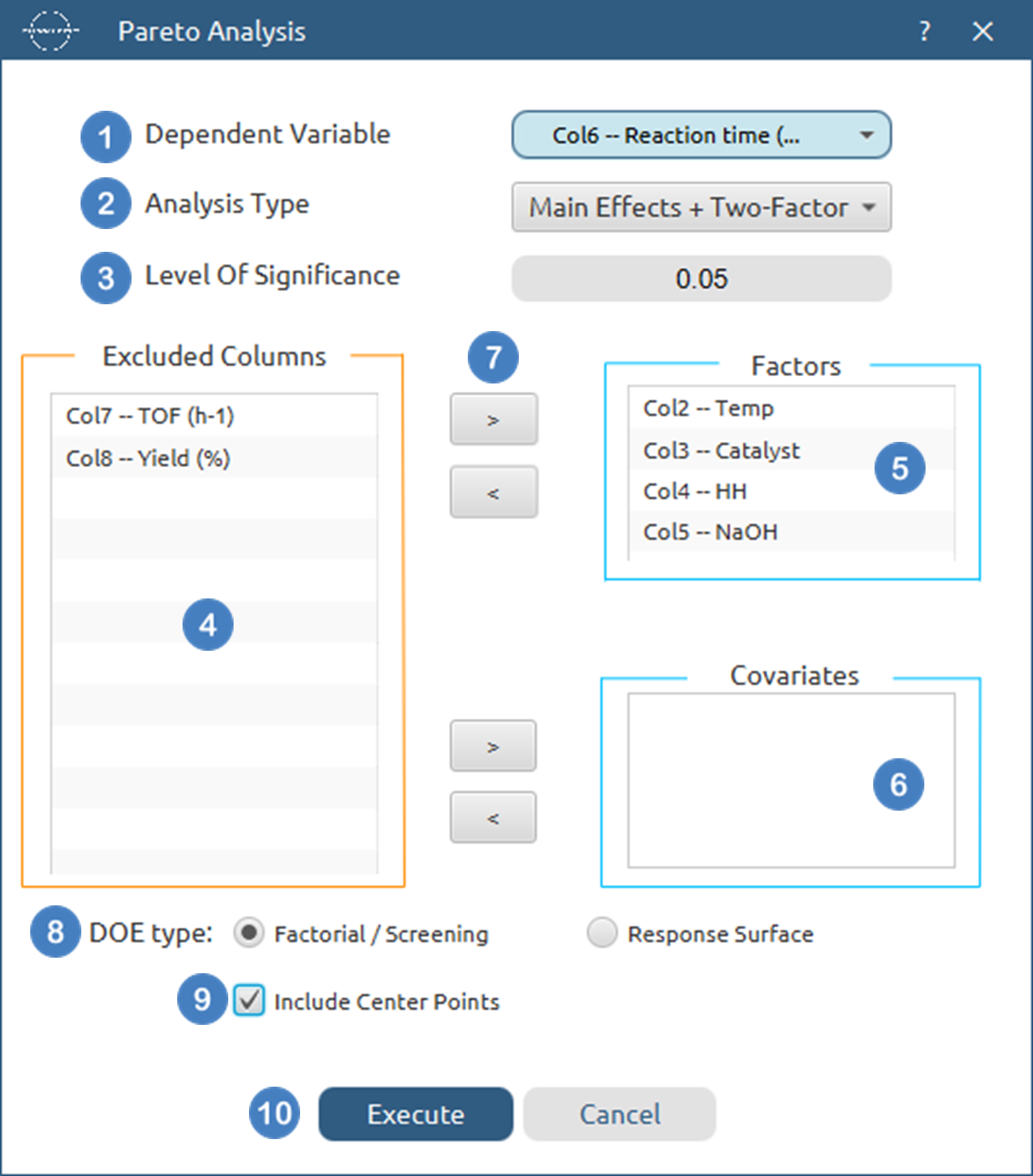
- Select
DOE→Post DoE Analysis→Pareto Analysis. - Select the
Dependent Variable[1] from the list of available options. This column should only contain numerical values. - Select the
Analysis Type[2] from the list of available options :Main Effects,Main Effects+Quadratic,Main Effects + Two Factor,Main Effects + Two Factor + Quadratic,Main Effects + Two Factor + Three Factor,Main Effects + Two Factor + Three Factor + Quadratic - Specify the
Level Of Significance[3] used to calculate the significance threshold. Default value is 0.05. - Select the columns by clicking on the arrow buttons [7] and moving columns between the
Excluded Columns[4] , theFactors[5] andCovariates[6] lists. - Select whether the DoE[8] method used before this step was a
Factorial/Screeningor aResponse Surfacemethod. - If the
Factorial/Screeningoption is selected, select/tick toInclude Center Points[9]. - Click on the
Executebutton [10] to perform Pareto Analysis
Output
The effects of each term in the model are presented in the output spreadsheet in descending order and the pareto chart is shown in a separate window.
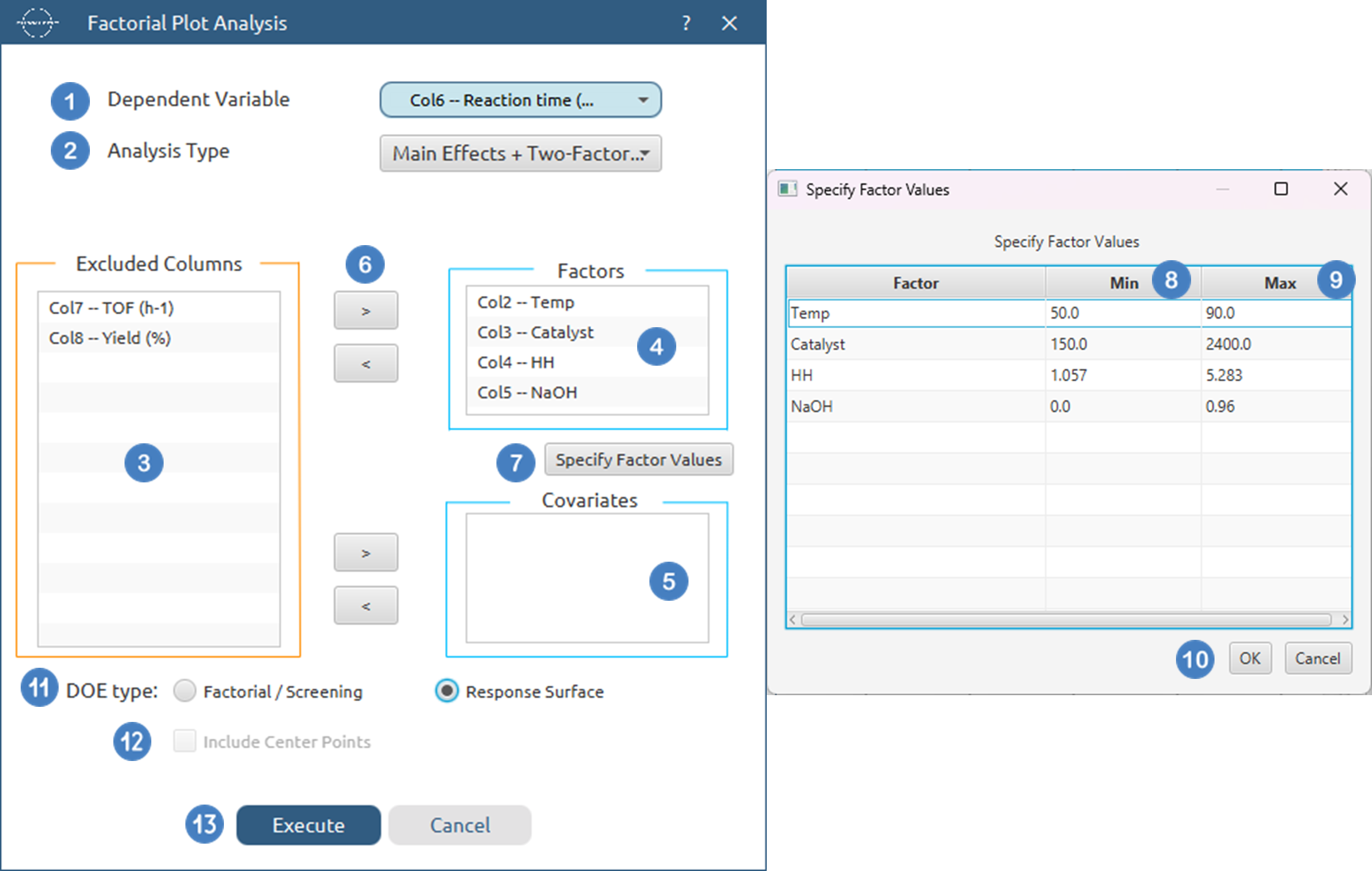
Factorial Plot Analysis
The Main Effects and Interaction Plots differ in construction depending on the type of experimental design chosen: Screening/Factorial or Response Surface.
- Screening / Factorial Designs
-
Main Effects Plots: For each factor, the response is evaluated at its two extreme levels (low and high) while all other factors are fixed at their center values. A line is drawn between these two fitted points to represent the main effect of that factor. The center point is also plotted to assess whether it aligns with the expected linear relationship.
-
Interaction Plots: For a given interaction (e.g., Factor A × Factor B), two lines are constructed: One with Factor B set at its low level. Another with Factor B set at its high level. For each line, the response is fitted at Factor A = low and Factor A = high. The center point is also included to check consistency with the modeled trend.
-
-
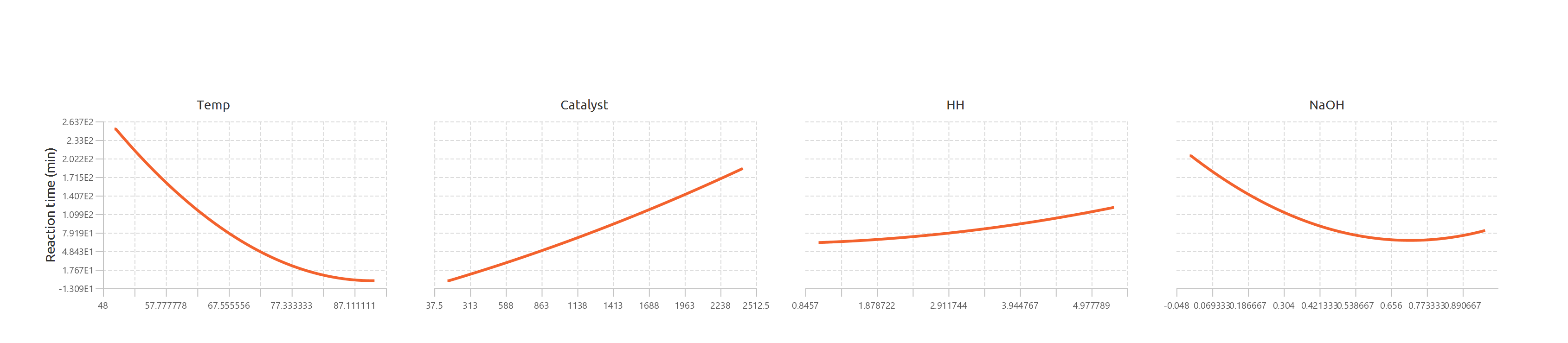
Response Surface Designs
-
Main Effects Plots: The fitted second-order model (including quadratic terms) is used to compute the response as each factor varies across its range. All other factors are fixed at their center values. This produces a smooth second-order curve showing the factor’s main effect on the response.
-
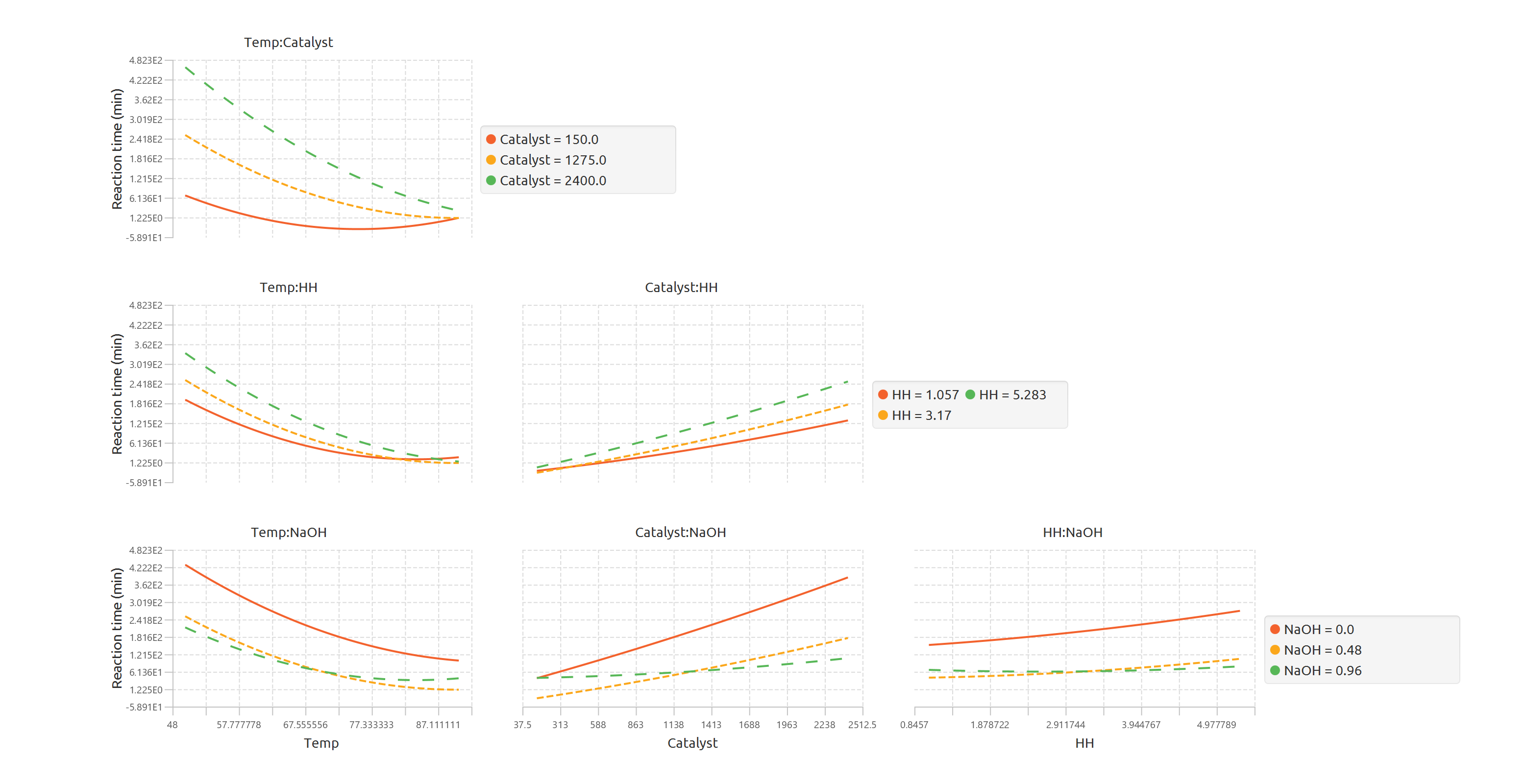
Interaction Plots: For two interacting factors, the second-order model is again used. One factor is varied across its range, while the second factor is fixed at three different levels: low, center, and high. This results in three separate curves, allowing the user to visualize how the interaction modifies the relationship between the factors and the response.
-
When generating main effects and interaction plots, it is essential to use the Specify Factor Values option to correctly define the low and high levels of each factor. These values determine how the plots are constructed and must be chosen carefully. Some constraints apply:
- The specified low value cannot be less than the minimum observed value of the factor in the dataset.
- The specified high value cannot be greater than the maximum observed value of the factor in the dataset.
- Additionally, the low value must always be strictly less than the high value.
Use the Factorial Plot Analysis tool by browsing in the top ribbon:
| DOE \(\rightarrow\) Post DoE Analysis \(\rightarrow\) Factorial Plot Analysis |
Input
All variables must be specified in the datasheet. The input to the algorithm consists of the results of a Design of Experiments (DoE) method, with the addition of the response calculated for each experimental run. The response variable must be strictly numerical. Experimental factors may be numerical or categorical. Categorical factors are permitted only when they contain exactly two levels. Additionally, categorical factors can only be included when the model does not contain quadratic terms. Each row corresponds to a single observation from the experiment.
Configuration
| Dependent Variable | Select the column that corresponds to values of the dependent variable. |
| Analysis Type | Select the desired analysis type for the analysis. Available options include: Main Effects, Main Effects + Two-Factor, Main Effects + Two Factor + Three Factor, Main Effects + Quadratic, Main Effects + Two-Factor + Quadratic, Main Effects + Two Factor + Three Factor + Quadratic, Full Factorial. For screening/factorial designs, it is recommended not to include quadratic terms, while for response surface designs, quadratic terms should typically be included. If there are categorical factors in the analysis then quadratic factors cannot be selected. |
| Factors/Covariates/Excluded Columns | Select manually the columns that correspond to factors and the columns that correspond to covariates through the dialog window: Use the buttons to move columns between the Factors and Covariates list and Excluded Columns list. Single-arrow buttons will move all selected columns and double-arrow buttons will move all columns. At least one factor column should be specified. |
| Specify Factor Values | Specify the low and high value for each factor to ensure the plots are generated correctly. By default, these values are initialized to the minimum and maximum observed values of each variable. |
| DOE type | Select whether you have performed a Factorial/Screening or a Response Surface Design. If categorical factors are selected the only acceptable option is Factorial/Screening. |
| Include Center Points | If you have performed a Factorial/Screening design, select whether to include center points in the analysis. |
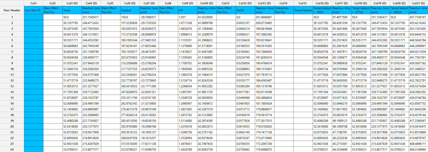
Output
The output spreadsheet contains the fitted response values used to generate the curves. For each curve, 300 data points are provided, allowing precise plotting and replication of the results. A separate pop-up window is generated for each plot:
- Main Effects Plots: One plot is displayed per factor, showing the fitted response across the specified low and high values, with the center point included when available. The y axis is shared across all main effect plots.
- Interaction Plots: One plot is displayed per estimable interaction. Each plot contains three fitted curves corresponding to the second factor of the interaction set at low, center, and high values. The spreadsheet includes the corresponding data points for each curve, as shown in the interaction plot output table.
Example
Input
In the input datasheet minimum requirement is to specify two columns, one factor and one dependent variable, as shown below.

Configuration
- Select
DOE→Post DoE Analysis→Factorial Plot Analysis. - Select the
Dependent Variabl[1] from the list of available options. This column should only contain numerical values. - Select the
Analysis Type[2] from the list of available options :Main Effects,Main Effects+Quadratic,Main Effects + Two Factor,Main Effects + Two Factor + Quadratic,Main Effects + Two Factor + Three Factor,Main Effects + Two Factor + Three Factor + Quadratic - Select the columns by clicking on the arrow buttons [6] and moving columns between the
Excluded Columns[3] , theFactors[4] andCovariates[5] lists. - Click on
Specify Factor Values[7] to specify theMin[8] andMax[9] value for each numerical factor, theLow level[10] andHigh level[11] value for each categorical factor. Once they are specified click onOK[12]. - Select whether the DoE[13] method used before this step was a
Factorial/Screeningor aResponse Surfacemethod. - If the
Factorial/Screeningoption is selected, select/tick toInclude Center Points[14]. - Click on the
Executebutton [15] to perform Factorial Plot Analysis
Output
The data points for each produced plot are shown in the output spreadsheet and the main effect and interaction plots are shown in separate windows.
Multi-Objective Optimization
Multi-Objective Optimization is used to determine factor settings that simultaneously optimize multiple responses. When responses have competing goals (for example, maximizing yield while minimizing reaction time), the algorithm converts each response into a desirability function and combines them into a single composite desirability score. The optimal solution corresponds to the factor settings that maximize this composite desirability.
Isalos supports two optimization strategies:
- Continuous optimization, where factor settings are searched across the modeled design space.
- Discrete optimization, where optimization is restricted to the observed factor levels present in the dataset. This option ensures that recommended settings correspond to experimentally tested conditions and may be preferred when interpolation between levels is not desired.
Users may also constrain the optimization domain by specifying allowable ranges for each factor, and/or fixing factors to specific values to evaluate constrained operating conditions. To compute predictions used during optimization, users must select the model structure to be fitted. For screening and factorial designs, simpler models are typically preferred, while response surface designs generally require quadratic terms to capture curvature.
For each response, users define an optimization objective:
- Maximize — increases the response toward higher values.
- Minimize — drives the response toward lower values.
- Target — seeks a specified value while penalizing deviations.
Each response is transformed into an individual desirability value ranging from 0 (undesirable) to 1 (fully desirable). The shape and influence of each desirability function are controlled by two parameters:
- Scale controls how quickly desirability changes as the response moves away from its goal. Higher scale values create a steeper penalty near limits or targets, while lower values produce a more gradual transition.
- Importance defines the relative priority of each response in the composite desirability calculation. Responses with higher importance exert greater influence on the optimization result.
Together, these settings allow users to balance competing objectives and tailor the optimization to process priorities.
For each predicted response, the model provides both confidence intervals (CI) and prediction intervals (PI) to quantify uncertainty. A confidence interval describes the range within which the true mean response is expected to lie at the specified factor settings and confidence level (e.g., 95%). It reflects uncertainty in estimating the model’s mean prediction. In contrast, a prediction interval represents the range within which a future individual observation is expected to fall under the same conditions. Because prediction intervals account for both model uncertainty and inherent experimental variability, they are always wider than confidence intervals.
Use the Multi-Objective Optimization tool by browsing in the top ribbon:
| DOE \(\rightarrow\) Post DoE Analysis \(\rightarrow\) Multi-Objective Optimization |
Input
All variables must be specified in the datasheet. The input to the algorithm consists of the results of a Design of Experiments (DoE) method, with the addition of the response variables calculated for each experimental run. Response variables must be strictly numerical. Experimental factors may be numerical or categorical. Categorical factors are permitted only when they contain exactly two levels. Additionally, categorical factors can only be included when the model does not contain quadratic terms.Each row corresponds to a single observation from the experiment.
Configuration
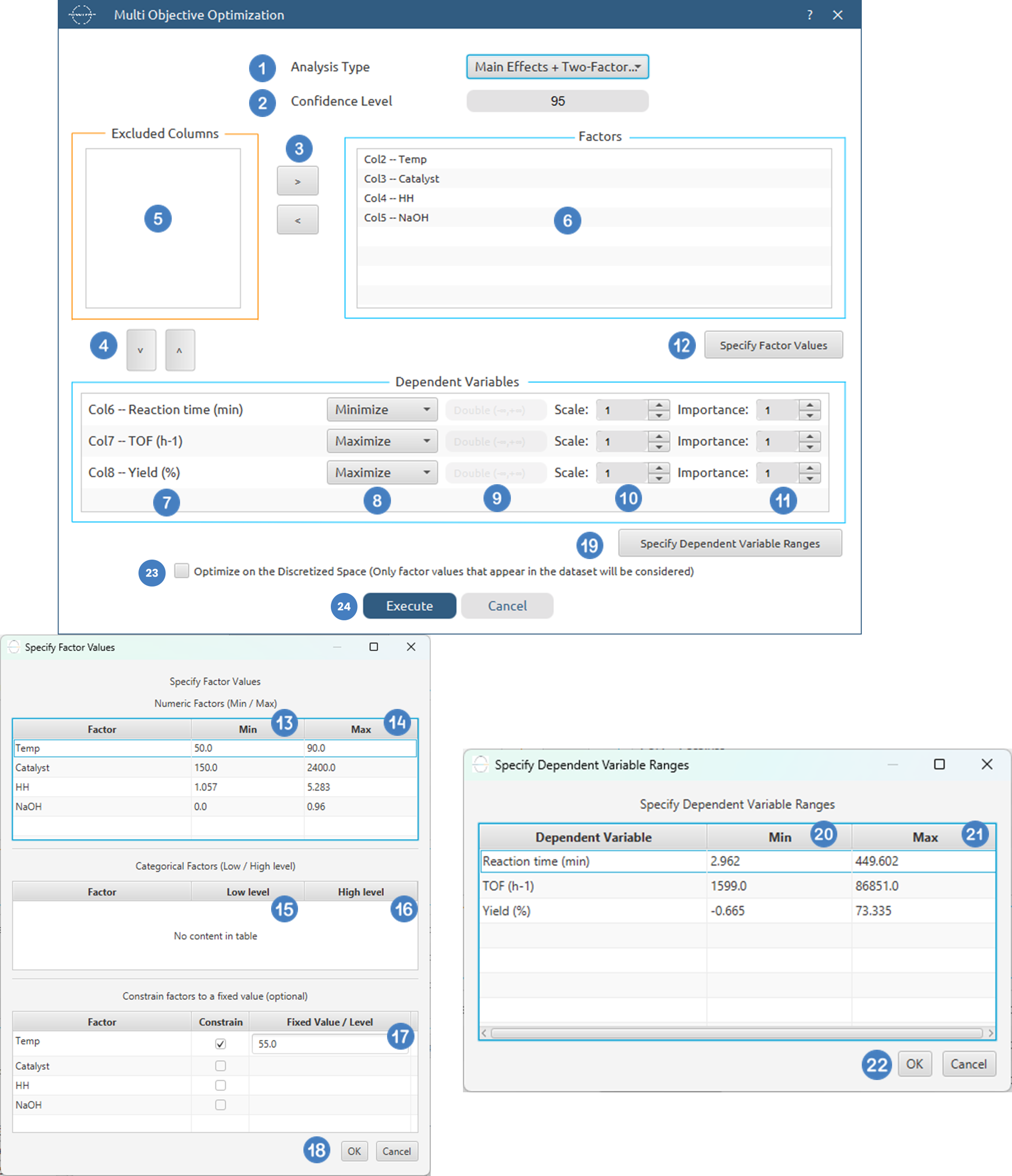
| Analysis Type | Select the desired analysis type for the analysis. Available options include: Main Effects, Main Effects + Two-Factor, Main Effects + Two Factor + Three Factor, Main Effects + Quadratic, Main Effects + Two-Factor + Quadratic, Main Effects + Two Factor + Three Factor + Quadratic, Full Factorial. For screening/factorial designs, it is recommended not to include quadratic terms, while for response surface designs, quadratic terms should typically be included. If there are categorical factors in the analysis then quadratic factors cannot be selected. |
| Confidence Level | Specify the confidence level for the analysis. Values should range from 0 to 100 with the default value being 95 |
| Factors/Dependent Variables/Excluded Columns | Select manually the columns that correspond to factors and the columns that correspond to dependent variables through the dialog window: Use the buttons to move columns between the Factors and Dependent Variables list and Excluded Columns list. At least one factor column and one Dependent Variable Column should be specified. |
| Specify Factor Values | Specify the low and high value for each factor to ensure the plots are generated correctly. By default, these values are initialized to the minimum and maximum observed values of each variable. Optionally specify constraints to fix factors to a specific value within the allowed range. |
| Specify Dependent Variable Ranges | Specify the minimum and maximum acceptable value for each dependent variable to correctly set objective goals and compute individual desirabilities. By default, these values are initialized to the minimum and maximum observed values of each variable. |
| Dependent Variable Settings | For each dependent variable added, specify the goal (Minimize/ Maximize/ Target), the target value if the Target option is selected, the scale and the importance of the dependent variable. The allowed range for scale is [0.01,10] and for importance it is [1,5]. |
| Optimize on the Discretized Space (Only factor values that appear in the dataset will be considered) | Use this option to enable discretized optimization, to restrict the optimization to the observed factor levels present in the dataset. |
Output
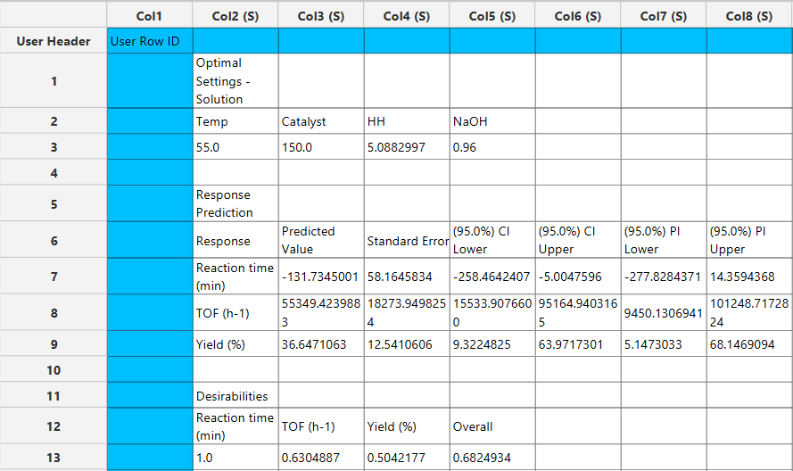
The output spreadsheet reports the optimal factor settings identified by the optimization routine, along with the predicted values for each response at those settings. For each response, the table includes the predicted value, standard error, confidence intervals, and prediction intervals. Individual desirability values are shown for every response, together with the overall composite desirability score used to rank the solution.
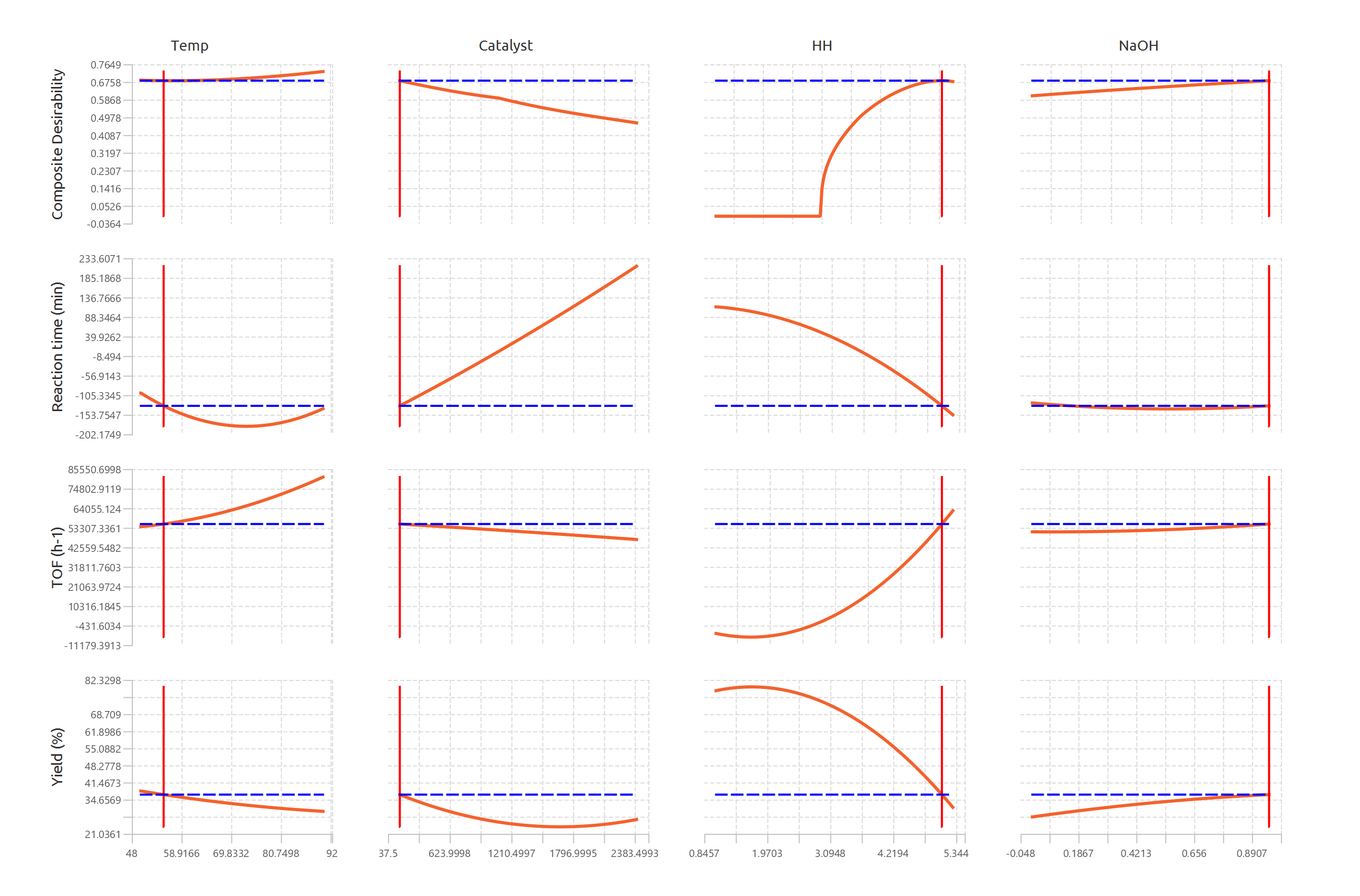
In addition, a pop-up window displays the Desirability & Response Profiles, illustrating how composite desirability and each predicted response vary across the range of each factor while other factors are held constant. Vertical reference lines indicate the optimal factor settings, and horizontal reference lines denote the predicted response or desirability values at the optimum, enabling visual assessment of trade-offs and sensitivity.
Example
Input
In the input datasheet minimum requirement is to specify two columns, one factor and one dependent variable, as shown below.
Configuration
- Select
DOE→Post DoE Analysis→Multi-Objective Optimization. - Select the
Analysis Type[1] from the list of available options :Main Effects,Main Effects+Quadratic,Main Effects + Two Factor,Main Effects + Two Factor + Quadratic,Main Effects + Two Factor + Three Factor,Main Effects + Two Factor + Three Factor + Quadratic,Full Factorial - Specify the
Significance Level[2] used to calculate the confidence intervals. Default value is 95. - Select the columns by clicking on the arrow buttons [3],[4] and moving columns between the
Excluded Columns[5] , theFactors[6] andDependent Variables[7] lists. - Specify the
Goal[8], theTarget Value[9] if the Target goal is selected, theScale[10] and theImportance[11] of each dependent variable. - Click on
Specify Factor Values[12] to specify theMin[14] andMax[15] value for each numerical factor, theLow level[15] andHigh level[16] value for each categorical factor and optionally constrain factors to aFixed Value[17]. Once they are specified click onOK[18]. - Click on
Specify Dependent Variable Ranges[19] to specify theMin[20] andMax[21] value for each dependent variable . Once they are specified click onOK[22]. - Click on
Optimize on the Discretized Space (Only factor values that appear in the dataset will be considered)[23] to only optimize on the discretized space. - Click on the
Executebutton [24] to perform Multi-Objective optimization
Output
The optimal factor settings, the predicted values and the individual and overall desirabilities are presented in the output spreadsheet and the Desirability & Response Profiles are shown in a separate window.
References
- Alkiayat, M., A practical guide to creating a Pareto chart as a quality improvement tool. Global Journal on Quality and Safety in Healthcare, 2021. 4(2): p. 83–84. doi.org/10.36401/JQSH-21-X1.
- Derringer, G., & Suich, R. (1980). Simultaneous Optimization of Several Response Variables. Journal of Quality Technology, 12(4), 214–219. doi.org/10.1080/00224065.1980.11980968
Version History
Introduced in Isalos Analytics Platform v0.2.4
Instructions last updated on November 2025