Comparison Charts
Comparison charts are visual tools used to evaluate and contrast multiple items, options, or variables side by side. By organizing key features, metrics, or criteria into a clear, structured format, they make similarities and differences easy to identify. This helps readers process information more efficiently, support decision-making, and reduce complexity when dealing with multiple choices.
Bar Chart
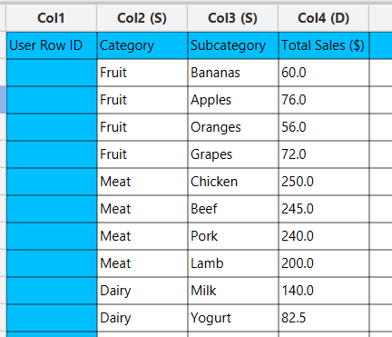
Bar charts display multiple categories as bars, with lengths proportional to their values or relative frequencies, making it easy to compare categories and identify the most significant ones. Stacked bar charts extend this concept by dividing each bar into segments that represent subcategories, showing how each contributes to the total. When each segment is expressed as a percentage of the total, the result is a 100% stacked bar chart. Both chart types are particularly effective for visualizing overall category importance alongside the contributions of their components—for example, illustrating how different product categories (fruit, meat, dairy) and their subcategories (bananas, apples, chicken, beef, milk, yogurt) contribute to total sales.
Use the Bar Chart function by browsing in the tools ribbon:
| Plot \(\rightarrow\) Comparison Charts \(\rightarrow\) Bar Chart |
Input
A data table in long format consisting of one categorical column listing the category names and one numerical column containing the values, frequencies, or percentages of each category. For stacked bar charts, an additional categorical column is required to indicate the subcategory values. If necessary, the conversion from wide to long format can be achieved via the Wide to Long function that can be found in the Data Transformation menu of the tools ribbon, under Data Manipulation.
Configuration
| Chart Title | Type the chart title. |
| Horizontal Axis Title | Type the horizontal axis title. |
| Vertical Axis Title | Type the vertical axis title. |
| Category Column | Select the category column. |
| Value Column | Select the numerical value column. |
| Include Subcategory | Check to include subcategory. |
| Subcategory | Select the subcategory column. |
| Stacked Bar Chart | Check to make subcategories stacked. |
Chart customization
Upon executing the Bar Chart function, the chart will appear in a separate window where the following customization options are available:
| Show Legend | Display a legend consisting of the category names. |
| Show Grid | Display grid lines in the background. |
| Background | Select the background color. |
| Bar Colors | Select the color of each bar category or subcategory. |
| Bar width | Select the width of all bar categories. |
| Horizontal / Vertical | Select orientation of the bars. |
| 100% Stacked Bar Chart | Express stacked bars as percentages of the total. |
Output
A graphical representation of the data in a bar chart format, where each bar represents the proportion of its respective category.
Example
Input
In the left-hand spreadsheet import a data consisting of the categories and the corresponding values.
Configuration
-
Use the Bar Chart function by browsing in the tools ribbon:
Plot \(\rightarrow\) Comparison Charts \(\rightarrow\) Bar Chart (1) 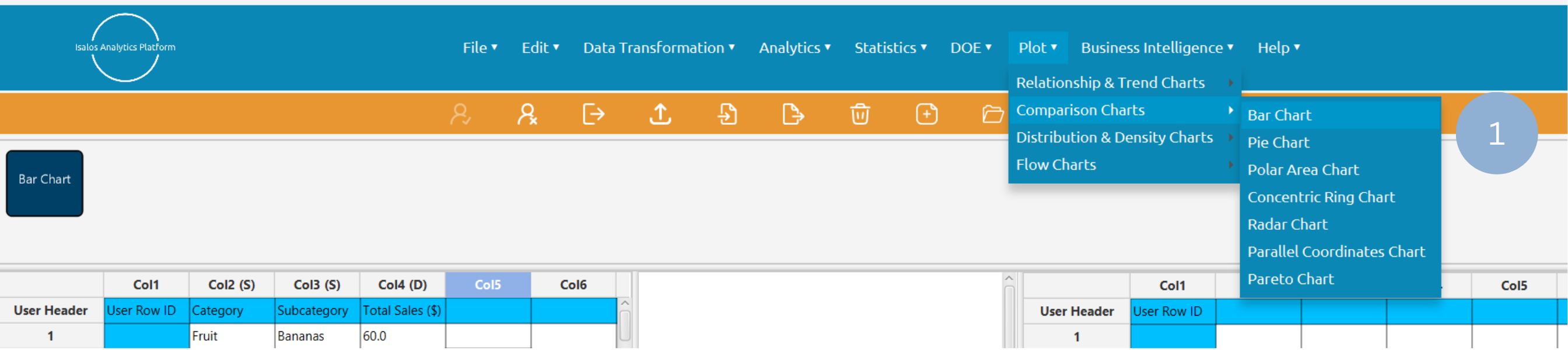
- Type the chart, horizontal axis, and vertical axis titles (2).
- Add the category and value columns (3).
- Optionally include a subcategory and activate the stacked bar chart (4).
- Click Execute to generate a bar chart (5).
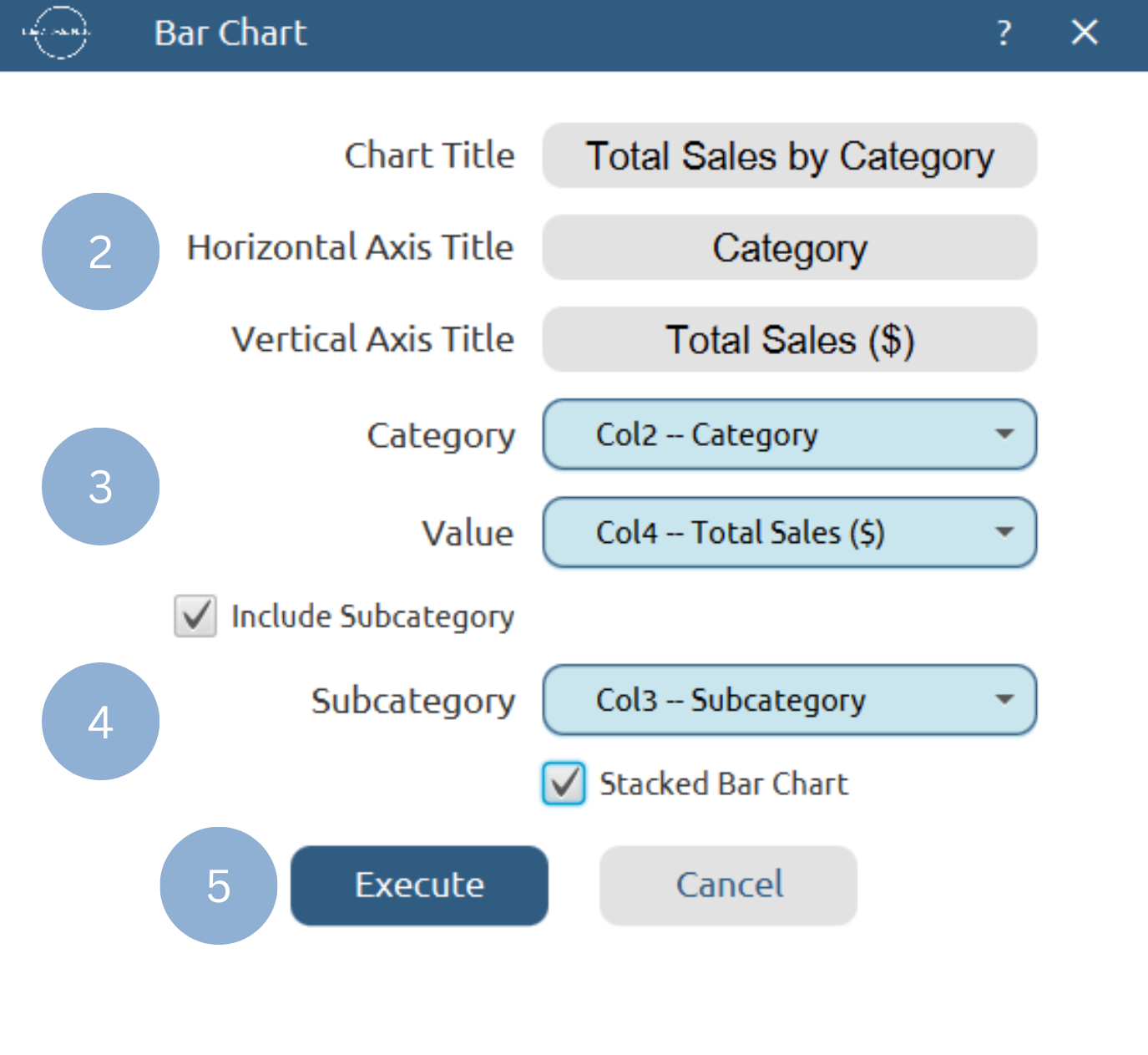
Chart customization
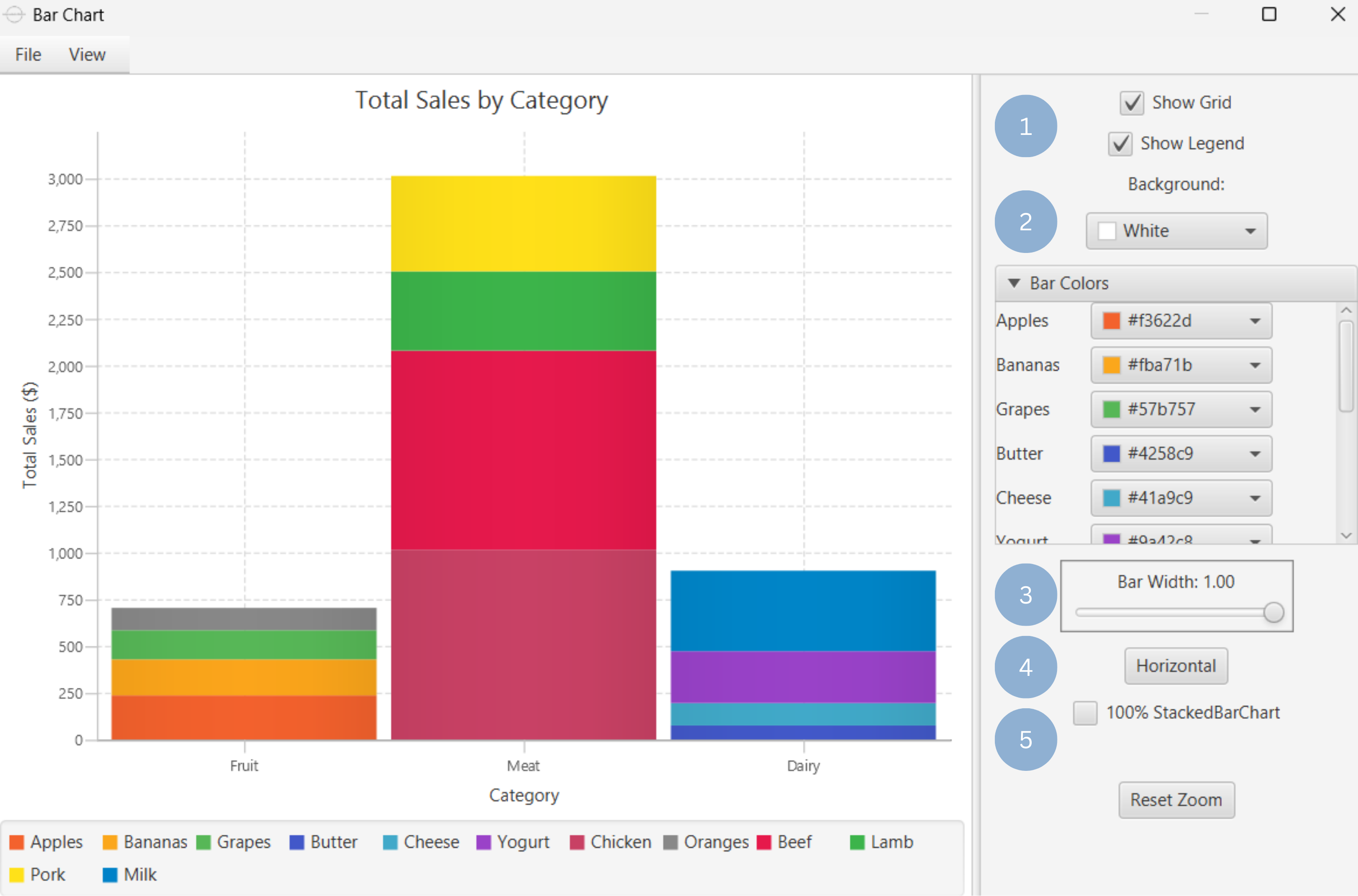
Upon clicking Execute the bar chart appears in a separate window.
- Display the chart legend and grid lines (1).
- Select the background and bar colors (2).
- Select bar width (3).
- Select bar orientation (4).
- Make bar 100% if stacked bar chart (5).
Output
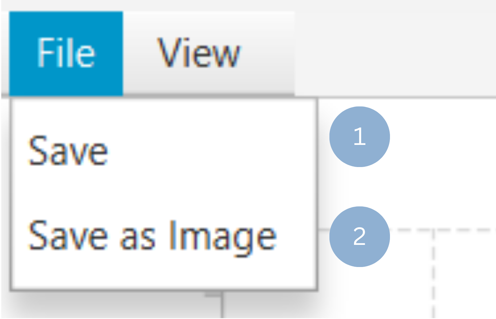
To save the chart customization changes in Isalos, click File→ Save (1). To save the chart as a PNG image, select File→ Save as Image (2).
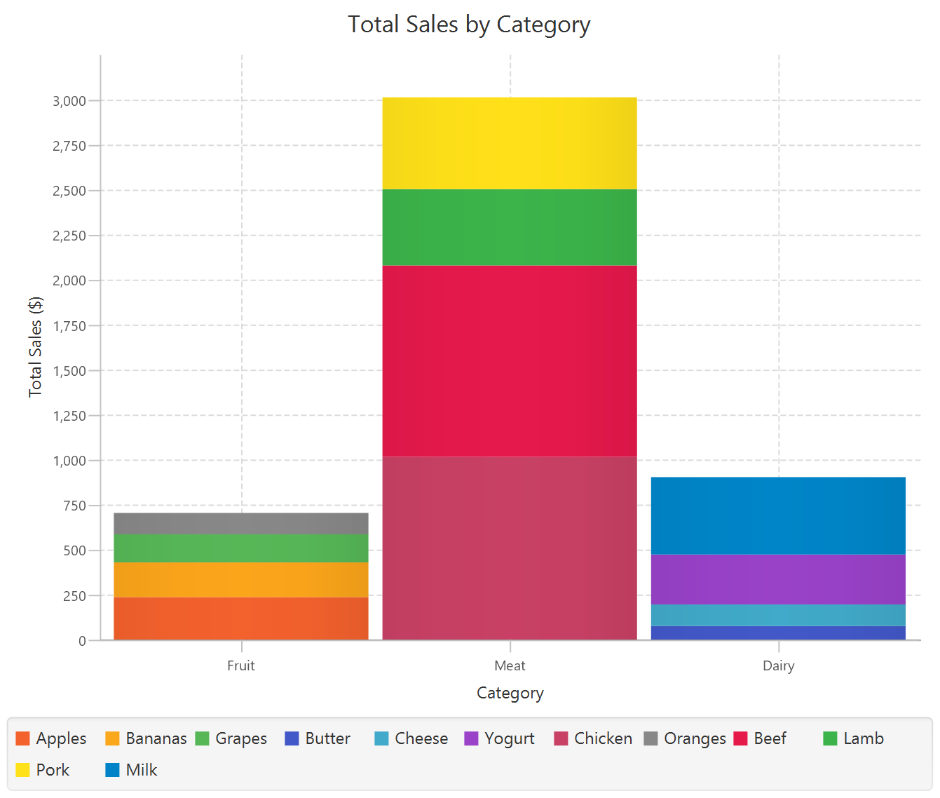
The downloadable, customized bar chart is presented below.
Pie Chart
Pie charts are circular graphs divided into slices to illustrate numerical proportions. Each slice represents a category’s contribution to the total (Eq. 1).
where \(\%\) is the calculated value indicating what portion of the total each category represents, and $x_i$ is the numerical value or count of the \(i\) category visualized in the pie chart.
Creating pie charts is a standard method for visualizing data distributions, as they are useful in displaying the proportional size of categories compared to the whole, e.g. the contribution of each product to total sales.
Use the Pie Chart function by browsing in the top ribbon:
| Plot \(\rightarrow\) Comparison Charts \(\rightarrow\) Pie Chart |
Input
A data table in long format consisting of one categorical column listing the category names and one numerical column containing the values, frequencies, or percentages of each category. If necessary, the conversion from wide to long format can be achieved via the Wide to Long function that can be found in the Data Transformation menu of the tools ribbon, under Data Manipulation.
Configuration
| Chart Title | Type the chart title. |
| Category Column | Select the category column. |
| Value Column | Select the numerical value column. |
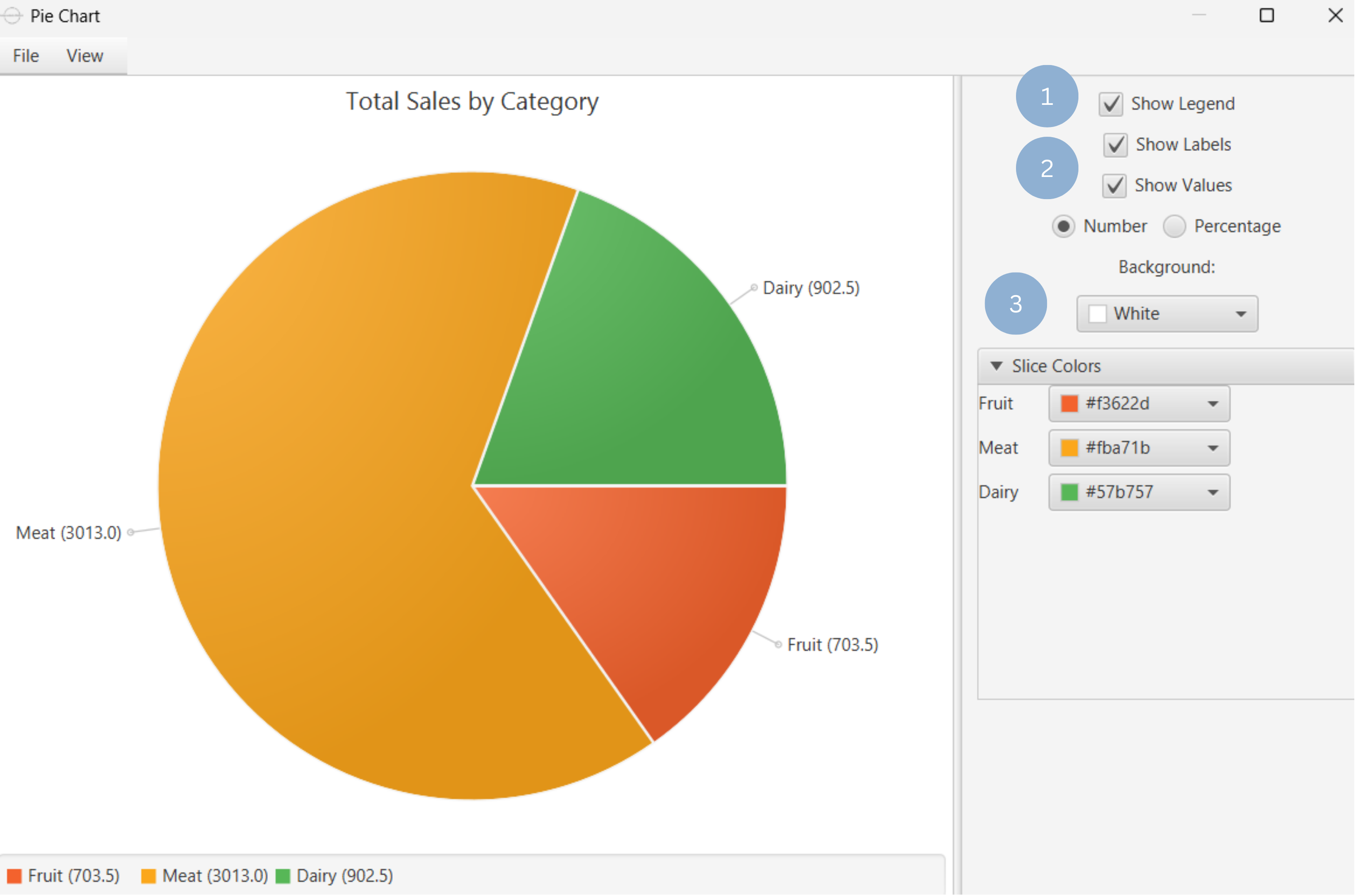
Chart customization
Upon executing the Pie Chart function, the chart will appear in a separate window where the following customization options are available:
| Show Legend | Display a legend consisting of the category names. |
| Show Labels | Display label of each slice. |
| Show Values | Display the value of each slice, either as a number or as a percentage. |
| Background | Select the background color. |
| Slice Colors | Select the color of each slice category. |
Output
A graphical representation of the data in a pie chart format, where each slice represents the proportion of its respective category.
Example
Input
In the left-hand spreadsheet import a data consisting of the categories and the corresponding values.
Configuration
-
Use the Pie Chart function by browsing in the tools ribbon:
Plot \(\rightarrow\) Comparison Charts \(\rightarrow\) Pie Chart (1) 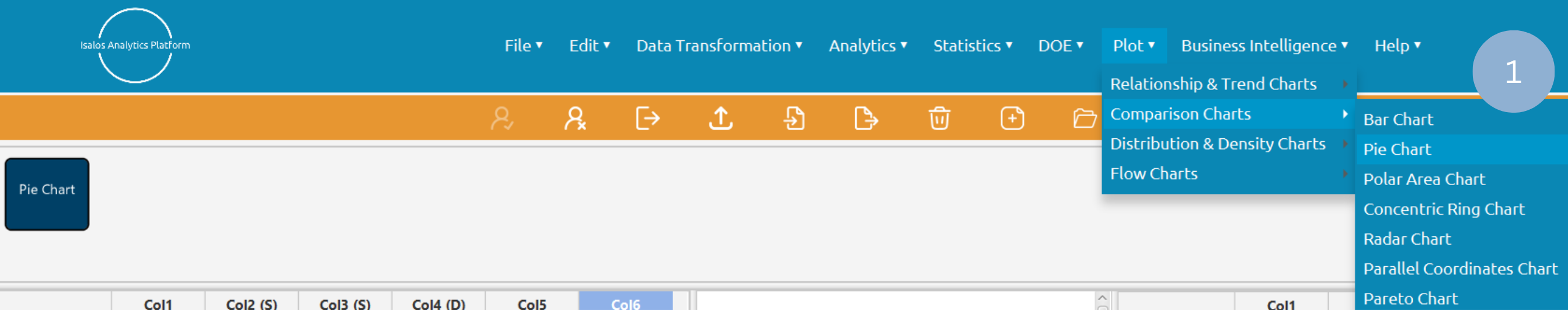
- Type the chart title (2).
- Add the category and value columns (3).
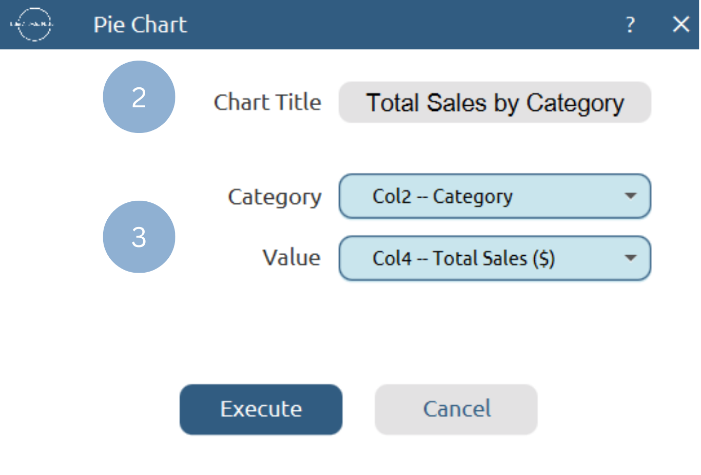
Chart customization
Upon clicking Execute the pie chart appears in a separate window.
- Display the chart legend (1).
- Display the slice labels and values (2).
- Select background and slice colors (3).
Output
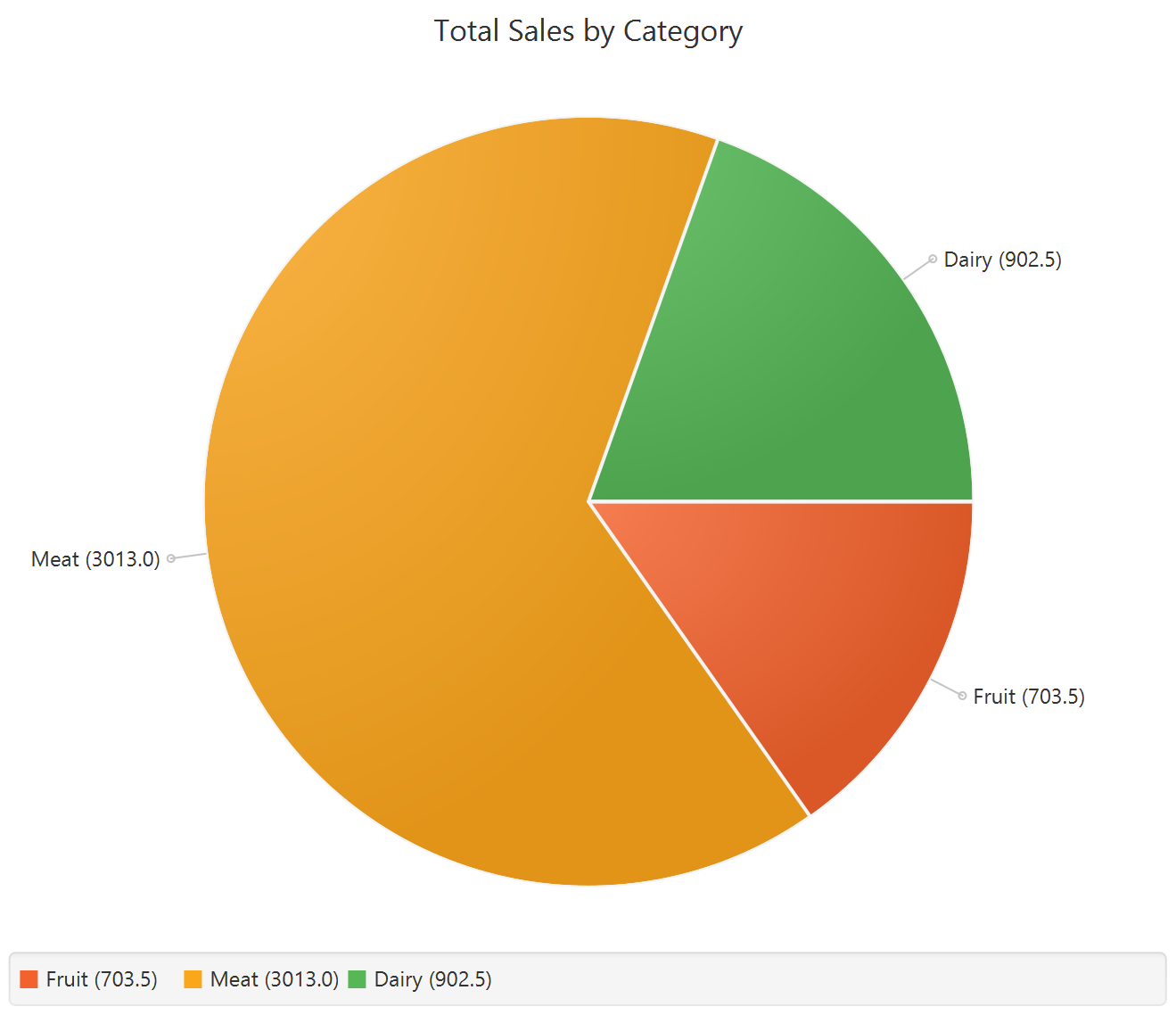
To save the chart customization changes in Isalos, click File→ Save (1). To save the chart as a PNG image, select File→ Save as Image (2).
The downloadable, customized pie chart is presented below.
Polar Area Chart
Polar Area charts are used, similarly to pie charts, to visualize the proportions of different categories of a whole. The various categories are plotted on a radial scale that extends from the center of a circle. While all sectors have equal angles, the radii vary proportionally to the size or relative frequency of their respective category. Polar Area charts are useful in illustrating the relative importance or contribution of each category to a whole.
Use the Polar Area Chart Chart function by browsing in the top ribbon:
| Plot \(\rightarrow\) Comparison Charts \(\rightarrow\) Polar Area Chart |
Input
A data table in long format consisting of one categorical column listing the category names and one numerical column containing the values, frequencies, or percentages of each category. If necessary, the conversion from wide to long format can be achieved via the Wide to Long function that can be found in the Data Transformation menu of the tools ribbon, under Data Manipulation.
Configuration
| Chart Title | Type the chart title. |
| Category Column | Select the category column. |
| Value Column | Select the numerical value column. |
Chart customization
Upon executing the Polar Area Chart function, the chart will appear in a separate window where the following customization options are available:
| Show Legend | Display a legend consisting of the category names. |
| Show Labels | Display label of each slice. |
| Show Values | Display the value of each slice, either as a number or as a percentage. |
| Background | Select the background color. |
| Slice Colors | Select the color of each slice category. |
Output
A graphical representation of the data in a polar area chart format, where each slice represents the proportion of its respective category.
Example
Input
In the left-hand spreadsheet import a data consisting of the categories and the corresponding values.
Configuration
-
Use the Polar Area Chart function by browsing in the tools ribbon:
Plot \(\rightarrow\) Comparison Charts \(\rightarrow\) Polar Area Chart (1) 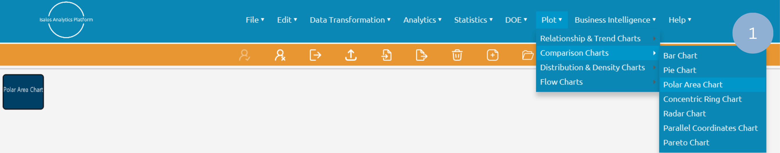
- Type the chart title (2).
- Add the category and value columns (3).
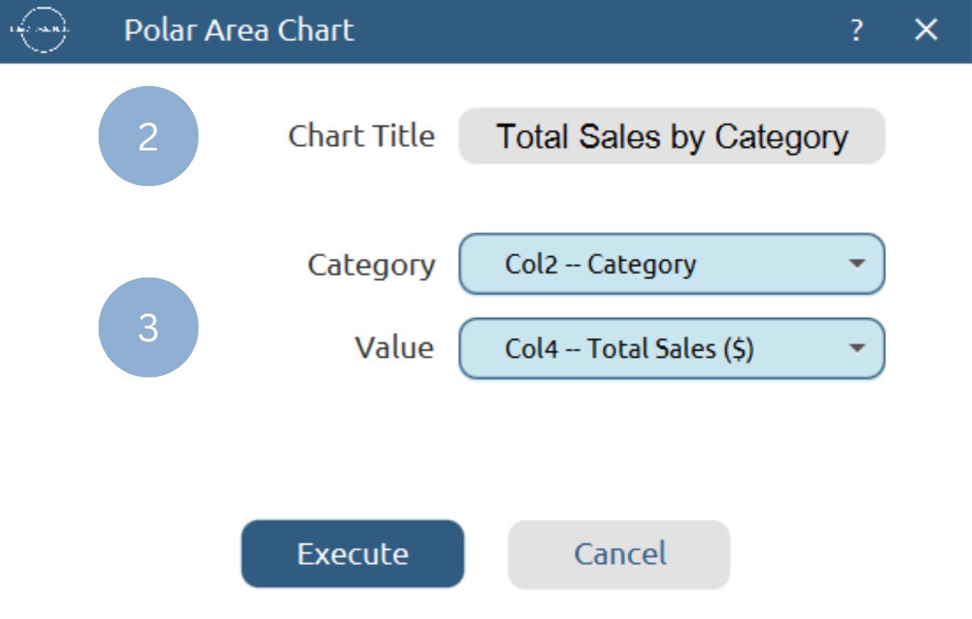
Chart customization
Upon clicking Execute the polar area chart appears in a separate window.
- Display the chart legend (1).
- Display the slice labels and values (2).
- Select background and slice colors (3).
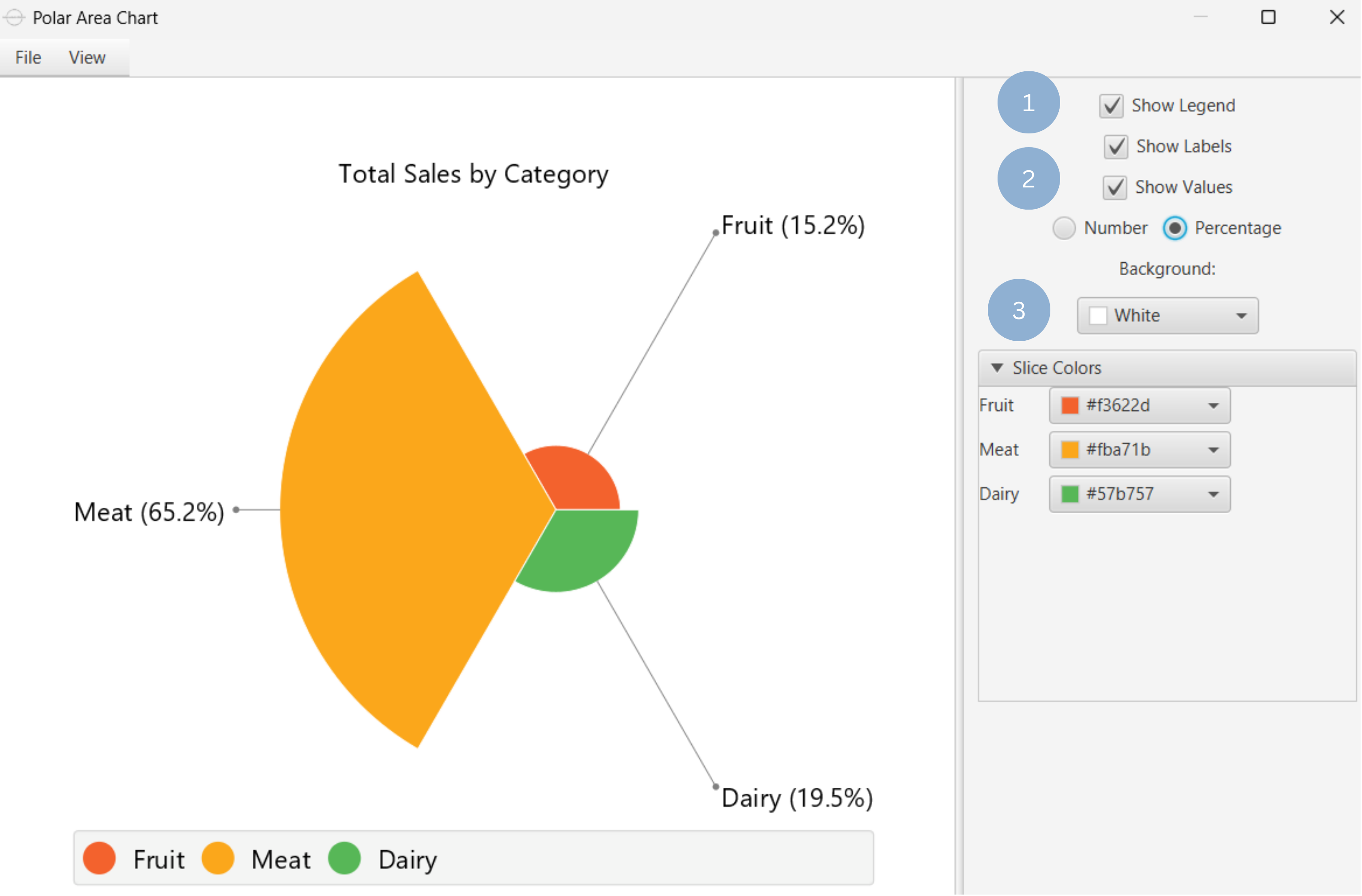
Output
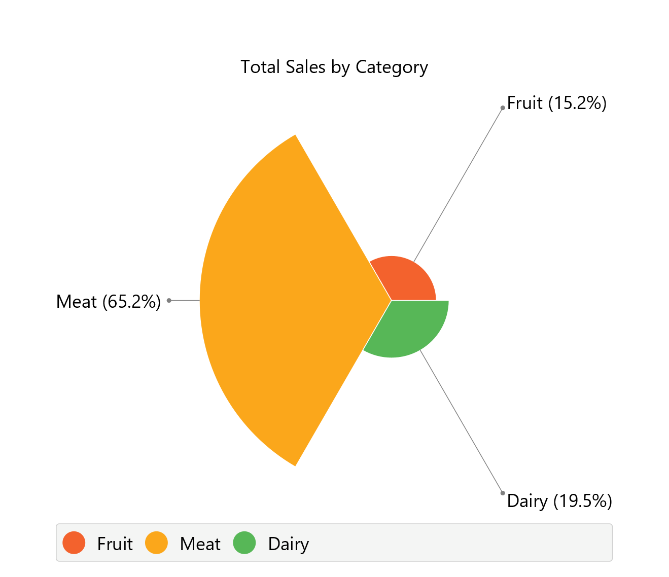
To save the chart customization changes in Isalos, click File→ Save (1). To save the chart as a PNG image, select File→ Save as Image (2).
The downloadable, customized polar area chart is presented below.
Concentric Ring Chart
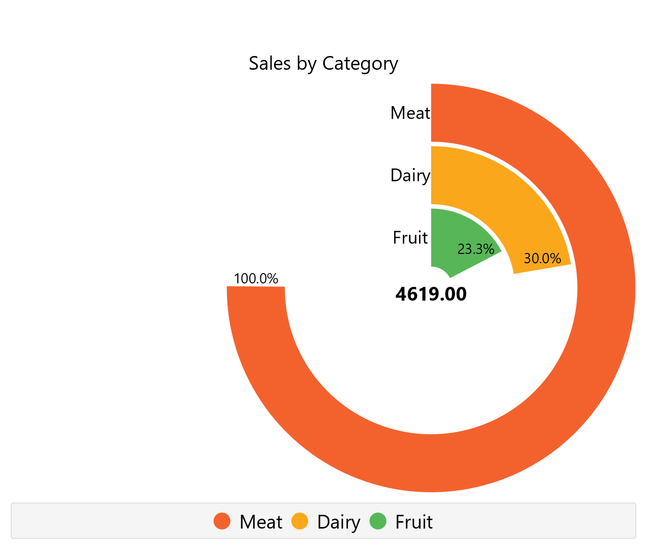
Concentric ring charts are circular diagrams used to represent the proportional relationships between multiple categories through concentric circular bands rather than slices. Each ring corresponds to a different category and extends outwards radially, based on its percentage of the whole. These charts are designed so that the 100% value is assigned to the most common or dominant category, with the rest of the rings being scaled proportionally. This format is particularly effective for comparing relative magnitudes across categories in a compact, visually intuitive layout, without dividing the circle by angle as in pie or ring charts.
Use the Concentric Ring Chart Chart function by browsing in the top ribbon:
| Plot \(\rightarrow\) Comparison Charts \(\rightarrow\) Concentric Ring Chart |
Input
A data table in long format consisting of one categorical column listing the category names and one numerical column containing the values, frequencies, or percentages of each category. If necessary, the conversion from wide to long format can be achieved via the Wide to Long function that can be found in the Data Transformation menu of the tools ribbon, under Data Manipulation.
Configuration
| Chart Title | Type the chart title. |
| Category Column | Select the category column. |
| Value Column | Select the numerical value column. |
Chart customization
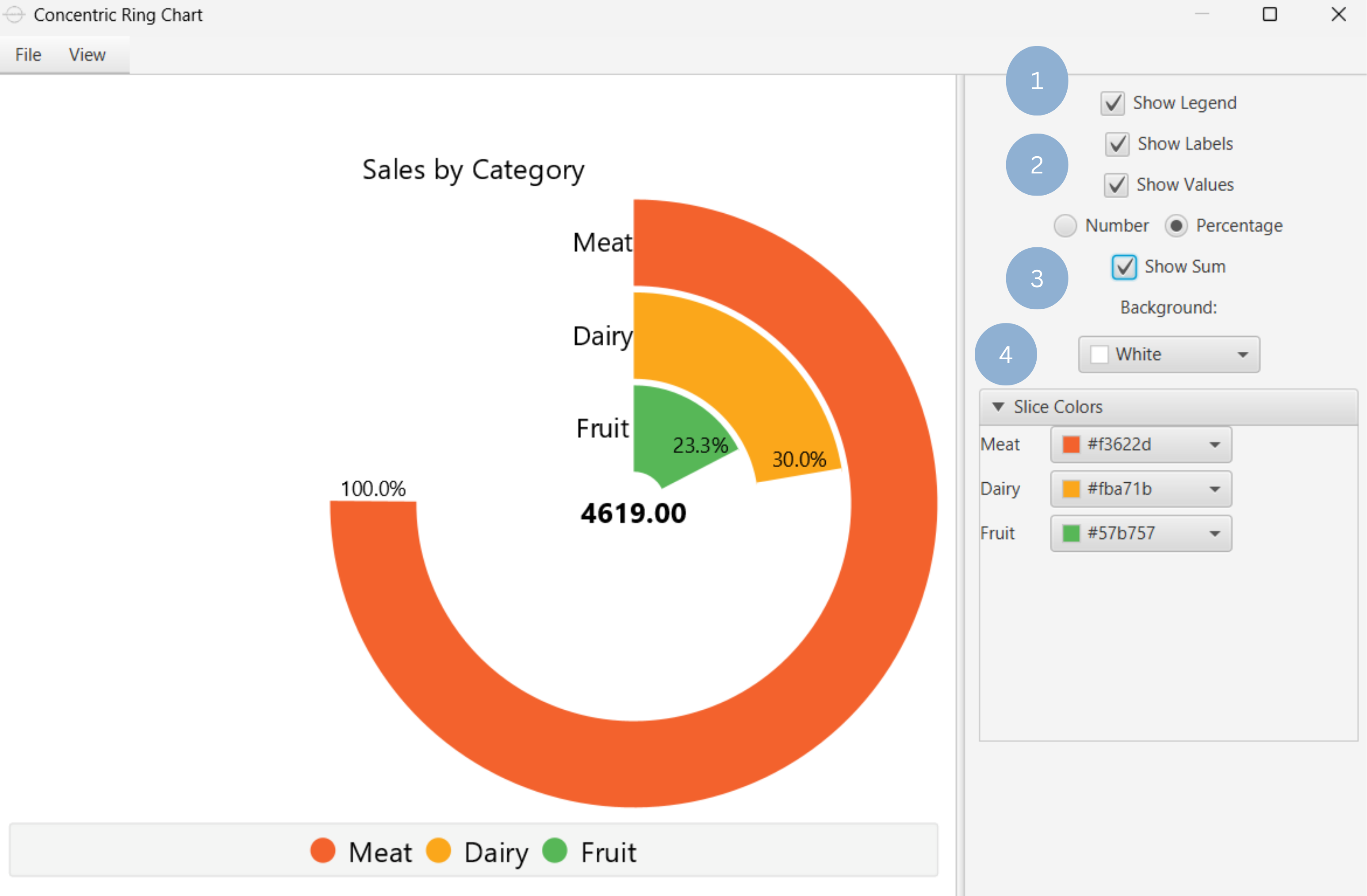
Upon executing the Concentric Ring Chart function, the chart will appear in a separate window where the following customization options are available:
| Show Legend | Display a legend consisting of the category names. |
| Show Labels | Display label of each slice. |
| Show Values | Display the value of each slice, either as a number or as a percentage. |
| Show Sum | Display the sum of all categories. |
| Background | Select the background color. |
| Slice Colors | Select the color of each slice category. |
Output
A graphical representation of the data in a concentric ring chart format, where each slice represents the proportion of its respective category.
Example
Input
In the left-hand spreadsheet import a data consisting of the categories and the corresponding values.
Configuration
-
Use the Concentric Ring Chart function by browsing in the tools ribbon:
Plot \(\rightarrow\) Comparison Charts \(\rightarrow\) Concentric Ring Chart (1) 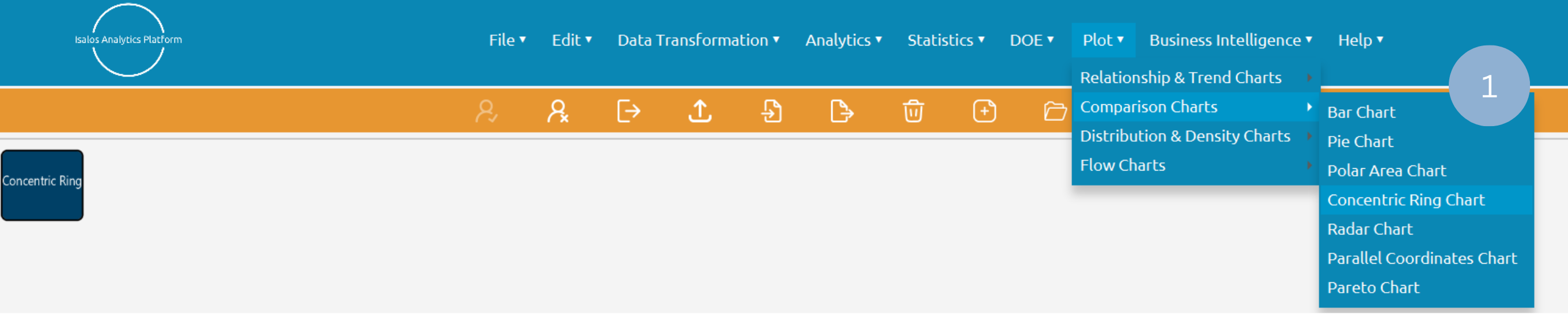
- Type the chart title (2).
- Add the category and value columns (3).
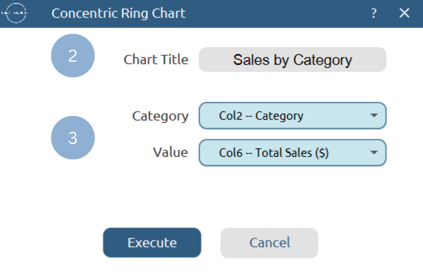
Chart customization
Upon clicking Execute the concentric ring chart appears in a separate window.
- Display the chart legend (1).
- Display the slice labels and values (2).
- Show total sum of all categories (3).
- Select background and slice colors (4).
Output
To save the chart customization changes in Isalos, click File→ Save (1). To save the chart as a PNG image, select File→ Save as Image (2).
The downloadable, customized concentric ring chart is presented below.
Radar Chart
A radar chart is a mathematical plot that displays multivariate data on a two-dimensional plane, with multiple axes originating from a common middle point, each corresponding to one variable or category. The axes are usually uniformly spaced across the two-dimensional plane. Data points coordinates are placed on each axis at a distance from the center that is proportional to the magnitude of the corresponding variable for that specific data point, relative to its maximum value. A line connects the data points across all axes, forming a “star” shape or polygon that is representative of the relationship between all included variables for a given data point. Variables with data points positioned closer to the center are less influential to the specific observation. Therefore, the shape of the “star” reveals patterns and similarities between variables, making radar charts useful for comparing different datasets. These plots are usually used in strengths/weaknesses analysis or to display performance metrics (e.g. for comparing different vehicles).
Use the Radar Chart function by browsing in the top ribbon:
| Plot \(\rightarrow\) Comparison Charts \(\rightarrow\) Radar Chart |
Input
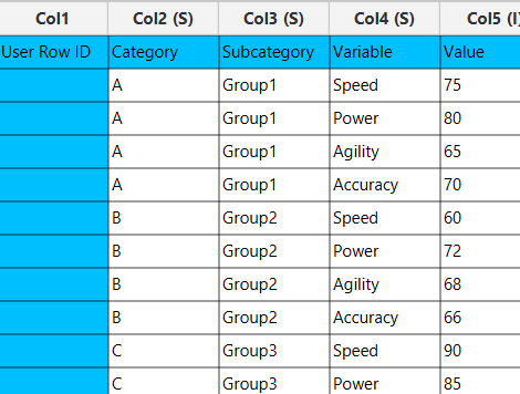
A data table in long format consisting of one categorical column for different variables to be compared, one categorical column for grouping, and one numerical column for the corresponding values. Each combination of variable and group category must be unique and present in the data. If necessary, the conversion from wide to long format can be achieved via the Wide to Long function that can be found in the Data Transformation menu of the tools ribbon, under Data Manipulation.
Configuration
| Chart Title | Type the chart title. |
| Variable | Select the variable column which will define the chart axes. |
| Group by | Select the grouping column. |
| Value Column | Select the numerical value column. |
Chart customization
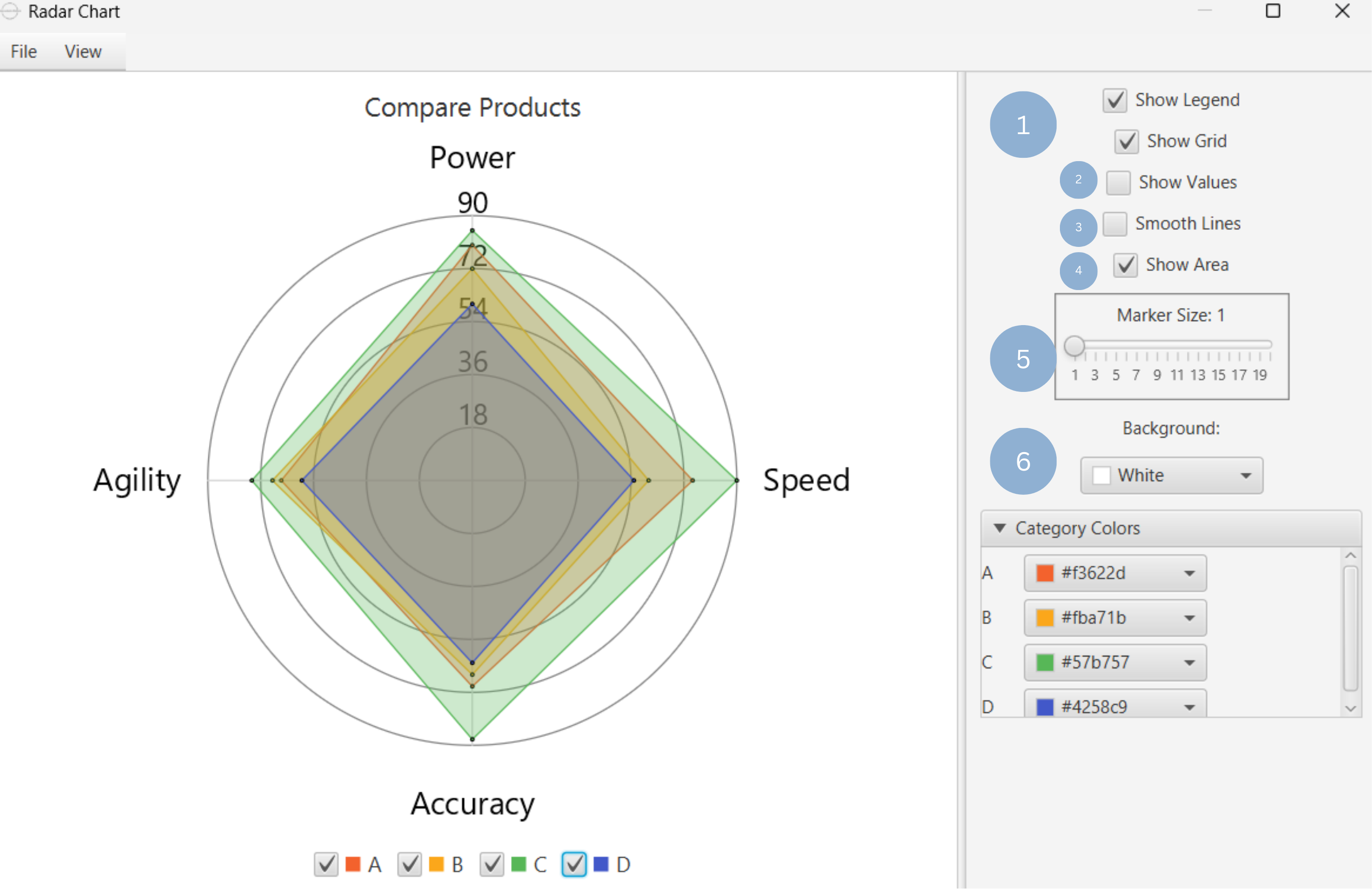
Upon executing the Radar Chart function, the chart will appear in a separate window where the following customization options are available:
| Show Legend | Display a legend consisting of the variable names. |
| Show Grid | Display the axis grid lines. |
| Show Values | Display the value of each data point. |
| Smooth Lines | Connect data points with a smooth line. |
| Show Area | Display the area of each group. |
| Marker Size | Size of each data point. |
| Background | Select the background color. |
| Category Colors | Select the color of each category. |
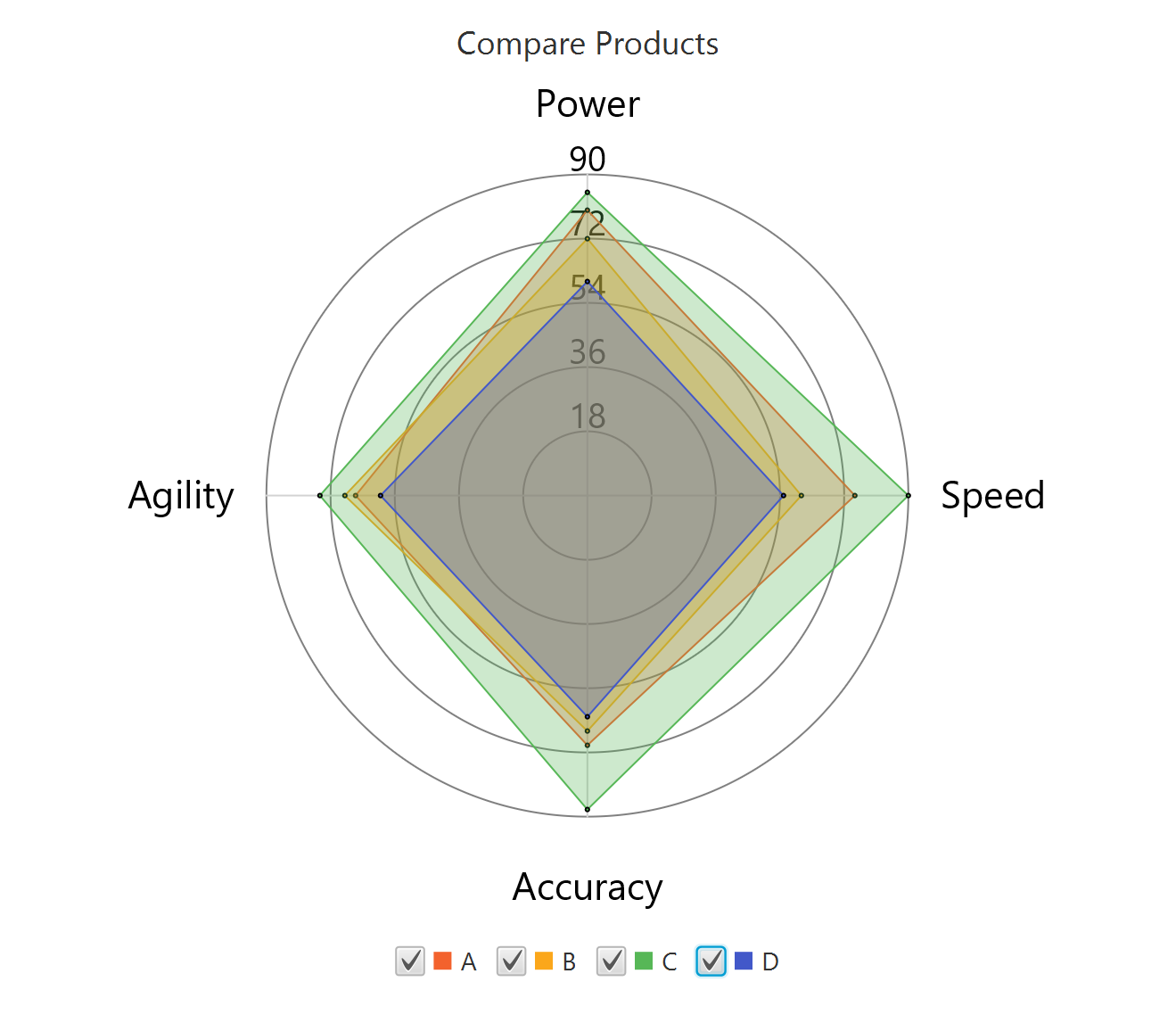
Output
A graphical representation of the data in a radar chart format, where with each axis representing a variable, values plotted along the axes, and each group forming a polygon to visualize differences and similarities across variables.
Example
Input
In the left-hand spreadsheet import a data consisting of the variables, group categories and the corresponding values.
Configuration
-
Use the Radar Chart function by browsing in the tools ribbon:
Plot \(\rightarrow\) Comparison Charts \(\rightarrow\) Radar Chart (1) 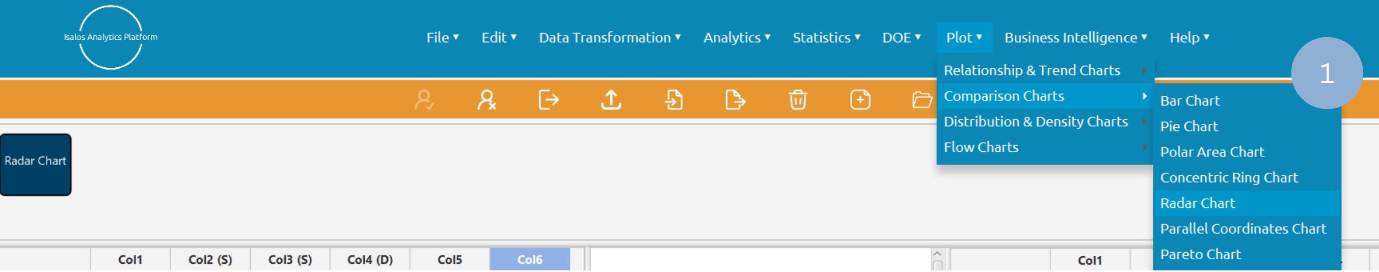
- Type the chart title (2).
- Add the variable, group by and value columns (3).
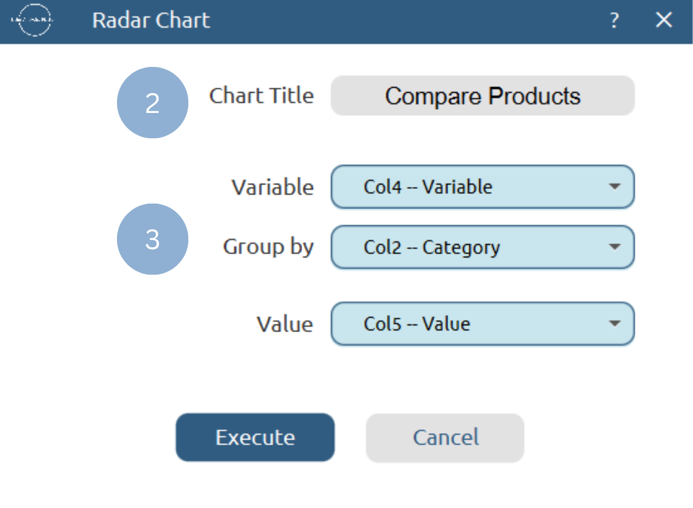
Chart customization
Upon clicking Execute the radar chart appears in a separate window.
- Display the chart legend and grid lines (1).
- Display the data point values (2).
- Show smooth lines (3).
- Show group area (4).
- Change data point size (5).
- Select background and category colors (6).
Output
To save the chart customization changes in Isalos, click File→ Save (1). To save the chart as a PNG image, select File→ Save as Image (2).
The downloadable, customized radar chart is presented below.
Parallel Coordinates Chart
Parallel coordinates charts are used for the visualization of high dimensional, multivariate datasets, enabling the comparison of multiple individual data points. The n axes of an n-dimensional plane are represented as parallel, equally distanced vertical lines. Each axis corresponds to one variable in the dataset and, therefore, can be individually scaled based on its range. To plot the data points, n vertices are placed on the parallel axes according to each variable’s value for the n-dimensional data point. These vertices are then connected sequentially with n-1 line segments, forming a polyline that represents the data point across all dimensions.
Use the Parallel Coordinates Chart function by browsing in the top ribbon:
| Plot \(\rightarrow\) Comparison Charts \(\rightarrow\) Parallel Coordinates Chart |
Input
A data table in long format consisting of one categorical column for different variables to be compared, one categorical column for grouping, and one numerical column for the corresponding values. Each combination of variable and group category must be unique and present in the data. If necessary, the conversion from wide to long format can be achieved via the Wide to Long function that can be found in the Data Transformation menu of the tools ribbon, under Data Manipulation.
Configuration
| Chart Title | Type the chart title. |
| Variable | Select the variable column which will define the chart axes. |
| Group by | Select the grouping column. |
| Value Column | Select the numerical value column. |
Chart customization
Upon executing the Parallel Coordinates Chart function, the chart will appear in a separate window where the following customization options are available:
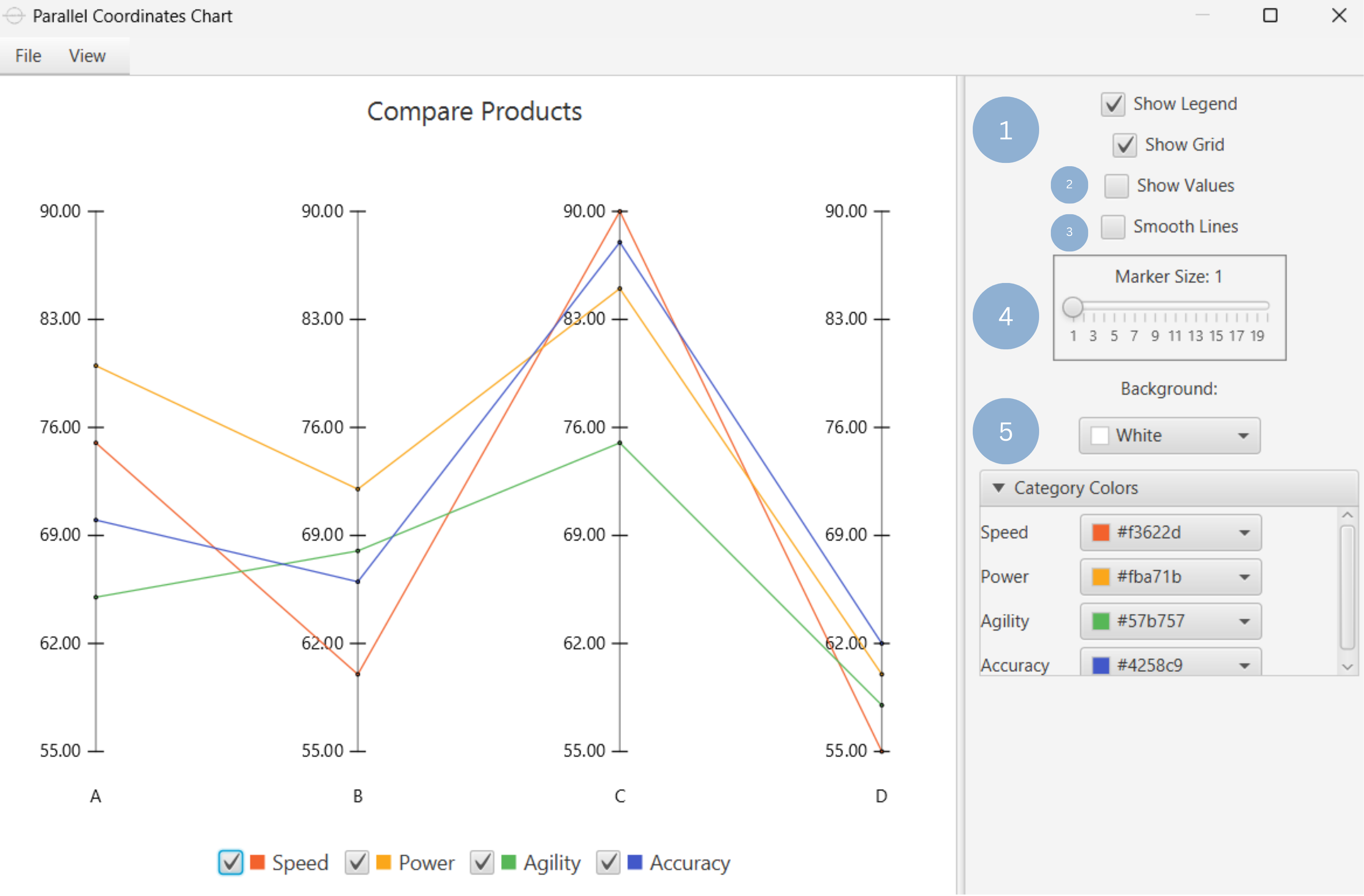
| Show Legend | Display a legend consisting of the variable names. |
| Show Grid | Display the axis grid lines. |
| Show Values | Display the value of each data point. |
| Smooth Lines | Connect data points with a smooth line. |
| Marker Size | Size of each data point. |
| Background | Select the background color. |
| Category Colors | Select the color of each category. |
Output
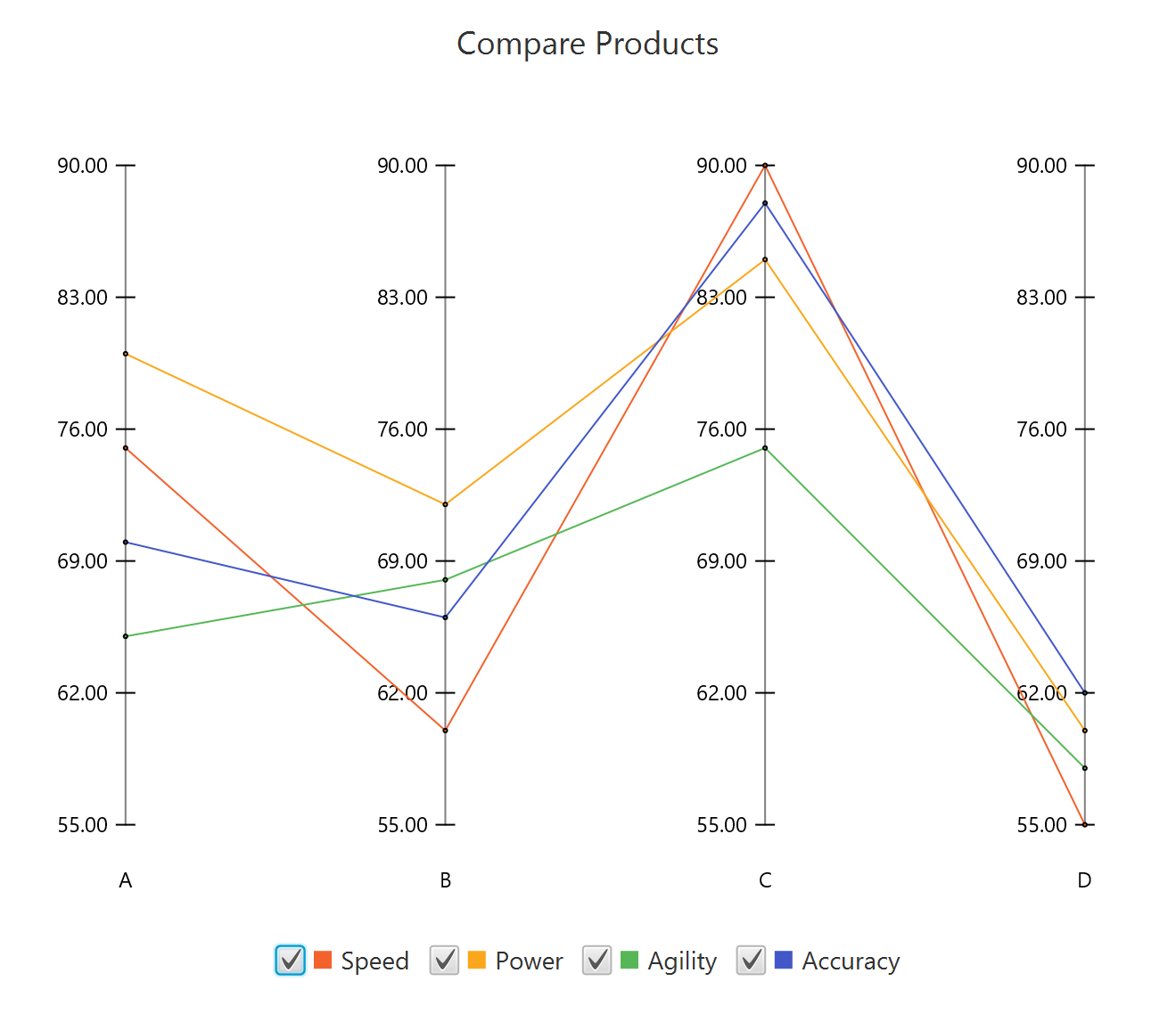
A graphical representation of the data in a parallel coordinates chart format, where with each axis representing a variable, values plotted along the axes, and each group forming a polyline to visualize differences and similarities across variables.
Example
Input
In the left-hand spreadsheet import a data consisting of the variables, group categories and the corresponding values.
Configuration
-
Use the Parallel Coordinates Chart function by browsing in the tools ribbon:
Plot \(\rightarrow\) Comparison Charts \(\rightarrow\) Parallel Coordinates Chart (1) 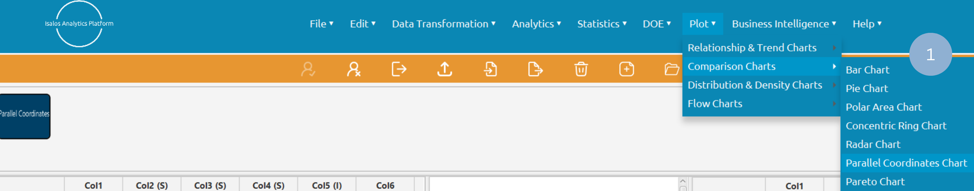
- Type the chart title (2).
- Add the variable, group by and value columns (3).
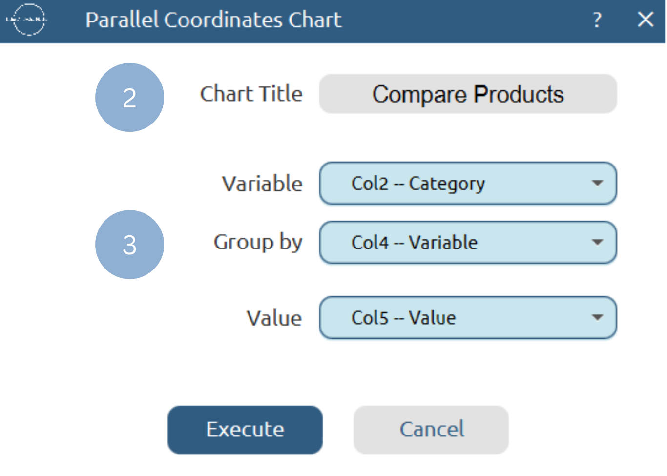
Chart customization
Upon clicking Execute the parallel coordinates chart appears in a separate window.
- Display the chart legend and grid lines (1).
- Display the data point values (2).
- Show smooth lines (3).
- Change data point size (4).
- Select background and category colors (5).
Output
To save the chart customization changes in Isalos, click File→ Save (1). To save the chart as a PNG image, select File→ Save as Image (2).
The downloadable, customized parallel coordinates chart is presented below.
Pareto Chart
A Pareto chart is a combination of a bar and a line chart. It displays the values of a variable-measured along the left vertical axis-as descending bars, while the cumulative total is shown as a continuous line. The right vertical axis corresponds to the cumulative percentage of the total. The structure of the plot facilitates the identification of the most significant or frequent elements in the analysis, making it valuable for project management and quality control studies.
Use the Pareto Chart function by browsing in the tools ribbon:
| Plot \(\rightarrow\) Comparison Charts \(\rightarrow\) Pareto Chart |
Input
A data table in long format consisting of one categorical column listing the category names and one numerical column containing the values, frequencies, or percentages of each category. If necessary, the conversion from wide to long format can be achieved via the Wide to Long function that can be found in the Data Transformation menu of the tools ribbon, under Data Manipulation.
Configuration
| Chart Title | Type the chart title. |
| Horizontal Axis Title | Type the horizontal axis title. |
| Vertical Axis Title | Type the vertical axis title. |
| Category Column | Select the category column. |
| Value Column | Select the numerical value column. |
Chart customization
Upon executing the Pareto Chart function, the chart will appear in a separate window where the following customization options are available:
| Show Grid | Display grid lines in the background. |
| Show Values | Display values of each bar as numbers or as percentages. |
| Show Line | Display continuous line of cumulative total. |
| Marker Size | Size of data points in line. |
| Bar Spacing | Distance between bars. |
| Bar Color | Select the color of all bars. |
| Line Color | Select the line color. |
| Background | Select the background color. |
Output
A graphical representation of the data in a pareto chart format, where each bar shows the value or proportion of a category, and the line indicates the cumulative total across all categories.
Example
Input
In the left-hand spreadsheet import a data consisting of the categories and the corresponding values.
Configuration
-
Use the Pareto Chart function by browsing in the tools ribbon:
Plot \(\rightarrow\) Comparison Charts \(\rightarrow\) Pareto Chart (1) 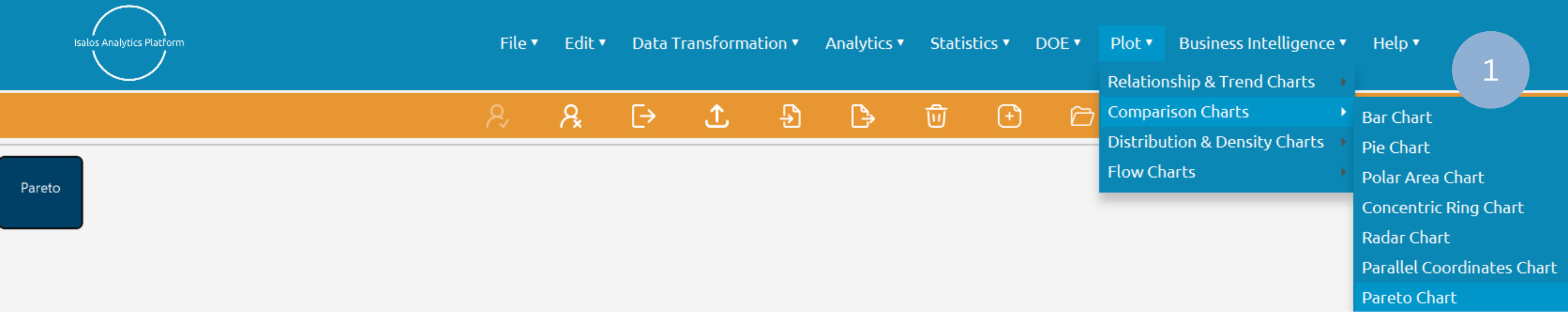
- Type the chart, horizontal axis, and vertical axis titles (2).
- Add the category and value columns (3).
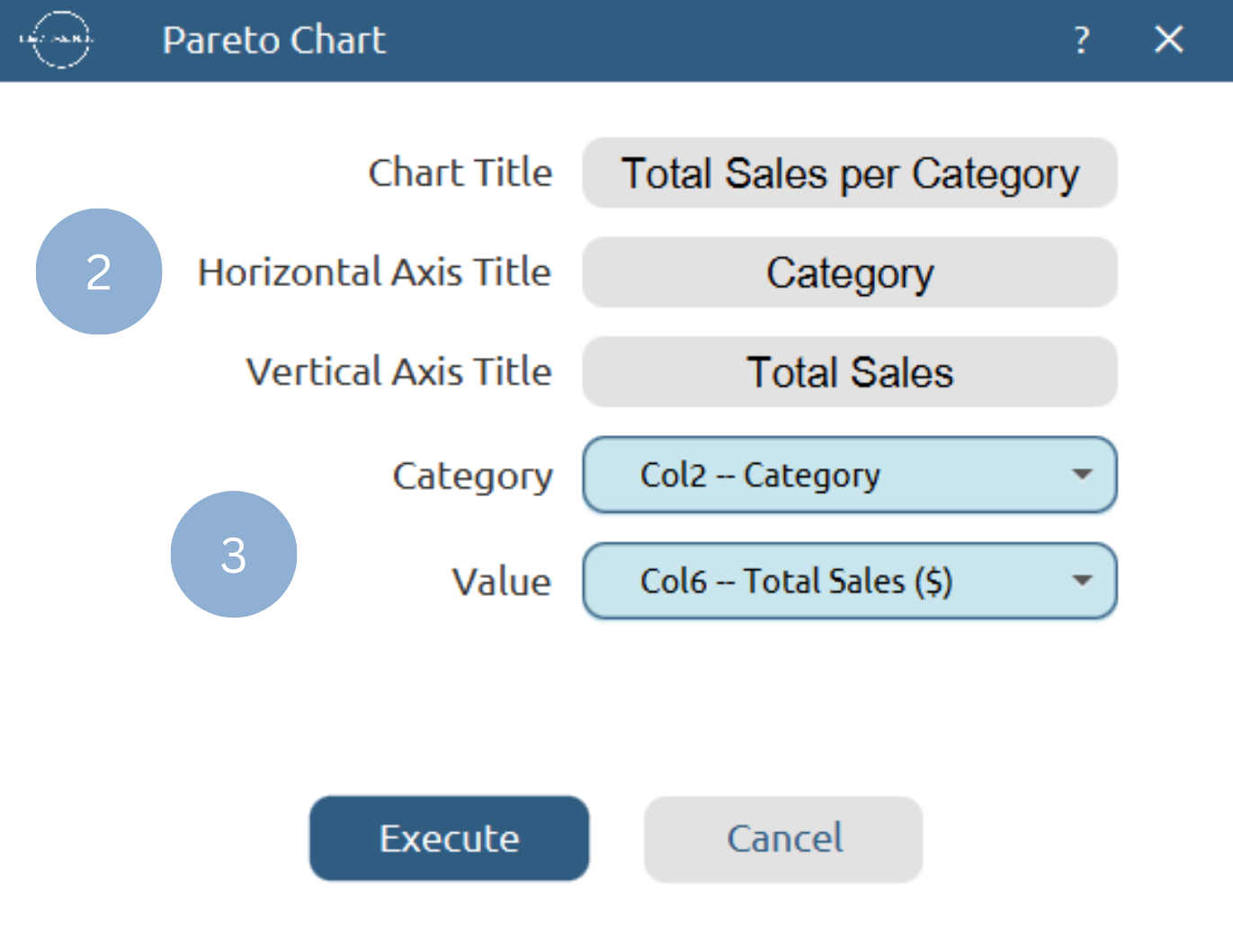
Chart customization
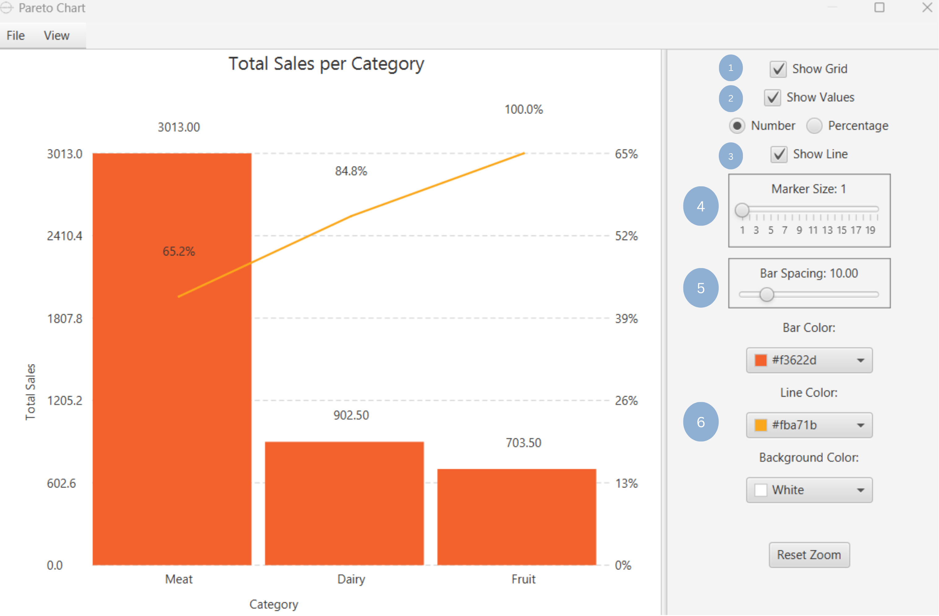
Upon clicking Execute the pareto chart appears in a separate window.
- Display the grid lines (1).
- Display bar values as numbers or as percentages (2).
- Show continuous line of cumulative total (3).
- Select size of data points in continuous line (4).
- Select space between bars (5).
- Select bar, line and background colors (6).
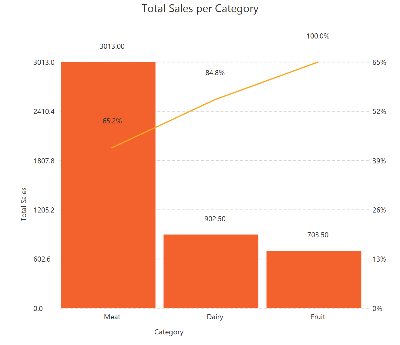
Output
To save the chart customization changes in Isalos, click File→ Save (1). To save the chart as a PNG image, select File→ Save as Image (2).
The downloadable, customized pareto chart is presented below.
✧ Tips
- Use a common zero-valued baseline for an easier comparison of bar lengths.
- Always label slices or include a legend to enhance plot interpretability.
- For closely proportioned data, opt for bar, stacked bar, or polar charts to avoid confusion caused by similar angles in pie or ring charts.
- To avoid a cluttered chart, choose to visualize a small number of observations on a radar chart. For numerous observations, it is advisable to opt for the parallel coordinates chart.
- A common scaling is important to compare variables of different metric units.
- Consider binning or aggregation for very large datasets.
Version History
Introduced in Isalos Analytics Platform v2.0.0
Instructions last updated on December 2025