Distribution and Density Charts
Distribution and density charts are visual tools used to illustrate how data values are spread across one or more dimensions and how frequently they occur. By representing magnitude through position, grouping, or intensity, these charts make it easier to identify patterns, concentrations, gaps, and variations within a dataset. They reveal where values cluster, how distributions change across categories or time, and whether trends or imbalances are present.
HeatMap Chart
HeatMaps are graphical visualizations in the form of table-like charts that use color coding to represent the intensity of the relationships and interactions between a set of selected variables. They provide an intuitive way to interpret multivariate datasets through a color gradient where one end typically represents low values, the other high values, and intermediate shades indicate values in between. This aspect of a HeatMap chart is valuable for identifying trends across large datasets. Additionally, plotting all variables against each other provides an indicator of their correlations. HeatMaps are valuable tools across various fields of analytics, including genomic, health data, financial and cybersecurity analyses.
Use the HeatMap Chart function by browsing in the tools ribbon:
| Plot \(\rightarrow\) Distribution and Density Charts \(\rightarrow\) HeatMap Chart |
Input
A data table in long format consisting of two categorical columns listing the x and y category names. Optionally a numerical column containing the values of each category. If necessary, the conversion from wide to long format can be achieved via the Wide to Long function that can be found in the Data Transformation menu of the tools ribbon, under Data Manipulation.
Configuration
| Chart Title | Type the chart title. |
| Horizontal Axis Title | Type the horizontal axis title. |
| Vertical Axis Title | Type the vertical axis title. |
| X Category Column | Select the X category column. |
| Y Category Column | Select the Y category column. |
| Include Value | Check to include numerical value. |
| Value | Select the numerical value column. |
Chart customization
Upon executing the HeatMap Chart function, the chart will appear in a separate window where the following customization options are available:
| Show Legend | Display a legend consisting of the value range. |
| Show Axis | Display category values in axis. |
| Show Cell Values | Display cell values as either counts or percentages. |
| X Bins | Specify the number of categories along the X-axis. |
| Y Bins | Specify the number of categories along the Y-axis. |
| Max Color | Choose the maximum color for the gradient. |
| Background | Select the background color. |
Output
A graphical representation of the data in a heatmap chart format. Without a specified value, it displays the count of each combination of categorical variables. When a value is specified, the heatmap uses a color gradient to represent the magnitude of the values.
Example
Input
In the left-hand spreadsheet import a data consisting of the categories and the value.
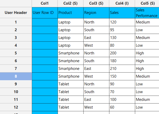
Configuration
-
Use the HeatMap Chart function by browsing in the tools ribbon:
Plot \(\rightarrow\) Distribution and Density Charts \(\rightarrow\) HeatMap Chart (1) 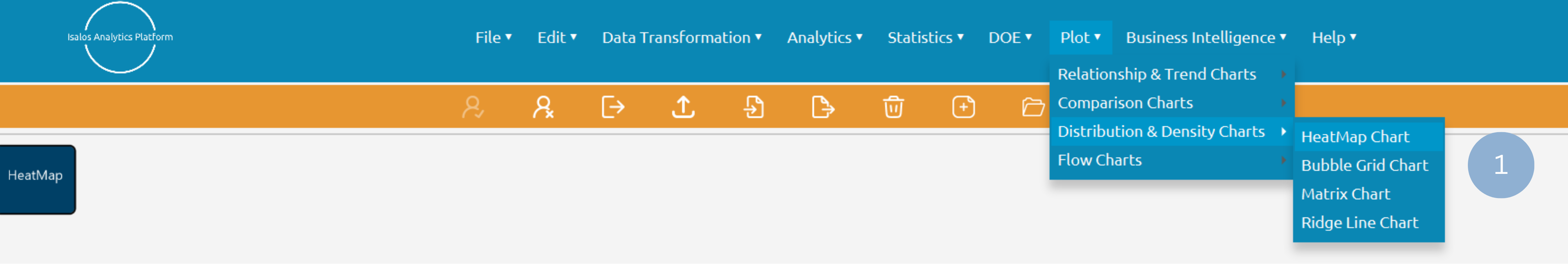
- Type the chart, horizontal axis, and vertical axis titles (2).
- Add x category and y category columns (3).
- Optionally include a value column (4).
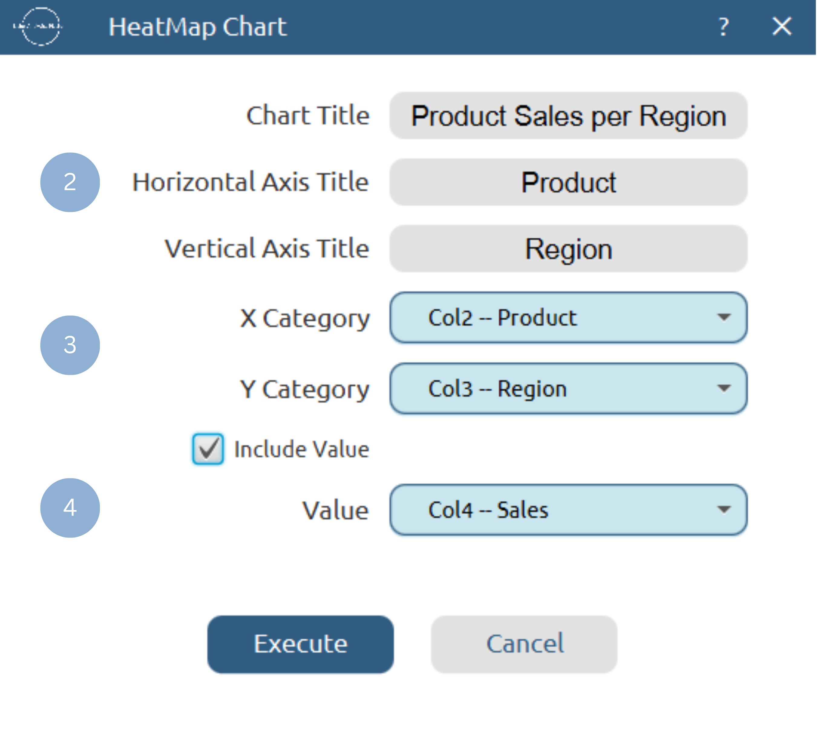
Chart customization
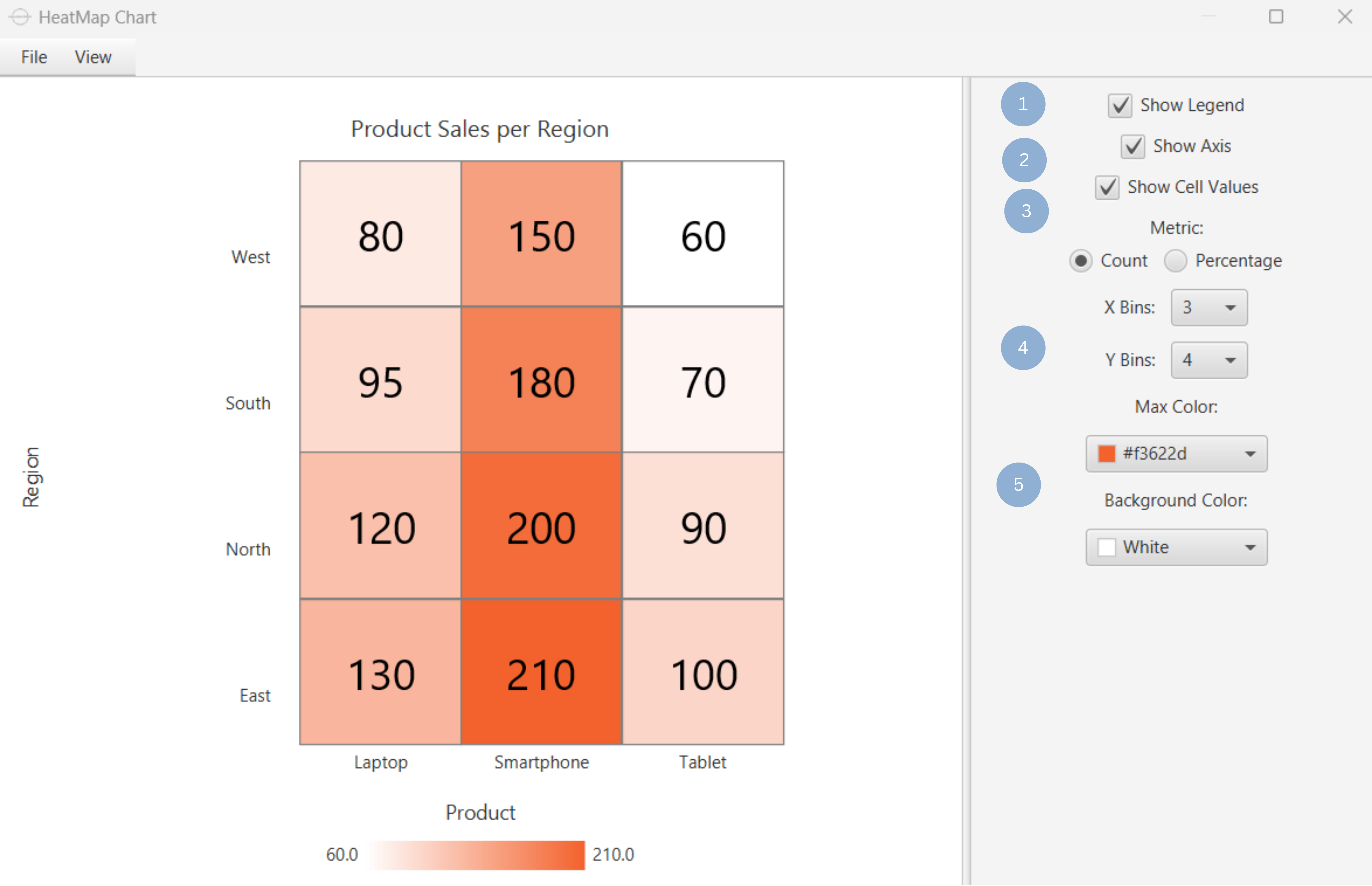
Upon clicking Execute the heatmap chart appears in a separate window.
- Display the gradient legend (1).
- Display the x and y category axis (2).
- Show cell values as count or percentage (3).
- Set number of x and y bins (4).
- Set max gradient and background colors (5).
Output
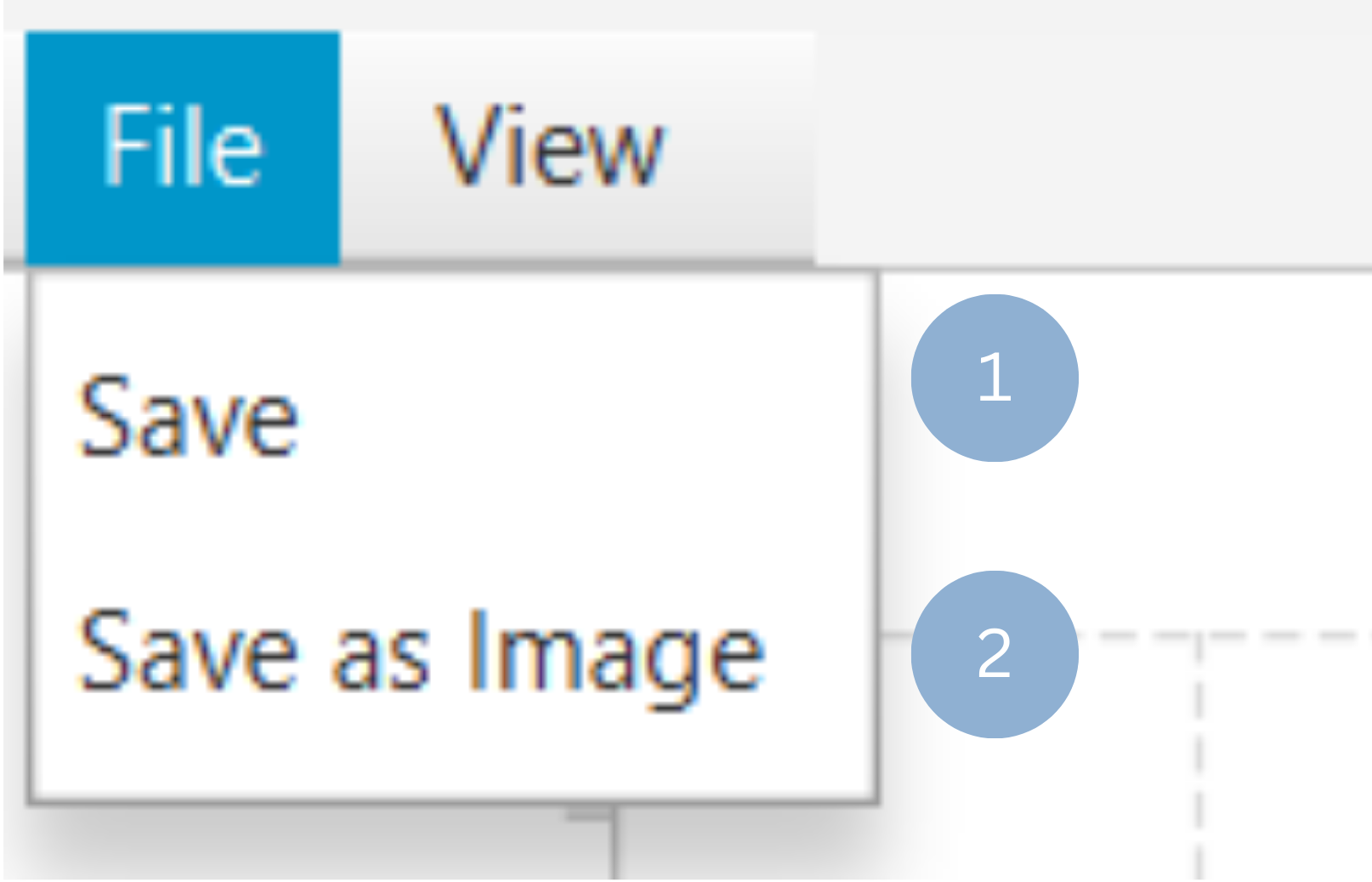
To save the chart customization changes in Isalos, click File→ Save (1). To save the chart as a PNG image, select File→ Save as Image (2).
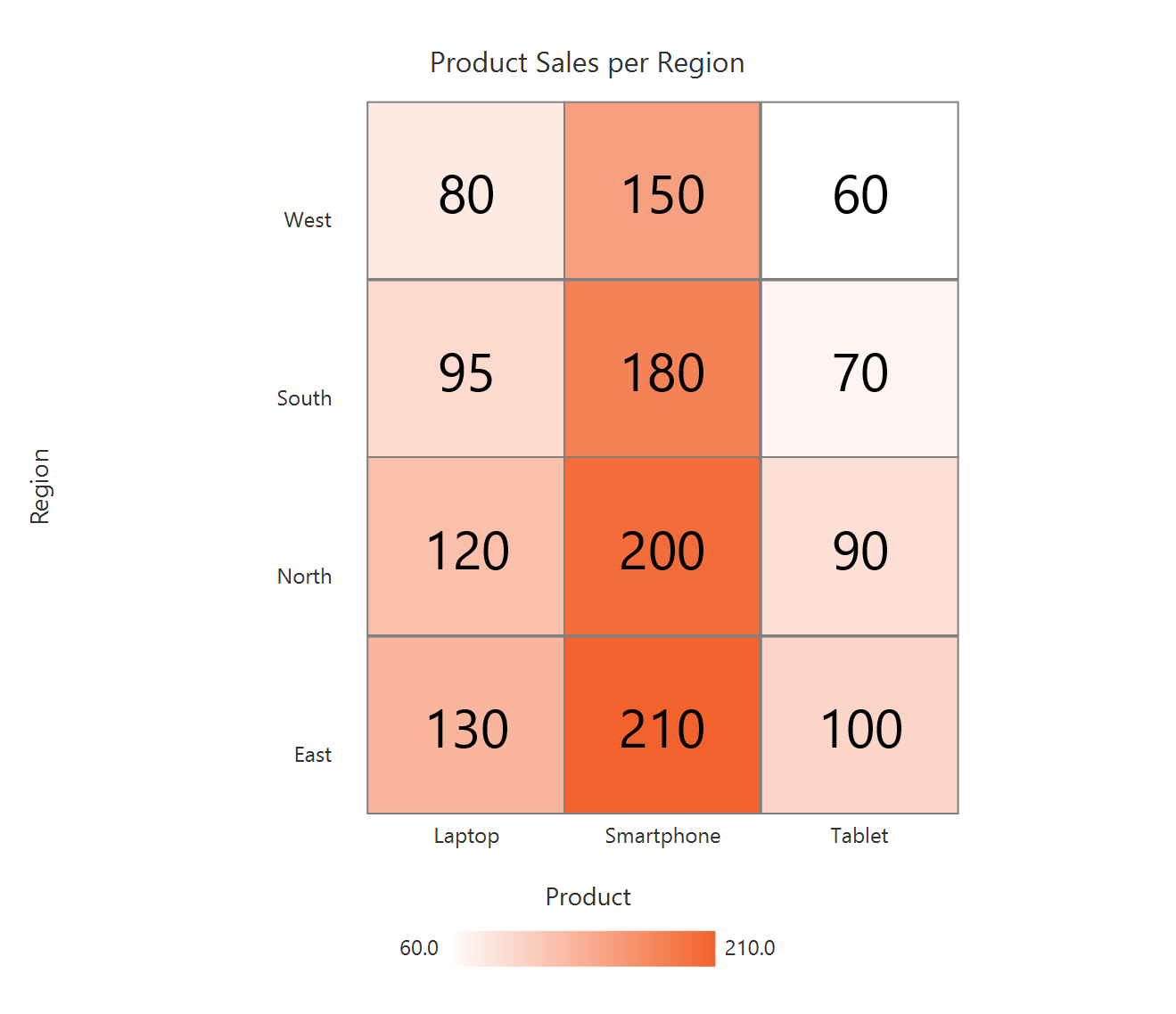
The downloadable, customized heatmap chart is presented below.
Bubble Grid Chart
The bubble grid chart is a two-dimensional visualization technique that combines elements of a heat map and a bubble plot. The two axes of the bubble table represent the categories of two variables, and at each intersection (table cell) a bubble is placed based on the magnitude of the relationship between the corresponding categories. Larger bubbles indicate a stronger relationship between categories. Bubble grid charts are useful for quickly identifying the most important relationships within a dataset, e.g. finding the most common polymeric products (PET, HDPE, PVC) used in different market sectors (Transportation, Packaging, Electronics).
Use the Bubble Grid Chart function by browsing in the tools ribbon:
| Plot \(\rightarrow\) Distribution and Density Charts \(\rightarrow\) Bubble Grid Chart |
Input
A data table in long format consisting of two categorical columns listing the x and y category names and a numerical column containing the values of each category combination. If necessary, the conversion from wide to long format can be achieved via the Wide to Long function that can be found in the Data Transformation menu of the tools ribbon, under Data Manipulation.
Configuration
| Chart Title | Type the chart title. |
| Horizontal Axis Title | Type the horizontal axis title. |
| Vertical Axis Title | Type the vertical axis title. |
| X Category Column | Select the X category column. |
| Y Category Column | Select the Y category column. |
| Value | Select the numerical value column. |
Chart customization
Upon executing the Bubble Grid Chart function, the chart will appear in a separate window where the following customization options are available:
| Show Legend | Display a legend consisting of the x category labels. |
| Show Grid | Display grid lines. |
| Show Cell Values | Display cell values. |
| Background | Select the background color. |
| Category Colors | Choose X axis category colors. |
Output
A graphical representation of the data in a bubble chart format, which uses bubble size to represent the magnitude of the values for each category combination.
Example
Input
In the left-hand spreadsheet import a data consisting of the two categories and the value.
Configuration
-
Use the Bubble Grid Chart function by browsing in the tools ribbon:
Plot \(\rightarrow\) Distribution and Density Charts \(\rightarrow\) Bubble Grid Chart (1) 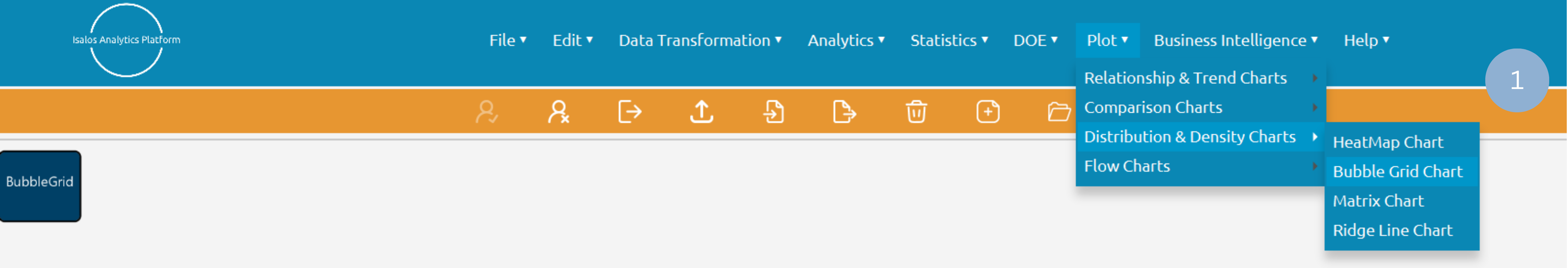
- Type the chart, horizontal axis, and vertical axis titles (2).
- Add x category, y category and value columns (3).
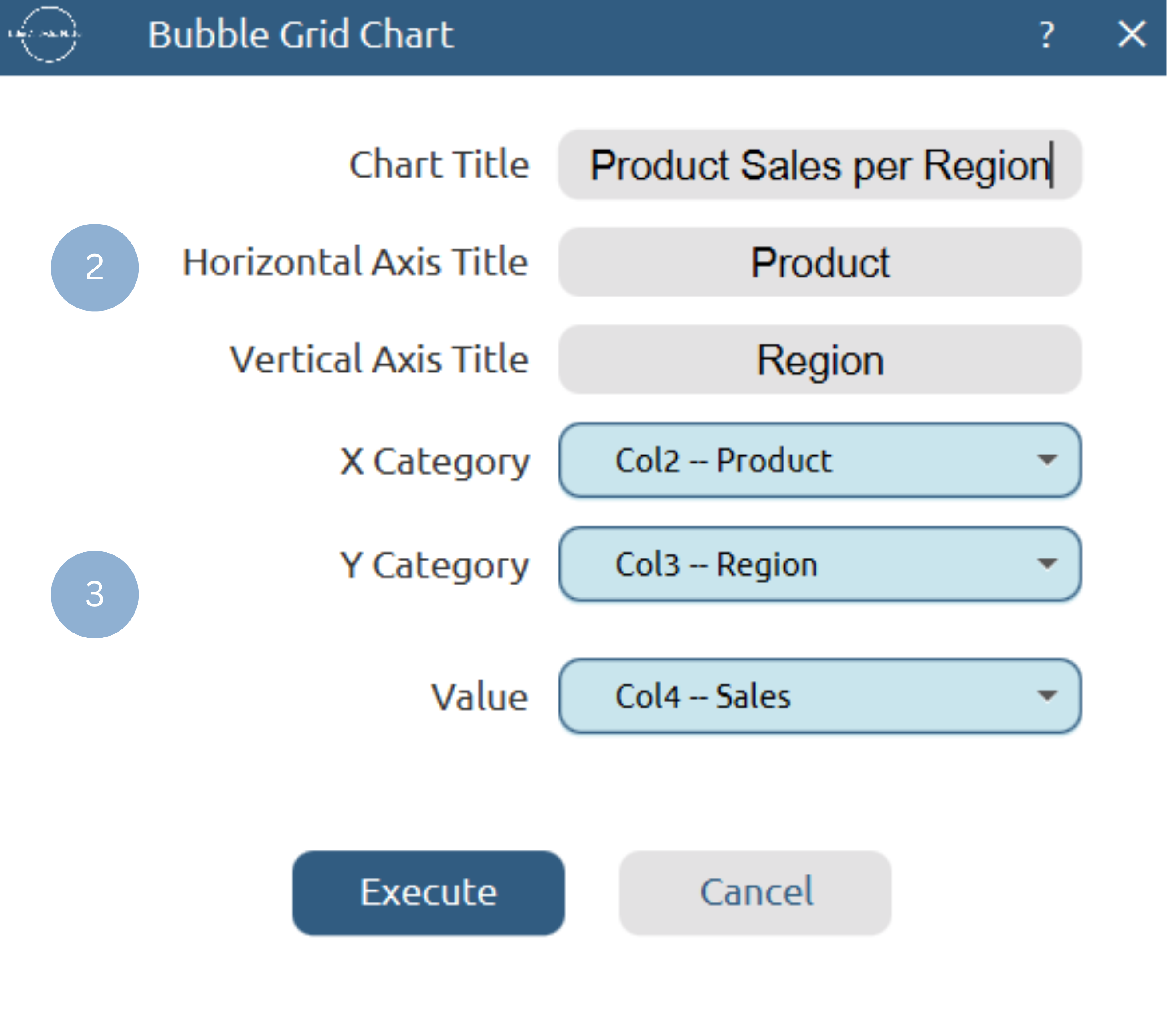
Chart customization
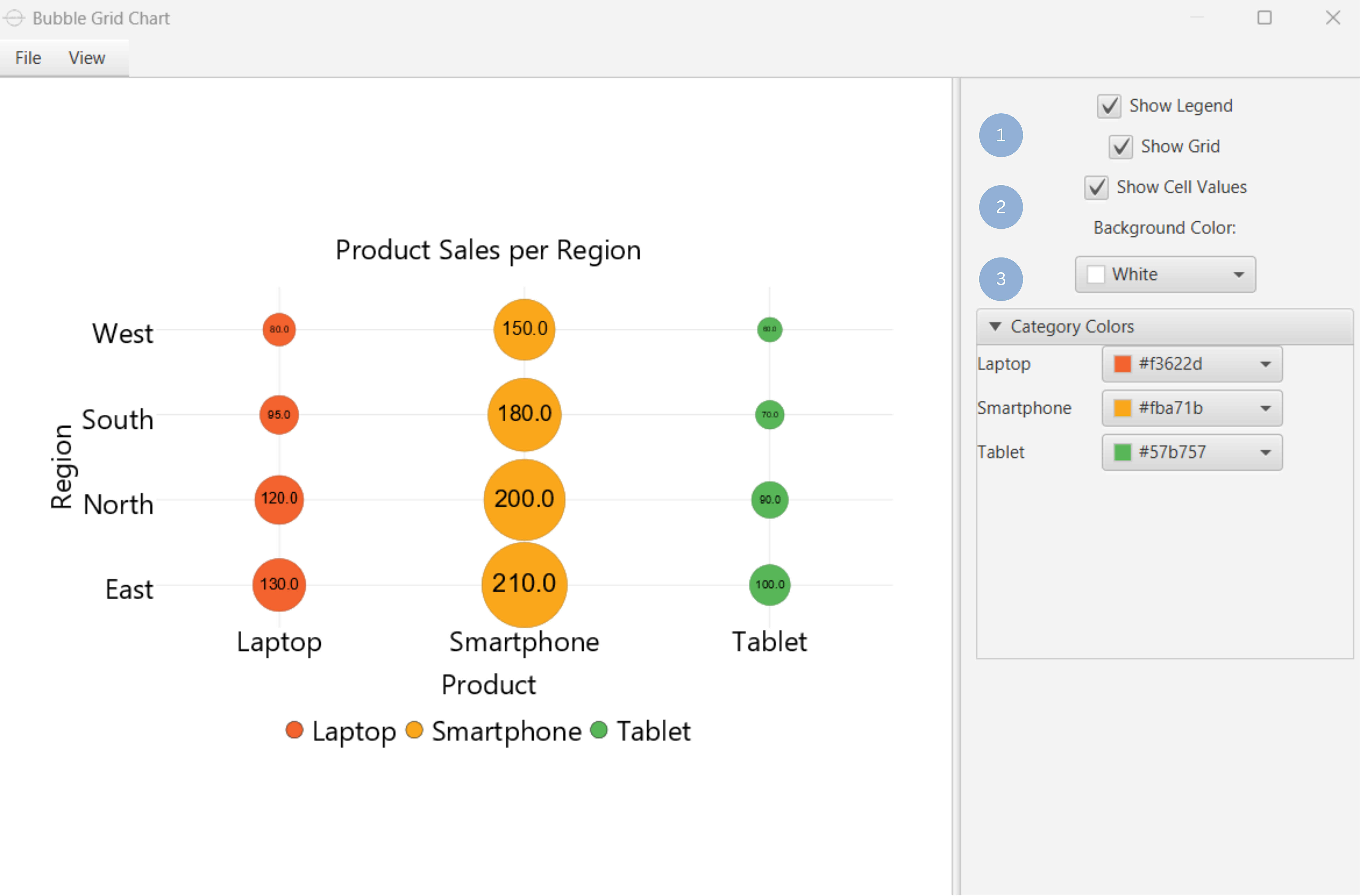
Upon clicking Execute the bubble grid chart appears in a separate window.
- Display the x category legend and grid lines(1).
- Show cell values (2).
- Set background and x category colors (3).
Output
To save the chart customization changes in Isalos, click File→ Save (1). To save the chart as a PNG image, select File→ Save as Image (2).
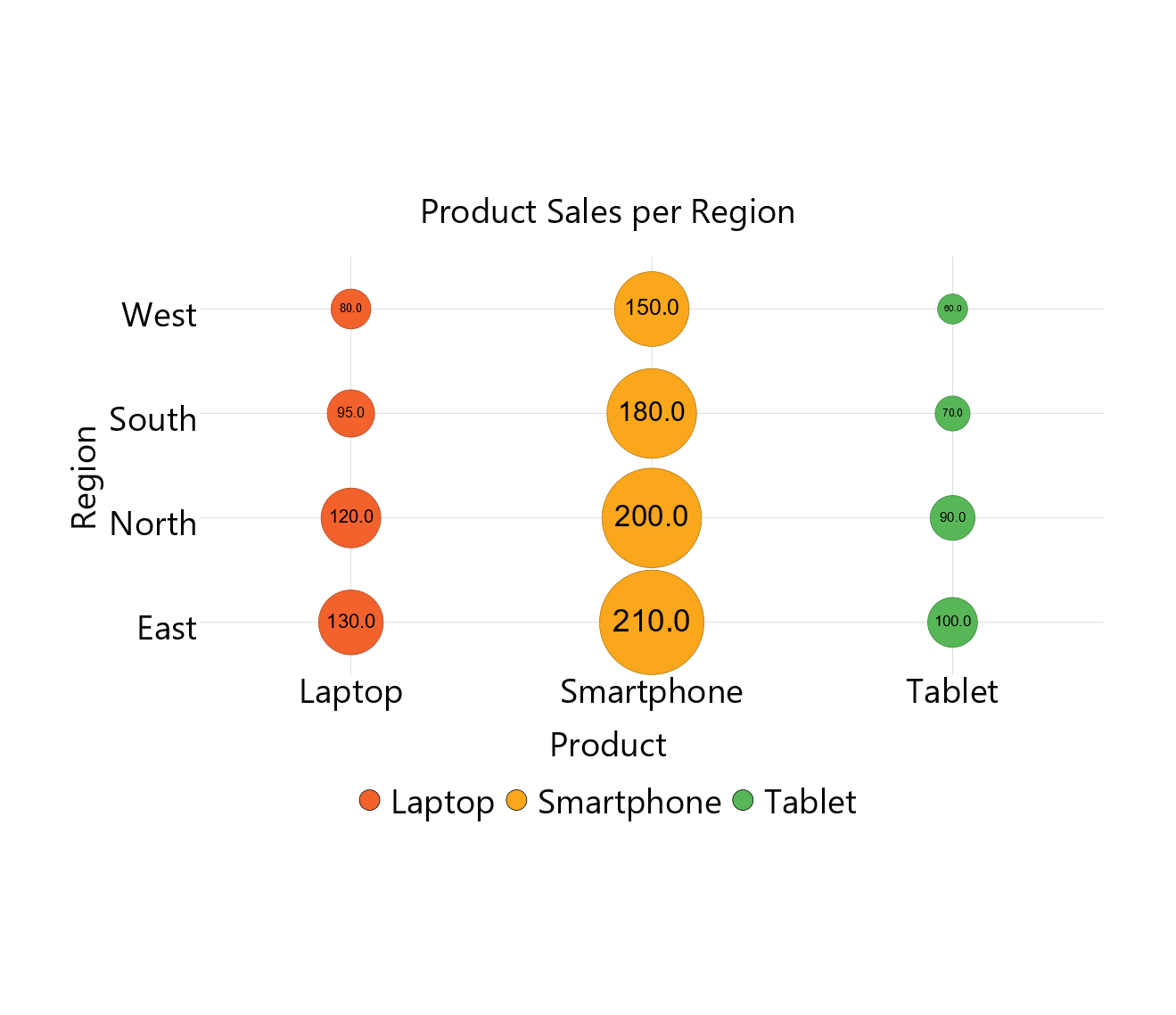
The downloadable, customized bubble grid chart is presented below.
Matrix Chart
Matrix charts are useful visual tools that represent relationships between categories in a grid format. The presence of a relationship is indicated by a symbol, or value within each cell, while the strength of the relationship can be conveyed through variations in color. A matrix chart can be used to determine problem causes, compare possible solutions/improvements, analyze the requirements of a task and assign responsibilities based on required skills.
Use the Matrix Chart function by browsing in the tools ribbon:
| Plot \(\rightarrow\) Distribution and Density Charts \(\rightarrow\) Matrix Chart |
Input
A data table in long format consisting of two categorical columns listing the x and y category names and a numerical or categorical column containing the values of each category combination. If necessary, the conversion from wide to long format can be achieved via the Wide to Long function that can be found in the Data Transformation menu of the tools ribbon, under Data Manipulation.
Configuration
| Chart Title | Type the chart title. |
| Horizontal Axis Title | Type the horizontal axis title. |
| Vertical Axis Title | Type the vertical axis title. |
| X Category Column | Select the X category column. |
| Y Category Column | Select the Y category column. |
| Value | Select the numerical or categorical value column. |
Chart customization
Upon executing the Matrix Chart function, the chart will appear in a separate window where the following customization options are available:
| Show Legend | Display a legend consisting of numeric range or category labels. |
| Value | Declare if the value column is categorical or numerical. |
| Show Cell Values | Display cell values. |
| Threshold | Visible when value is numerical. Set threshold to categorize values. |
| Category Colors | Visible when value is categorical. Set category colors. |
| Background | Select the background color. |
Output
A graphical representation of the data in a matrix format based on two categories. If the value is numerical, the threshold determines how each value is categorized. If the value is categorical, the matrix displays the corresponding categories.
Example
Input
In the left-hand spreadsheet import a data consisting of the categories and the value.
Configuration
-
Use the Matrix Chart function by browsing in the tools ribbon:
Plot \(\rightarrow\) Distribution and Density Charts \(\rightarrow\) Matrix Chart (1) 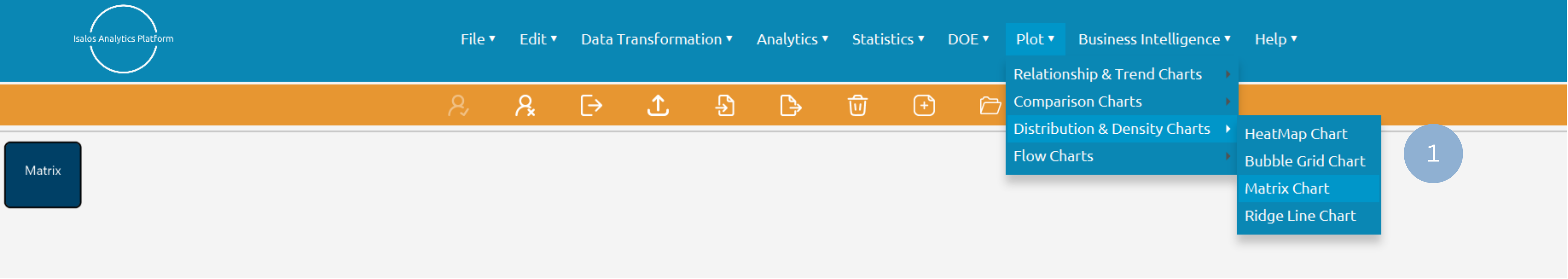
- Type the chart, horizontal axis, and vertical axis titles (2).
- Add x category, y category and value columns (3).
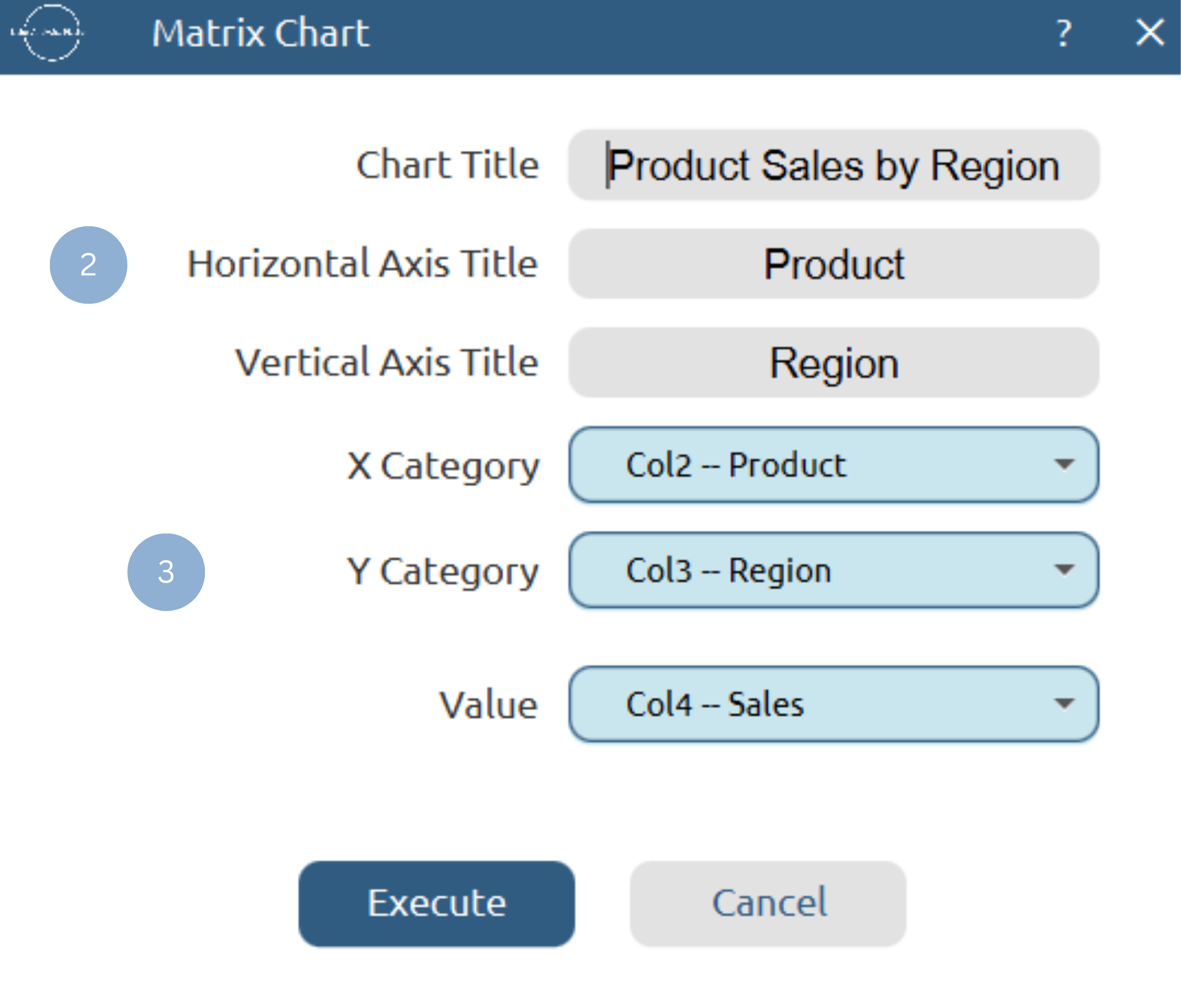
Chart customization
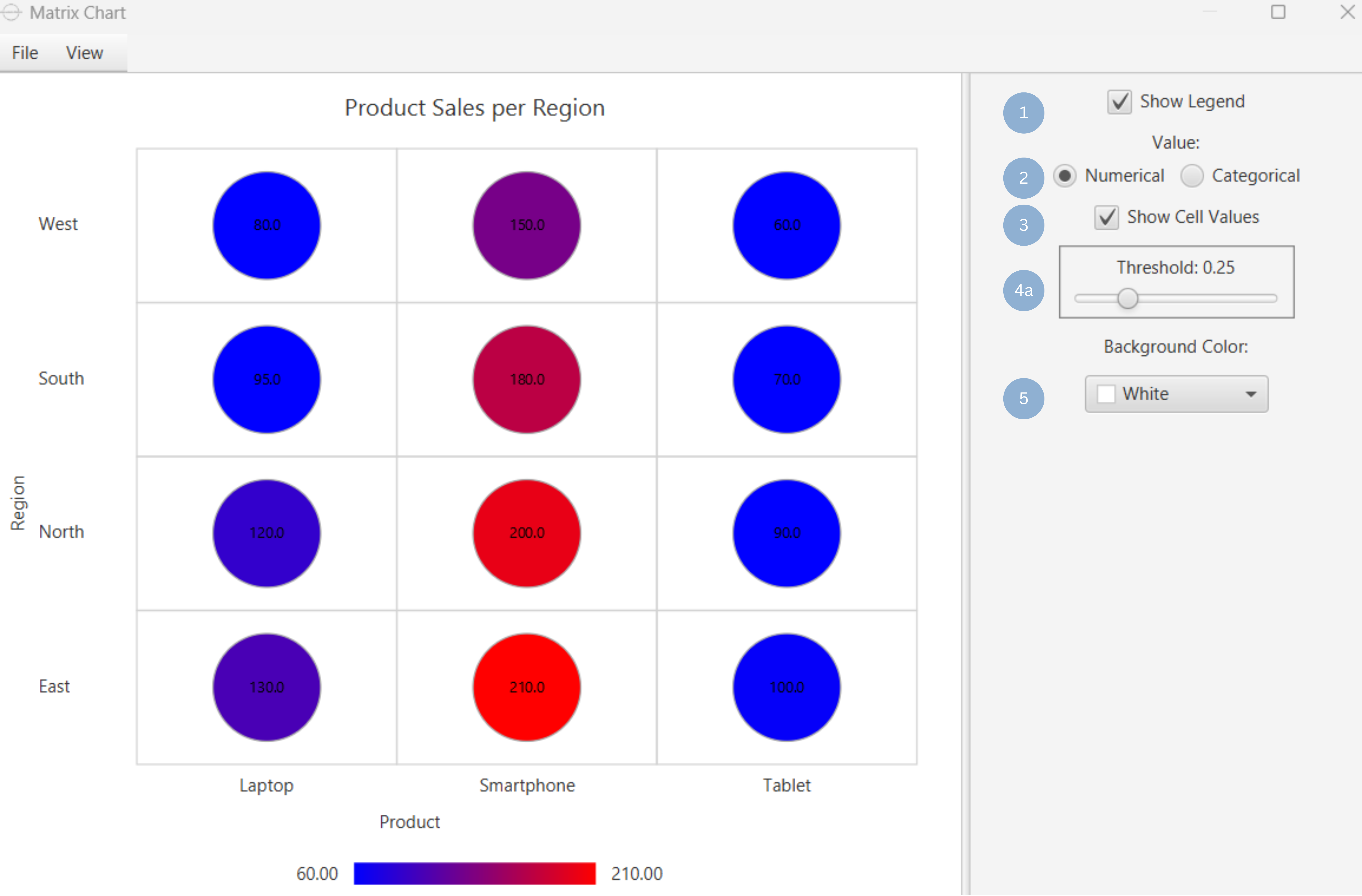
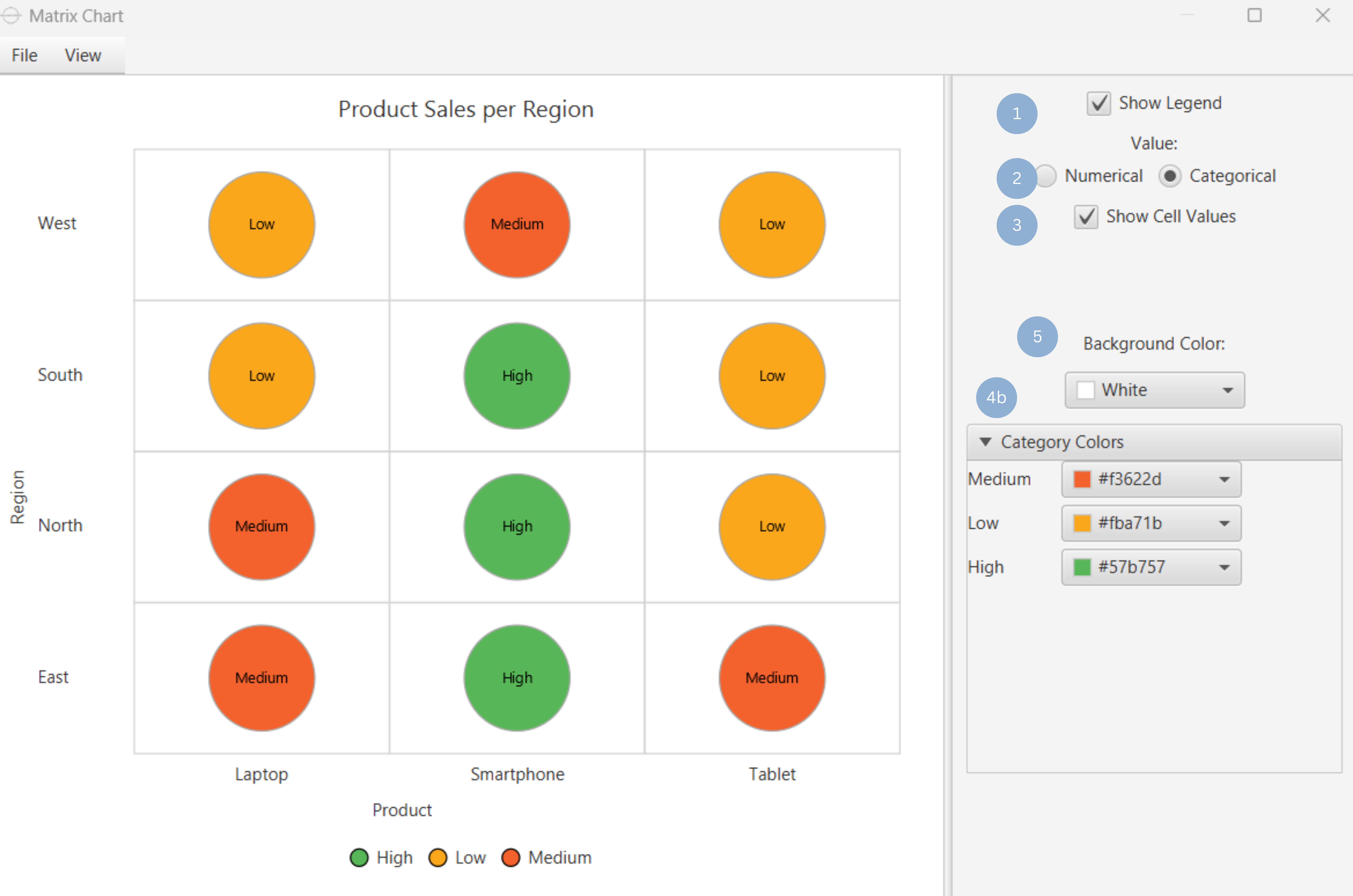
Upon clicking Execute the matrix chart appears in a separate window.
- Display the x category legend (1).
- Set value type, numerical or categorical (2).
- Show cell values (3).
- Set threshold value to categorize value, when value is numerical (4a). Category colors when value is categorical (4b).
- Set background color (5).
Output
To save the chart customization changes in Isalos, click File→ Save (1). To save the chart as a PNG image, select File→ Save as Image (2).
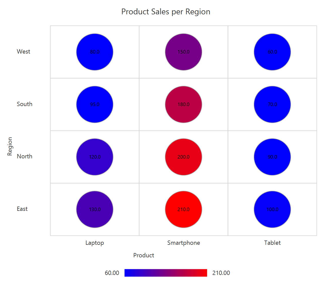
The downloadable, customized matrix chart, with numerical value is presented below.
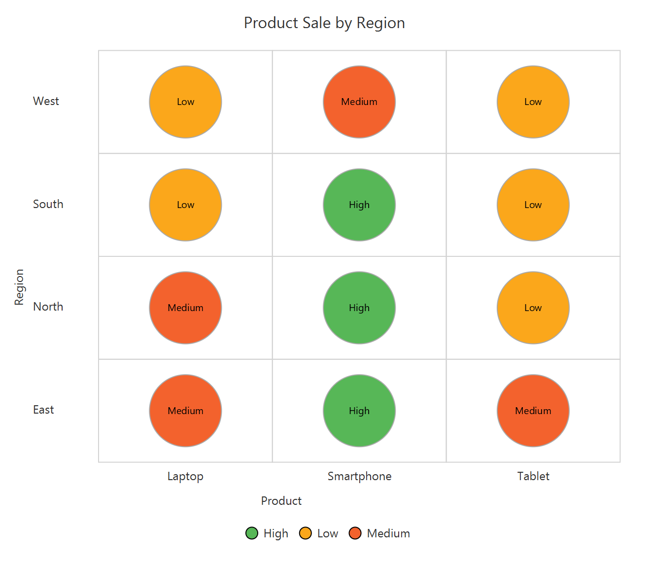
The downloadable, customized matrix chart, with categorical value is presented below.
Ridge Line Chart
The ridge line chart consists of a series of line plots that are stacked vertically, each one depicting the distribution of the numerical values of different categories. The categories names and a common scale for the distributions are displayed on the vertical and horizontal axes, respectively. Ridge line charts are particularly useful for visualizing the distribution of multiple categories within a variable, especially in cases where there is a clear pattern or ranking within the categories, e.g. the temperature distribution of every month in a year.
Use the Ridge Line Chart function by browsing in the tools ribbon:
| Plot \(\rightarrow\) Distribution and Density Charts \(\rightarrow\) Ridge Line Chart |
Input
A data table in long format consisting of one categorical column listing the category names and a numerical column containing the values of each category. If necessary, the conversion from wide to long format can be achieved via the Wide to Long function that can be found in the Data Transformation menu of the tools ribbon, under Data Manipulation.
Configuration
| Chart Title | Type the chart title. |
| Horizontal Axis Title | Type the horizontal axis title. |
| Vertical Axis Title | Type the vertical axis title. |
| Horizontal Value Column | Select the numerical value column. |
| Vertical Category Column | Select the category column. |
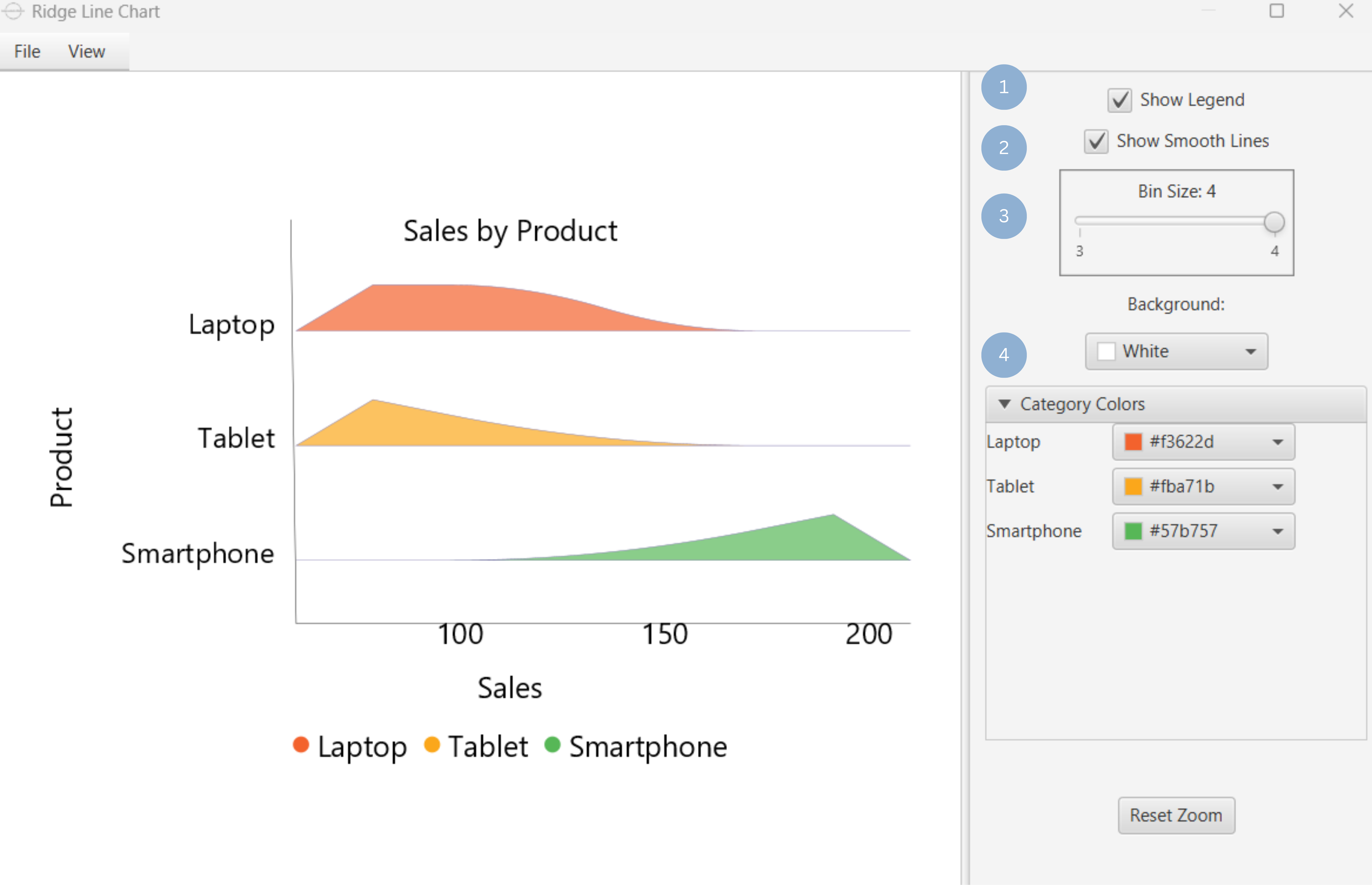
Chart customization
Upon executing the Ridge Line Chart function, the chart will appear in a separate window where the following customization options are available:
| Show Legend | Display a legend consisting of the category labels. |
| Show Smooth Lines | Display smooth lines. |
| Bin size | Set number of bins to use to create histograms of each distribution. |
| Background | Select the background color. |
| Category Colors | Choose category colors. |
Output
A graphical representation of the data in a ridge line chart format, which shows the distribution of each different category.
Example
Input
In the left-hand spreadsheet import a data consisting of the category and the value.
Configuration
-
Use the Ridge Line Chart function by browsing in the tools ribbon:
Plot \(\rightarrow\) Distribution and Density Charts \(\rightarrow\) Ridge Line Chart (1) 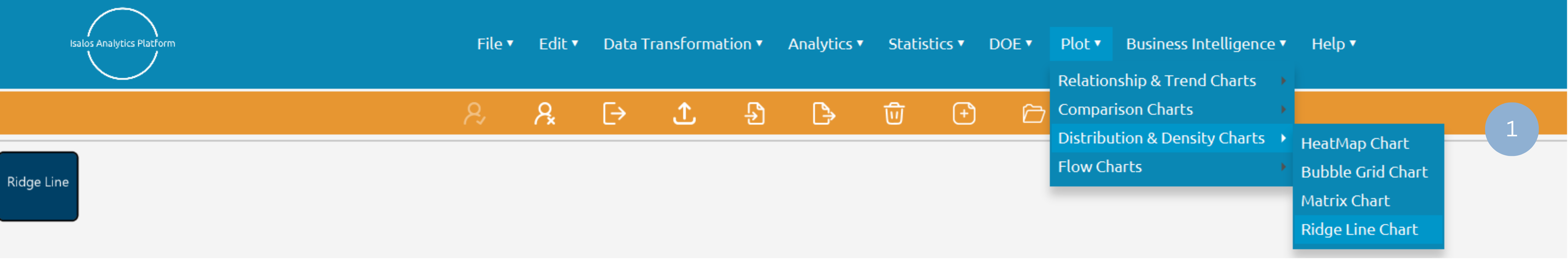
- Type the chart, horizontal axis, and vertical axis titles (2).
- Add vertical value and horizontal category columns (3).
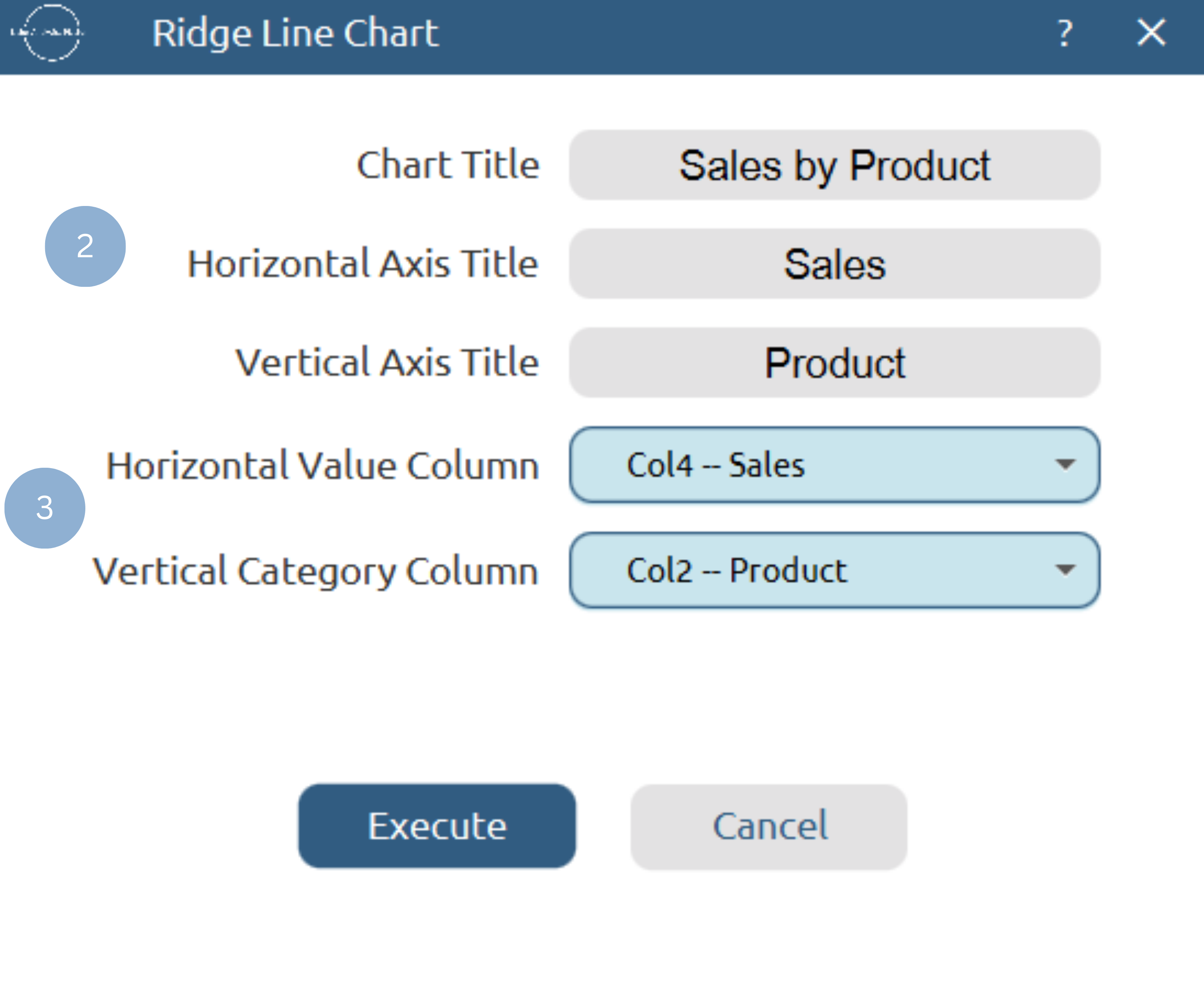
Chart customization
Upon clicking Execute the ridge line chart appears in a separate window.
- Display the category legend (1).
- Show smooth Lines values (2).
- Declare bin size for distributions (3).
- Set background and category colors (4).
Output
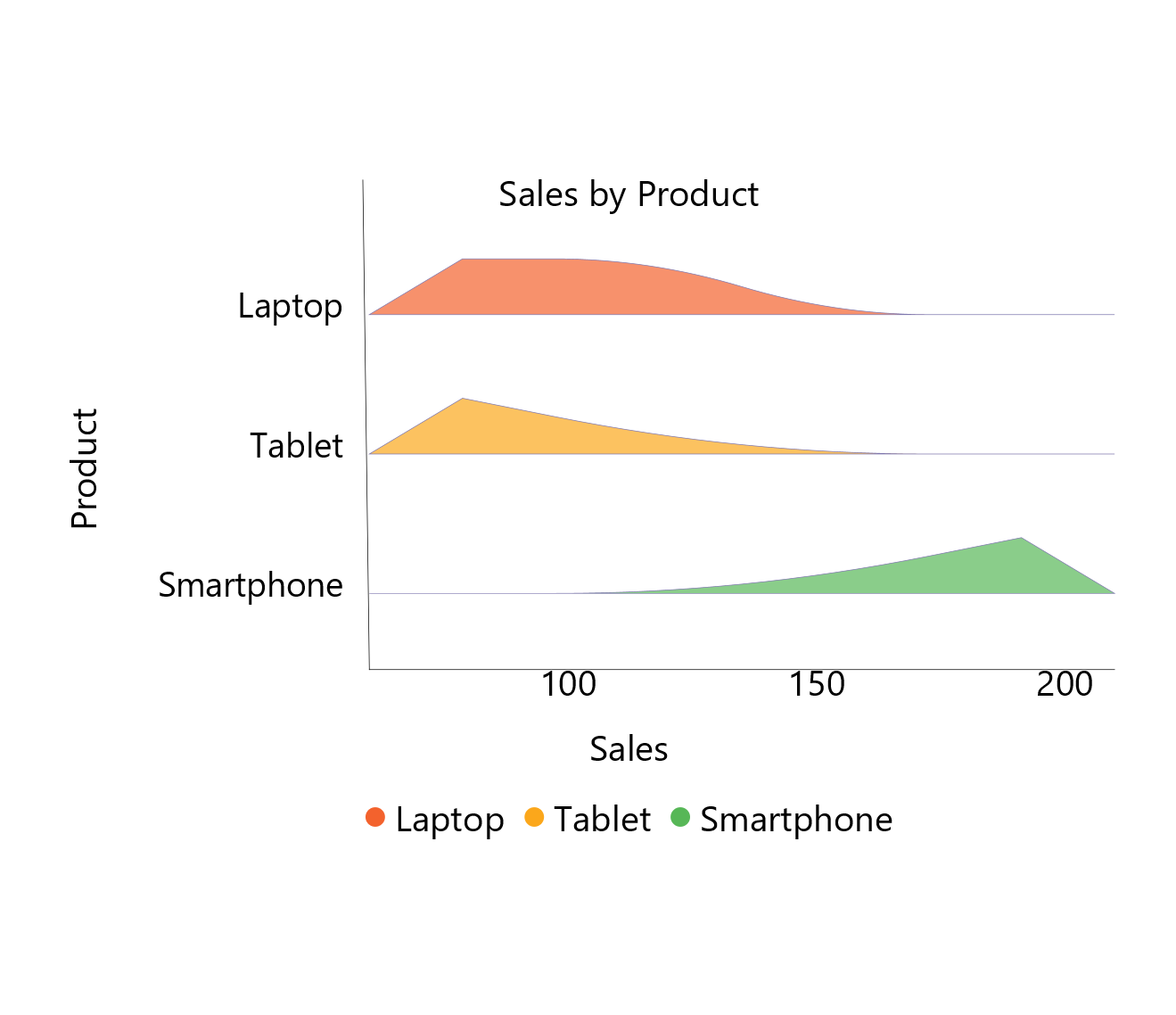
To save the chart customization changes in Isalos, click File→ Save (1). To save the chart as a PNG image, select File→ Save as Image (2).
The downloadable, customized ridge line chart is presented below.
✧ Tips
- It is often advisable to normalize the data before creating a HeatMap, to highlight the magnitude of relationships between categories without being influenced by differences in value ranges.
- Use this chart when most category relationship differences are significant, since subtle differences are not easily recognizable in the bubble grid format.
Version History
Introduced in Isalos Analytics Platform v2.0.0
Instructions last updated on December 2025