Flow Charts
Flow plots are useful visualizations for representing relationships, movements, or transfers between entities. They highlight how quantities flow from one category to another, making it easy to track connections, dependencies, and the distribution of resources across a system. By emphasizing the magnitude and direction of flows, these charts provide an intuitive way to understand complex networks and interactions in a single view.
Chord Diagram Chart
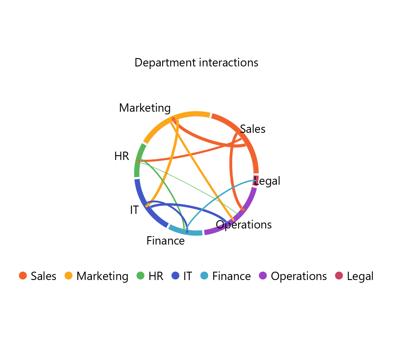
Chord diagram charts are graphical visualizations of the inter-relationships between categories that are called entities or nodes. The nodes are arranged on the outer part of a circular layout, with each node represented by a fragment of the circle analogous to its contribution to the whole. Arcs with breadth proportional to the importance relationship between the nodes are then used to connect them.
This type of chart is used to display the importance, as well as the flow of the relationship between two entities and, therefore, is popular in migration studies and economic flows, used, for example, to display the population or product flows between multiple countries.
Use the Chord Diagram Chart function by browsing in the tools ribbon:
| Plot \(\rightarrow\) Flow Charts \(\rightarrow\) Chord Diagram Chart |
Input
A data table in long format consisting of two categorical columns that represent the source and target nodes, respectively. A numerical column of link values should also be included to show relationship magnitudes. If necessary, the conversion from wide to long format can be achieved via the Wide to Long function that can be found in the Data Transformation menu of the tools ribbon, under Data Manipulation.
Configuration
| Chart Title | Type the chart title. |
| Source Category | Select the source nodes column which must be categorical. |
| Target Category | Select the target nodes column which must be categorical. |
| Value | Select the link values column. |
Chart customization
Upon executing the Chord Diagram Chart function, the chart will appear in a separate window where the following customization options are available:
| Show Legend | Display a legend consisting of the node labels. |
| Show Link Values | Display numerical link values on the chart. |
| Background | Select the background color. |
| Node Colors | Select the nodes colors. |
Output
A chord diagram chart that displays the flow of the relationships between the source and target categories (nodes).
Example
Input
In the left-hand spreadsheet, import a table in long format including two categorical columns which correspond to the source and target categories, respectively, and a numerical column consisting of the link values (1).

Configuration
-
Use the Chord Diagram Chart function by browsing in the tools ribbon:
Plot \(\rightarrow\) Flow Charts \(\rightarrow\) Chord Diagram Chart (1) 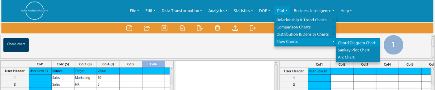
- Type the chart title (2).
- Select from the drop-down menu the source (3), target (4), and numerical value (5) columns.
- Click Execute to generate a chord diagram chart (6).
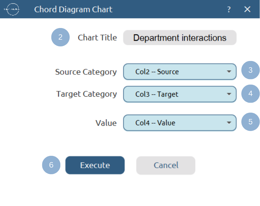
Chart customization
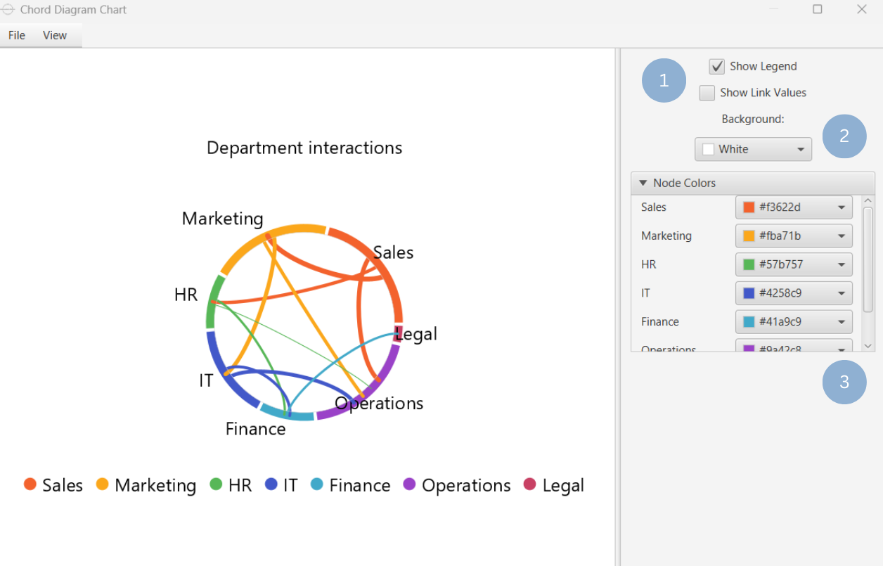
Upon clicking Execute the chord diagram chart appears in a separate window.
- Display the chart legend or link values (1).
- Select the background color (2).
- Select the nodes colors (3).
Output
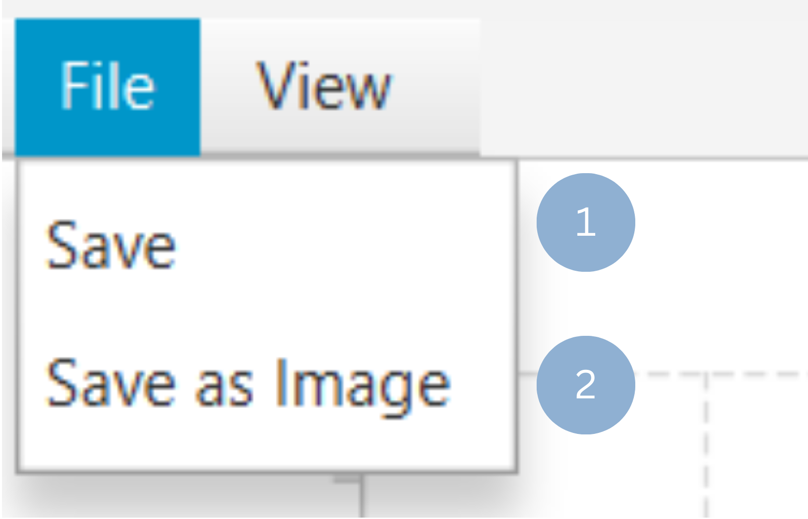
To save the chart customization changes in Isalos, click File→ Save (1). To save the chart as a PNG image, select File→ Save as Image (2).
The downloadable, customized chord diagram chart is presented below.
Sankey Plot Chart
A Sankey diagram is a flow chart that consists of nodes (entities) connected by arcs, where the width of each link is proportional to the strength or magnitude of the relationship. Its value lies in visualizing both the direction and quantity of flows between variables, making it particularly useful in the analysis of energy and material flows or cost breakdowns.
Use the Sankey Plot Chart function by browsing in the tools ribbon:
| Plot \(\rightarrow\) Flow Charts \(\rightarrow\) Sankey Plot Chart |
Input
A data table in long format consisting of two categorical columns that represent the source and target nodes, respectively. A numerical column of link values should also be included to show relationship magnitudes. If necessary, the conversion from wide to long format can be achieved via the Wide to Long function that can be found in the Data Transformation menu of the tools ribbon, under Data Manipulation.
Configuration
| Chart Title | Type the chart title. |
| Source Category | Select the source nodes column which must be categorical. |
| Target Category | Select the target nodes column which must bew categorical. |
| Value | Select the link values column. |
Chart customization
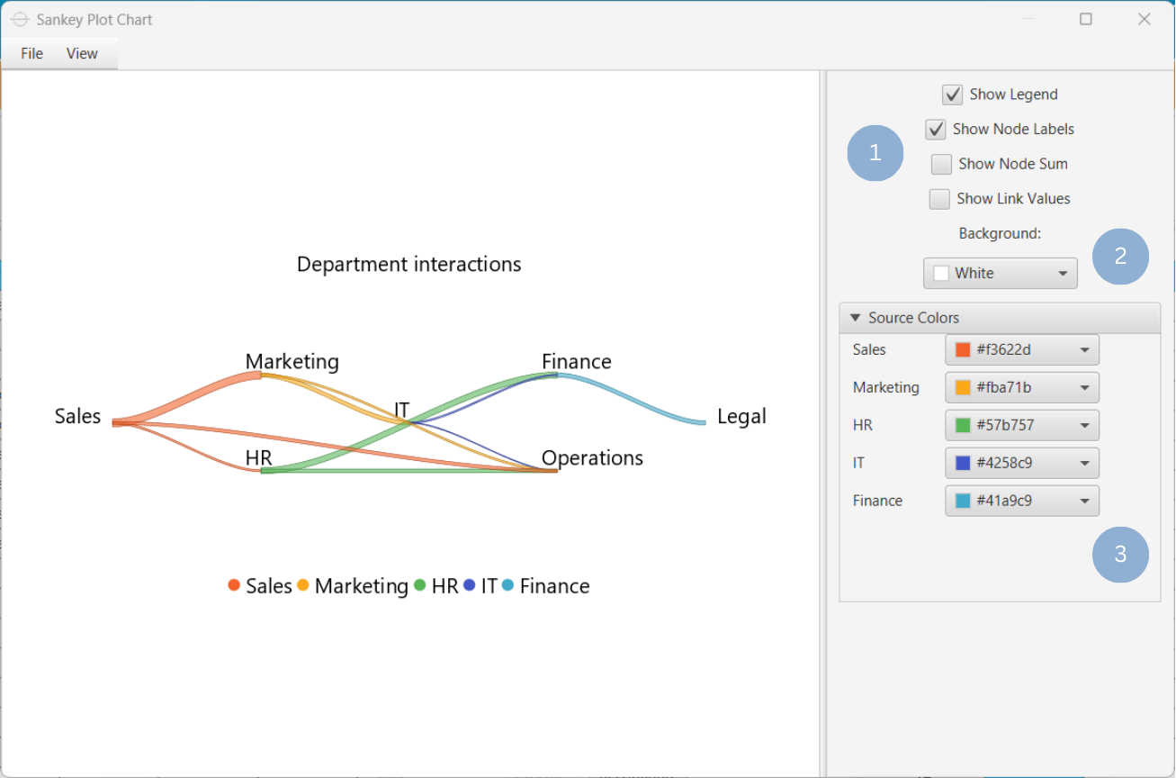
Upon executing the Sankey Plot Chart function, the chart will appear in a separate window where the following customization options are available:
| Show Legend | Display a legend consisting of the node labels. |
| Show Node Labels | Display the node labels on the chart. |
| Show Node Sum | Display the total of the values for all links connected at each node. |
| Show Link Values | Display numerical link values on the chart. |
| Background | Select the background color. |
| Source Colors | Select the colors of links originating from source nodes. |
Output
A Sankey plot chart presenting the direction and magnitude of the relationships between the given categories.
Example
Input
In the left-hand spreadsheet, import a table in long format including two categorical columns which correspond to the source and target categories, respectively, and a numerical column consisting of the link values (1).
Configuration
-
Use the Sankey Plot Chart function by browsing in the tools ribbon:
Plot \(\rightarrow\) Flow Charts \(\rightarrow\) Sankey Plot Chart (1) 
- Type the chart title (2).
- Select from the drop-down menu the source (3), target (4), and numerical value (5) columns.
- Click Execute to generate a Sankey plot chart (6).
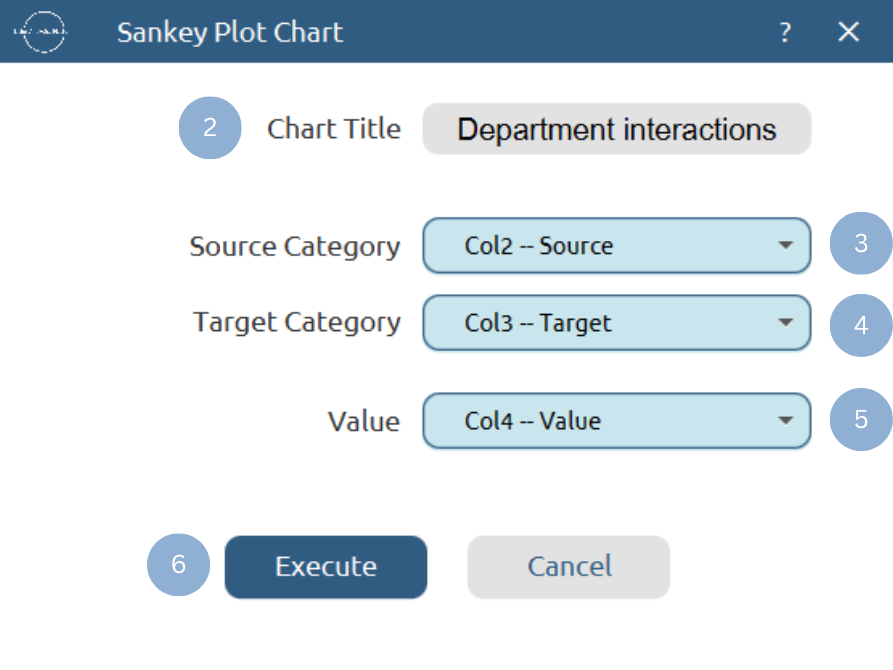
Chart customization
Upon clicking Execute the Sankey plot chart appears in a separate window.
- Display the chart legend, node names, node sum, or link values (1).
- Select the background color (2).
- Select the source nodes colors (3).
Output
To save the chart customization changes in Isalos, click File→ Save (1). To save the chart as a PNG image, select File→ Save as Image (2).
The downloadable, customized Sankey plot chart is presented below.

Arc Chart
An arc chart is a data visualization technique where categories (nodes) are placed along a single axis, and pairs of interrelated nodes are connected by arcs to display their relationships. This type of graph emphasizes the existence of links between the categories rather than the magnitude of those connections. However, the contribution of each category to the whole can be quantified by scaling the sizes of the nodes proportionally.
This type of chart has been proved a useful tool for information visualization in the analysis of number-theoretic connections between rational numbers, as well as the analysis of RNA secondary structure.
Use the Arc Chart function by browsing in the tools ribbon:
| Plot \(\rightarrow\) Flow Charts \(\rightarrow\) Arc Chart |
Input
A data table in long format consisting of two categorical columns that represent the source and target nodes, respectively. A numerical column of link values can be included to show relationship magnitudes. If necessary, the conversion from wide to long format can be achieved via the Wide to Long function that can be found in the Data Transformation menu of the tools ribbon, under Data Manipulation.
Configuration
| Chart Title | Type the chart title. |
| Source Category | Select the source nodes column which must be categorical. |
| Target Category | Select the target nodes column which must be categorical. |
| Value | Select the link values column. |
Chart customization
Upon executing the Arc Chart function, the chart will appear in a separate window where the following customization options are available:
| Show Legend | Display a legend consisting of the node labels. |
| Show Link Values | Display numerical link values on the chart. |
| Show Node Labels | Display node labels on the chart. |
| Background | Select the background color. |
| Node Colors | Select the nodes colors. |
Output
An arc chart illustrating the links between categories. The node diameter is proportional to the contribution of each category to the whole.
Example
Input
In the left-hand spreadsheet, import a table in long format including two categorical columns which correspond to the source and target categories, respectively, and, optionally, a numerical column consisting of the link values (1).
Configuration
-
Use the Arc Chart function by browsing in the tools ribbon:
Plot \(\rightarrow\) Flow Charts \(\rightarrow\) Arc Chart (1) 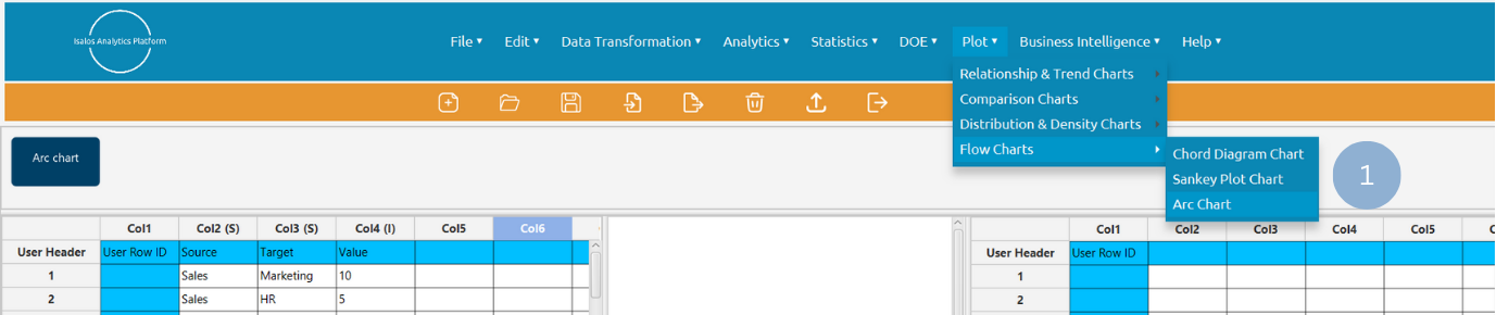
- Type the chart title (2).
- Select from the drop-down menu the source (3), target (4), and, optionally, the numerical value (5) columns.
- Click Execute to generate an arc chart (6).

Chart customization
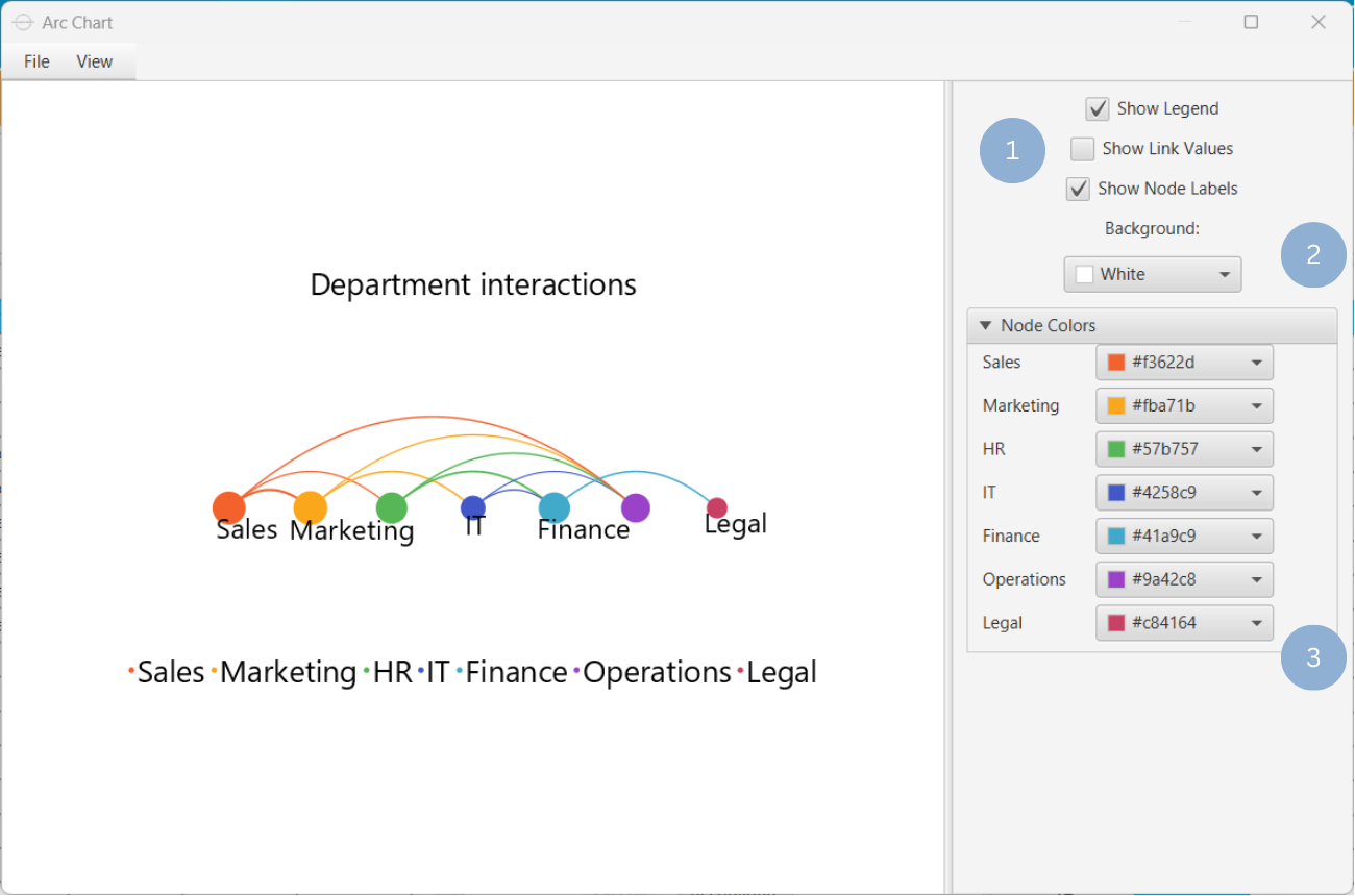
Upon clicking Execute the arc chart appears in a separate window.
- Display the chart legend, link values, or node labels (1).
- Select the background color (2).
- Select the nodes colors (3).
Output
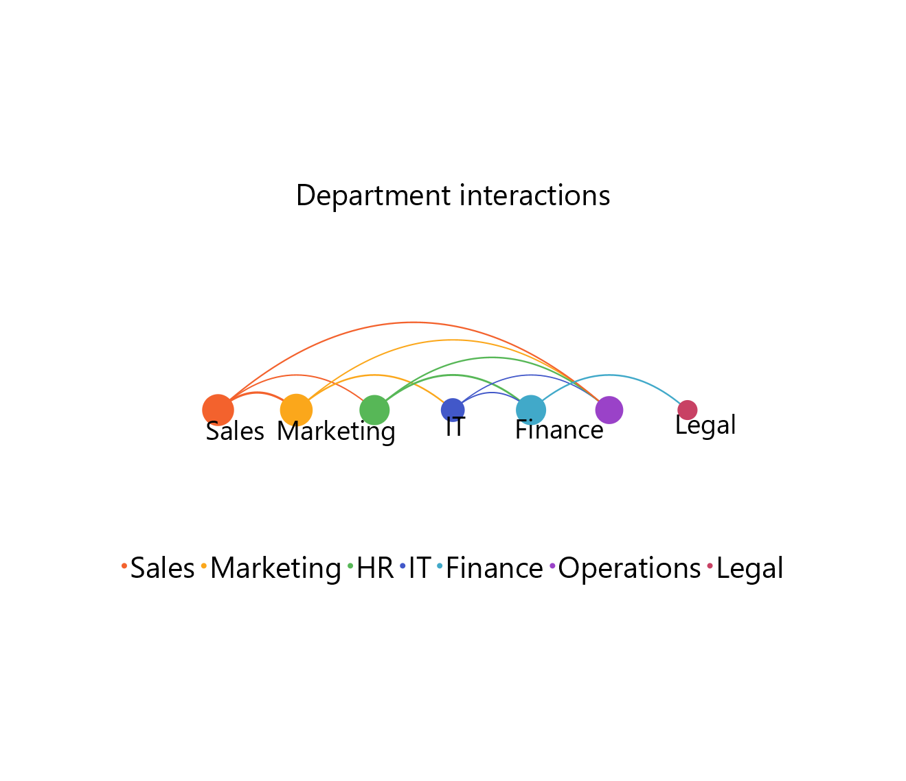
To save the chart customization changes in Isalos, click File→ Save (1). To save the chart as a PNG image, select File→ Save as Image (2).
The downloadable, customized arc chart is presented below.
- Consider removing or aggregating weaker relationships for simpler, more interpretable charts.
Version History
Introduced in Isalos Analytics Platform v2.0.0
Instructions last updated on December 2025