Relationship and Trend Charts
Relationship and trend charts are powerful tools for understanding how data behaves and interacts. By highlighting patterns, correlations, and shifts within datasets, they enable users to quickly identify trends, detect anomalies, and make informed decisions. As a versatile category of visualizations, these charts provide a clear and intuitive way to explore relationships between variables and track developments across diverse data contexts.
Line Chart
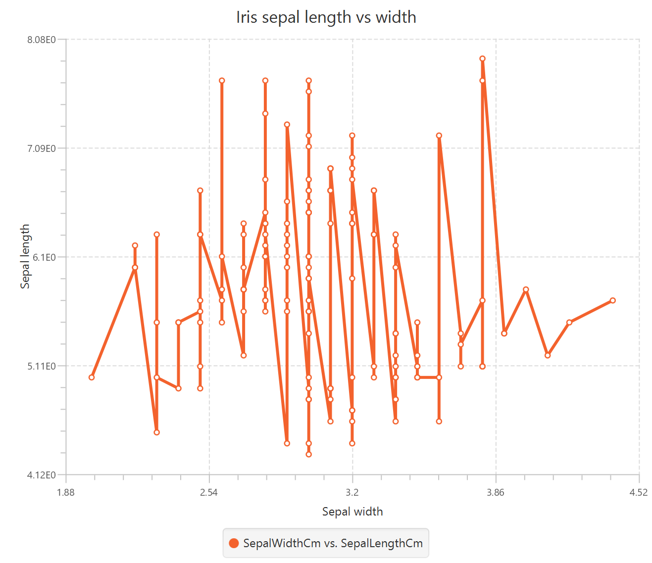
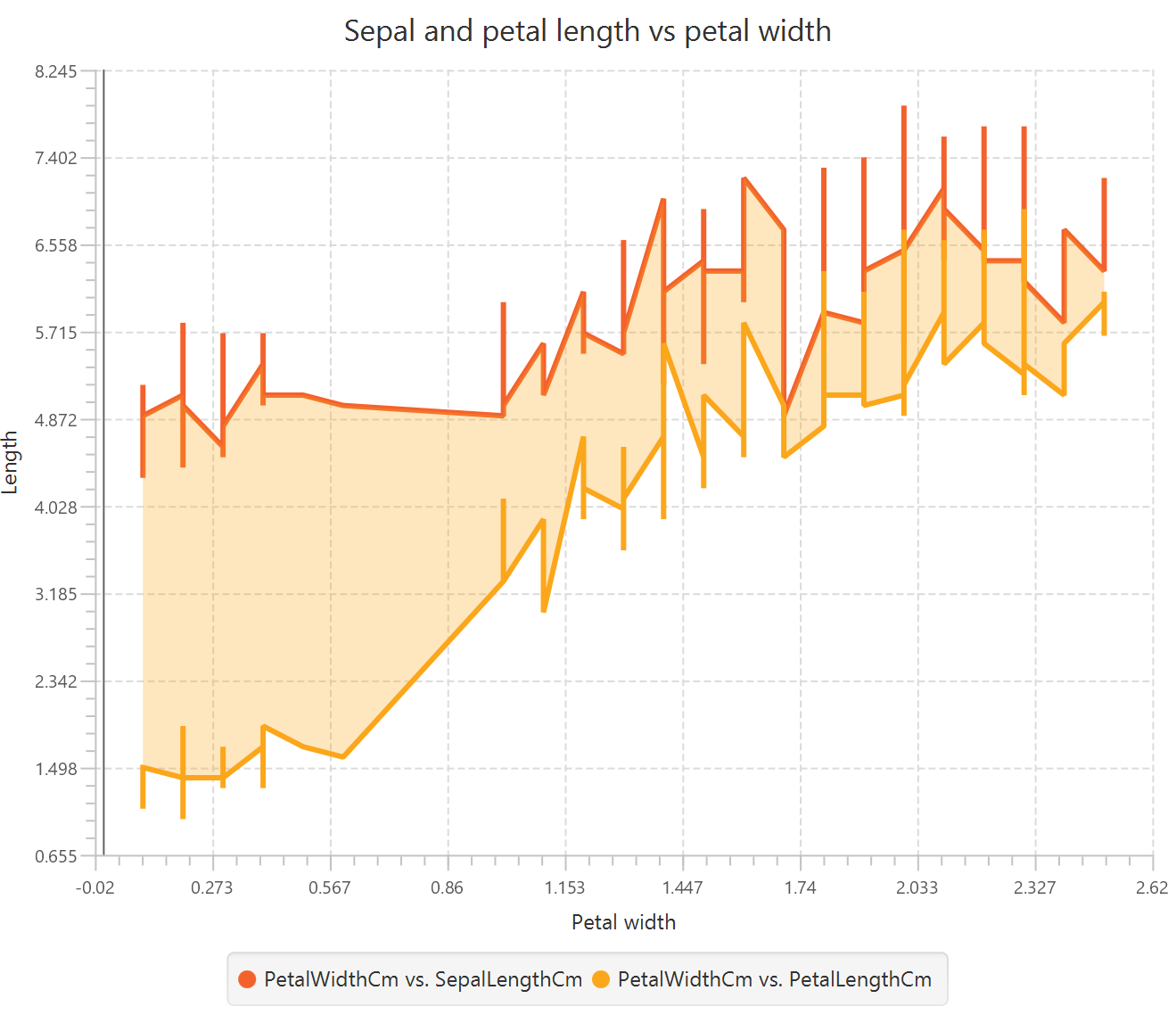
A line chart is a basic mathematical plot that maps two variables on the Cartesian plane, determining the horizontal and vertical position of each data point based on the values of the first and second variable respectively. Line charts typically sort data points by their horizontal axis values and connect them with lines to show trends and patterns over continuous intervals. This chart can be used, for example, to plot the relationship between the sepal length and width of iris plants.
Use the Line Chart function by browsing in the tools ribbon:
| Plot \(\rightarrow\) Relationship & Trend Charts \(\rightarrow\) Line Chart |
Input
A data table in long format consisting of at least two columns, at least one of which is numerical. If necessary, the conversion from wide to long format can be achieved via the Wide to Long function that can be found in the Data Transformation menu of the tools ribbon, under Data Manipulation.
Configuration
| Chart Title | Type the chart title. | |
| Horizontal Axis Title | Type the horizontal axis title. | |
| Vertical Axis Title | Type the vertical axis title. | |
| Add Column Pairs | Select the input column pair(s) to be plotted against each other. | |
| Select X column | Select from the drop-down menu the numerical or categorical variable to be plotted on the horizontal axis. | |
| Select Y column | Select from the drop-down menu the numerical variable to be plotted on the vertical axis. | |
| Remove Selected Column Pairs | Remove the selected column pair(s). |
Chart customization
Upon executing the Line Chart function, the chart will appear in a separate window where the following customization options are available:
| Show Legend | Display a legend consisting of the column pair names. | |
| Show Grid | Display grid lines in the background. | |
| X axis ticks | Select the number of horizontal grid line ticks from the drop-down menu. | |
| Y axis ticks | Select the number of vertical grid line ticks from the drop-down menu. | |
| Point Size | Drag and select the data points size. | |
| Background | Select the background color. | |
| Series Properties | Select the desired properties for each series of column pairs plotted on the chart. | |
| Series Color | Select series color. | |
| Line | Show a line connecting the data points. | |
| Point | Show data points. | |
| Symbol | Select the symbol denoting each data point (e.g. circle or square). |
Output
A line plot displaying a selection of data points connected by lines, where the horizontal and vertical coordinates represent the values of the first and second input variables, respectively.
Example
Input
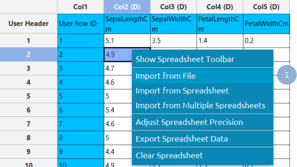
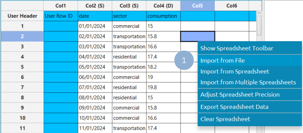
In the left-hand spreadsheet import a table consisting of the categories and the corresponding values (1).
Configuration
-
Use the Line Chart function by browsing in the tools ribbon:
Plot \(\rightarrow\) Relationship & Trend Charts \(\rightarrow\) Line Chart (1) 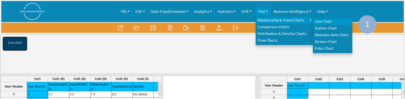
- Type the chart, horizontal axis, and vertical axis titles (2).
- Click Add Column Pair(s) (3) and selected the variables to be plotted on the horizontal (Select X Column) and the vertical axis (Select Y Column) (4). Click Add (5) to select multiple column pairs. When all column pairs are added click Add & Close (6).
- Click Execute to generate a line chart (7).

Chart customization
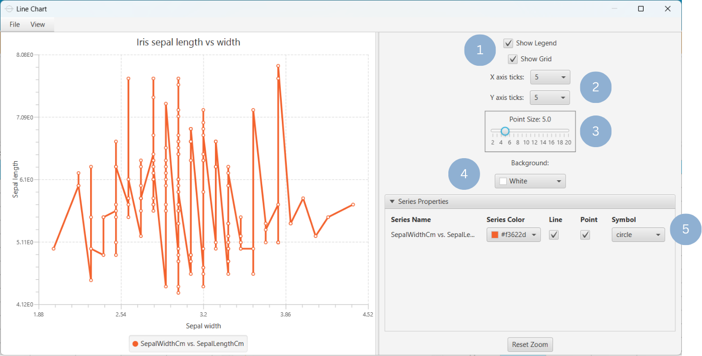
Upon clicking Execute the line chart appears in a separate window.
- Display the chart legend and grid lines (1).
- Select the number of horizontal and vertical grid line ticks (2).
- Select the data points size (3).
- Select the background color (4).
- In the Series Properties section, select the series color, line or/and point configuration, and data point symbol (5).
Output
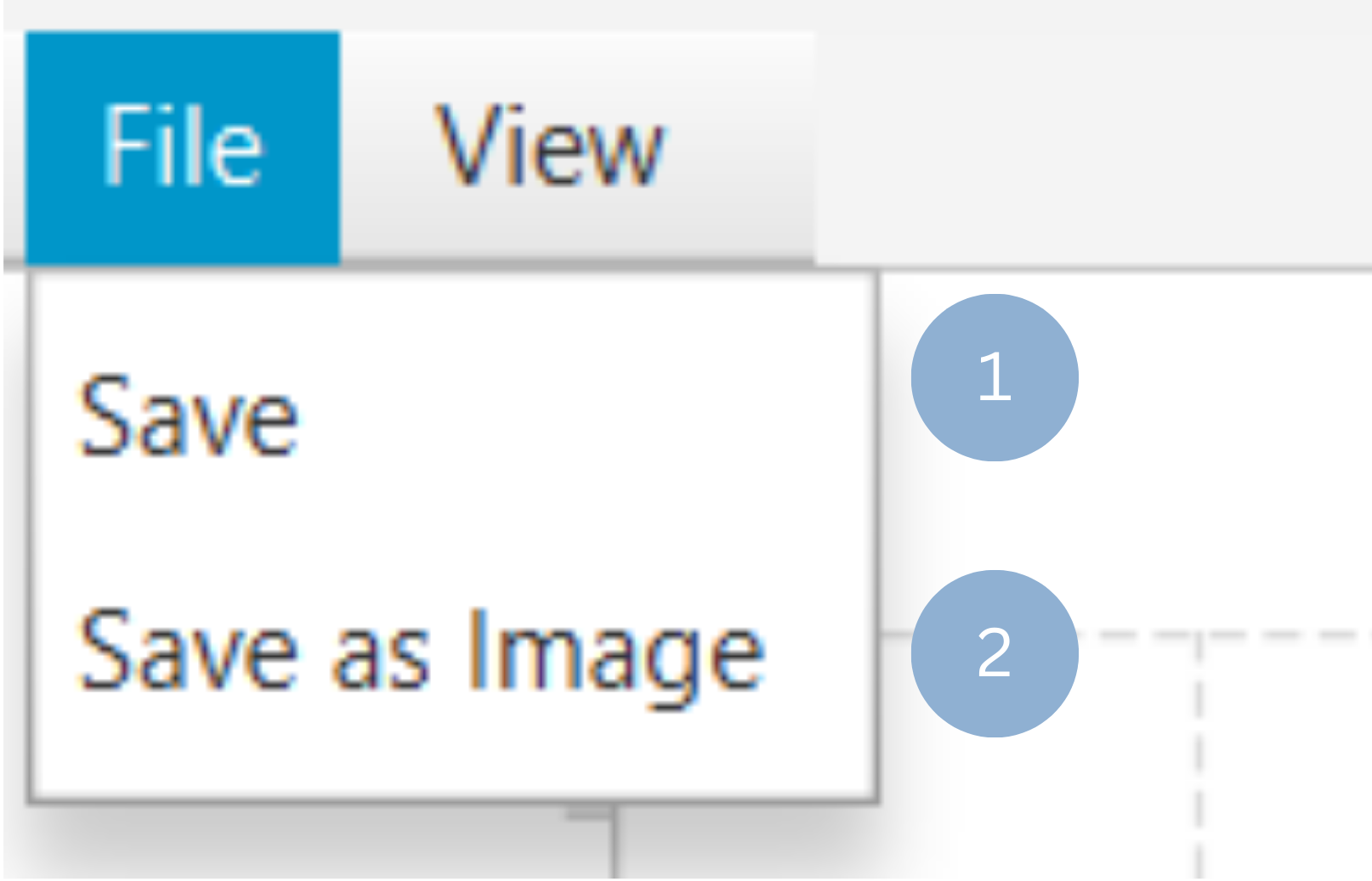
To save the chart customization changes in Isalos, click File→ Save (1). To save the chart as a PNG image, select File→ Save as Image (2).
The downloadable, customized line chart is presented below.
Scatter Chart
A scatter chart, or scatter plot, is a mathematical diagram that captures the relationships between two variables on the Cartesian plane. The position of each data point on the horizontal and vertical axis is determined by the values of the first and second variable respectively.
The scatter plot format is useful for identifying correlations, trends and outliers among variables. For example, it can be used to visualize the relationship between a child’s height (in cm) and its age (in years).
Use the Scatter Chart function by browsing in the tools ribbon:
| Plot \(\rightarrow\) Relationship & Trend Charts \(\rightarrow\) Scatter Chart |
Input
A data table in long format consisting of at least two numerical columns. If necessary, the conversion from wide to long format can be achieved via the Wide to Long function that can be found in the Data Transformation menu of the tools ribbon, under Data Manipulation.
Configuration
| Chart Title | Type the chart title. | |
| Horizontal Axis Title | Type the horizontal axis title. | |
| Vertical Axis Title | Type the vertical axis title. | |
| Add Column Pairs | Select the input column pair(s) to be plotted against each other. | |
| Select X column | Select from the drop-down menu the numerical variable to be plotted on the horizontal axis. | |
| Select Y column | Select from the drop-down menu the numerical variable to be plotted on the vertical axis. | |
| Remove Selected Column Pairs | Remove the selected column pair(s). |
Chart customization
Upon executing the Scatter Chart function, the chart will appear in a separate window where the following customization options are available:
| Show Legend | Display a legend consisting of the column pair names. |
| Show Grid | Display grid lines in the background. |
| X axis ticks | Select the number of horizontal grid line ticks from the drop-down menu. |
| Y axis ticks | Select the number of vertical grid line ticks from the drop-down menu. |
| Point Size | Drag and select the data points size. |
| Background | Select the background color. |
| Series Color | Select series color. |
Output
A scatter plot displaying a selection of data points, where the horizontal and vertical coordinates represent the values of the first and second input variables, respectively.
Example
Input
In the left-hand spreadsheet import a table consisting of the categories and the corresponding values (1).
Configuration
-
Use the Scatter Chart function by browsing in the tools ribbon:
Plot \(\rightarrow\) Relationship & Trend Charts \(\rightarrow\) Scatter Chart (1) 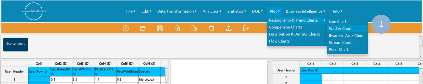
- Type the chart, horizontal axis, and vertical axis titles (2).
- Click Add Column Pair(s) (3) and selected the variables to be plotted on the horizontal (Select X Column) and the vertical axis (Select Y Column) (4). Click Add (5) to select multiple column pairs. When all column pairs are added click Add & Close (6).
- Click Execute to generate a scatter chart (7).
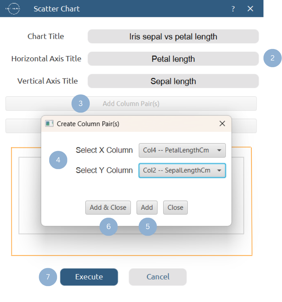
Chart customization
Upon clicking Execute the scatter chart appears in a separate window.
- Display the chart legend and grid lines (1).
- Select the number of horizontal and vertical grid line ticks (2).
- Select the data points size (3).
- Select the background color (4).
- Select the series color (5).

Output
To save the chart customization changes in Isalos, click File→ Save (1). To save the chart as a PNG image, select File→ Save as Image (2).
The downloadable, customized scatter chart is presented below.

Bivariate Area Chart
The bivariate area chart is a visualization tool used to display the evolution of two numerical variables along a shared horizontal axis, which is often a time variable. It is particularly useful for identifying trends in both variables, and more importantly, for highlighting the gap, balance, flips, and trade-offs between them. Its most distinctive feature is that the variables’ curves are color-coded, and the area where one variable exceeds the other across the horizontal axis is shaded accordingly. This makes it easier to identify both the number and extent of imbalances between the variables.
The chart is commonly used for commercial and economic analyses, e.g. to visualize the trends in exports and imports over time.
Use the Bivariate Area Chart function by browsing in the tools ribbon:
| Plot \(\rightarrow\) Relationship & Trend Charts \(\rightarrow\) Bivariate Area Chart |
Input
A data table consisting of the values of two numerical variables and a common numerical variable to be displayed on the horizontal axis. If necessary, the conversion from wide to long format can be achieved via the Wide to Long function that can be found in the Data Transformation menu of the tools ribbon, under Data Manipulation.
Configuration
| Chart Title | Type the chart title. |
| Horizontal Axis Title | Type the horizontal axis title. |
| Vertical Axis Title | Type the vertical axis title. |
| Horizontal Axis Column | Select the common numerical variable to be plotted on the horizontal axis. |
| First variable column | Select the first numerical variable to be plotted on the vertical axis. |
| Second variable column | Select the second numerical variable to be plotted on the vertical axis. |
Chart customization
Upon executing the Bivariate Area Chart function, the chart will appear in a separate window where the following customization options are available:
| Show Legend | Display a legend consisting of the two series names. |
| Show Grid | Display grid lines in the background. |
| X axis ticks | Select the number of horizontal grid line ticks from the drop-down menu. |
| Y axis ticks | Select the number of vertical grid line ticks from the drop-down menu. |
| Show Points | Show data points on the chart. |
| Point Size | Drag and select the data points size. |
| Show Bivariate Area | Show the color-coded area where one variable exceeds the other. |
| Background | Select the background color. |
| Series Colors | Select the series colors. |
Output
A bivariate area chart in which the areas where one variable exceeds the other are shaded accordingly.
Example
Input
In the left-hand spreadsheet import a table consisting of at least three numerical columns, including a common numerical variable to be plotted on the horizontal axis and two variables to be plotted on the vertical axis (1).
Configuration
-
Use the Bivariate Area Chart function by browsing in the tools ribbon:
Plot \(\rightarrow\) Relationship & Trend Charts \(\rightarrow\) Bivariate Area Chart (1) 
- Type the chart, horizontal axis, and vertical axis titles (2).
- Select from the drop-down menu the horizontal axis variable (3), and the first (4) and second (5) vertical axis variables.
- Click Execute to generate a bivariate area chart (6).

Chart customization
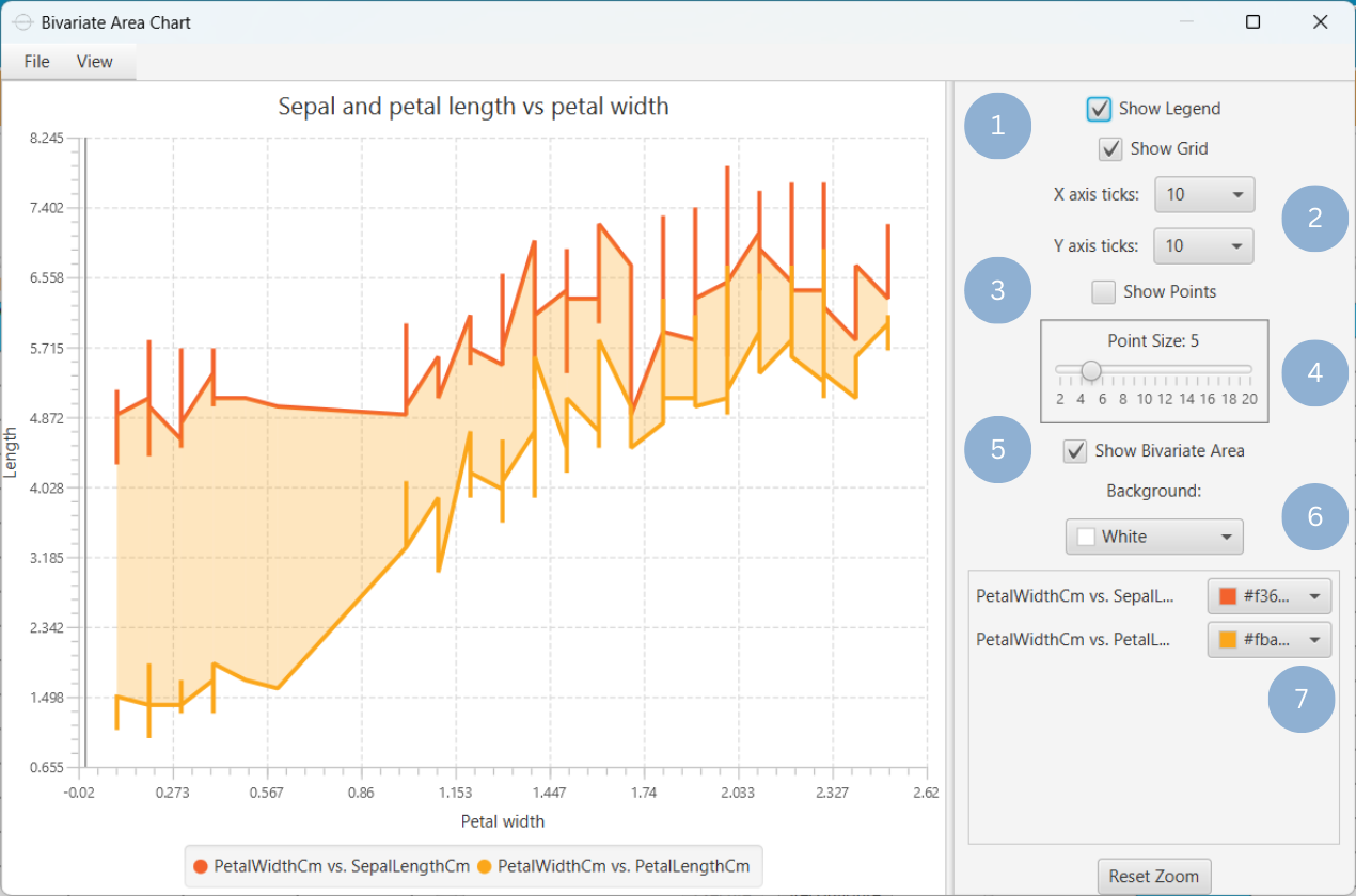
Upon clicking Execute the bivariate area chart appears in a separate window.
- Display the chart legend and grid lines (1).
- Select the number of horizontal and vertical grid line ticks (2).
- Show the data points on the chart (3).
- Select the data point size (4).
- Show the color-coded area where one variable exceeds the other (5).
- Select the background color (6).
- Select the series colors (7).
Output
To save the chart customization changes in Isalos, click File→ Save (1). To save the chart as a PNG image, select File→ Save as Image (2).
The downloadable, customized bivariate area chart is presented below.
Stream Chart
A stream chart, or streamgraph, is a type of stacked area graph in which the numerical values of different categories (layers) are distributed around a horizontal axis in the center of the graph, creating a flowing, stream-like shape. The stacked categories are displayed as continuous areas through interpolation between the given data points. The height of each layer is analogous to its numeric value, and the total height of the graph reflects the sum of categories at any given point. The geometry of the chart is dependent on the bottom layer outline which is determined by the minimization of the average of the squares of slopes between each layer’s midpoints, weighted by layer height.
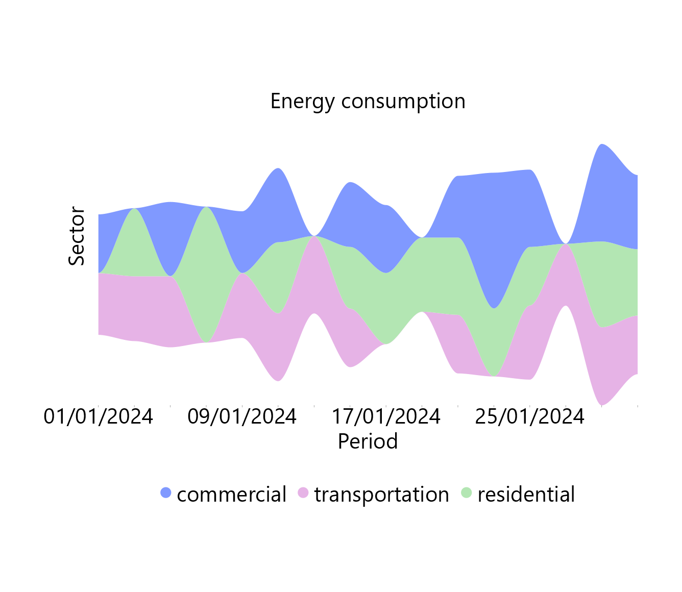
This chart is typically used to illustrate how the values of each category evolve over the baseline category on the horizontal axis (e.g. the variable of time). This characteristic makes it particularly useful for visualizing the relative proportions of the whole as they evolve along the horizontal axis, while also revealing trends and patterns within the data. For example, stream charts can be used to capture the trends of energy consumption across different sectors (industrial, commercial, transportation) over a given period of time.
It should be noted that since the horizontal axis is not fixed in a stream chart, distinguishing between positive and negative values is not possible. Therefore, exclusively positive or negative values should be included in one plot.
Use the Stream Chart function by browsing in the tools ribbon:
| Plot \(\rightarrow\) Relationship & Trend Charts \(\rightarrow\) Stream Chart |
Input
A categorical or numerical column consisting of the categories to be layered and a numerical column with continuous values for each category. The baseline values (categorical or numerical) over which the main categories are evolving should be given in a separate column. If necessary, the conversion from wide to long format can be achieved via the Wide to Long function that can be found in the Data Transformation menu of the tools ribbon, under Data Manipulation.
Configuration
| Chart Title | Type the chart title. |
| Horizontal Axis Title | Type the horizontal axis title. |
| Vertical Axis Title | Type the vertical axis title. |
| Time | Select the categorical or numerical column consisting of baseline values over which the main categories are evolving. |
| Category | Select the categories column which can be either numerical or categorical. |
| Value | Select the numerical values column. |
Chart customization
Upon executing the Stream Chart function, the chart will appear in a separate window where the following customization options are available:
| Show Legend | Display a legend consisting of the categories names. |
| Show Smooth Lines | Connect chart peaks with smooth lines. |
| Background | Select the background color. |
| Stream Colors | Select the stream colors. |
Output
A stream chart depicting the evolution of the given variables along a baseline as a symmetrical flowing shape.
Example
Input
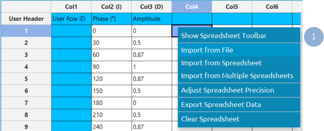
In the left-hand spreadsheet, import a table in long format that consists of a numerical or categorical baseline variable (for example, a time variable), a numerical or categorical column representing different categories, and a numerical column containing the corresponding values (1).
Configuration
-
Use the Stream Chart function by browsing in the tools ribbon:
Plot \(\rightarrow\) Relationship & Trend Charts \(\rightarrow\) Stream Chart (1) 
- Type the chart, horizontal axis, and vertical axis titles (2).
- Select from the drop-down menu the baseline (Time) variable (3), the categories column (4), and numerical variable (5).
- Click Execute to generate a stream chart (6).
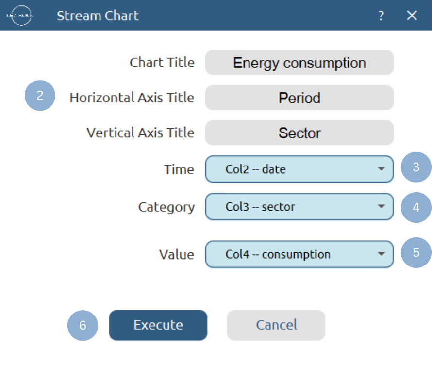
Chart customization
Upon clicking Execute the stream chart appears in a separate window.
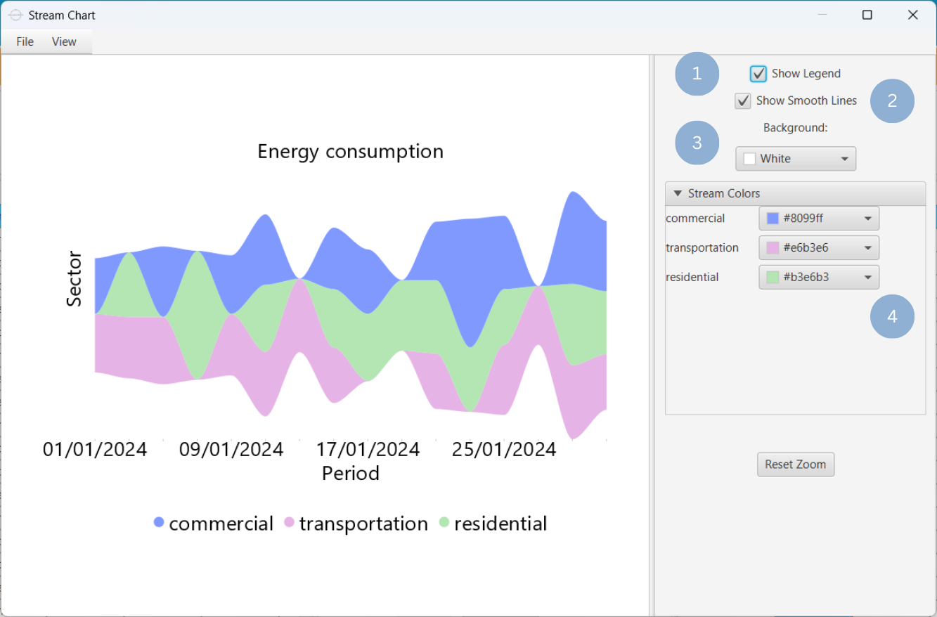
- Display the chart legend (1).
- Connect the chart peaks with smooth lines (2).
- Select the background color (3).
- Select the streams colors (4).
Output
To save the chart customization changes in Isalos, click File→ Save (1). To save the chart as a PNG image, select File→ Save as Image (2).
The downloadable, customized stream chart is presented below.
Polar Chart
A polar graph is used to represent data defined by a radius-angle coordinate system, where each data point is specified by a magnitude (radius) and a direction (angle). This type of chart is particularly effective for visualizing measurements that depend on orientation, rotation, or angular position, allowing patterns and variations to be observed around a central point rather than along linear axes. For example, the polar chart is used to capture the trends in signal phase vs. amplitude in physics or engineering problems.
Use the Polar Chart function by browsing in the tools ribbon:
| Plot \(\rightarrow\) Relationship & Trend Charts \(\rightarrow\) Polar Chart |
Input
A data table in long format consisting of at least two numerical columns. If necessary, the conversion from wide to long format can be achieved via the Wide to Long function that can be found in the Data Transformation menu of the tools ribbon, under Data Manipulation.
Configuration
| Chart Title | Type the chart title. | |
| Add Column Pairs | Select the input column pair(s) to be plotted against each other. | |
| Radius | Select from the drop-down menu the numerical variable representing the magnitude. | |
| Angle | Select from the drop-down menu the numerical variable representing the direction. | |
| Remove Selected Column Pairs | Remove the selected column pair(s). |
Chart customization
Upon executing the Polar Chart function, the chart will appear in a separate window where the following customization options are available:
| Show Legend | Display a legend consisting of the column pair names. |
| Show Values | Display the coordinates on the chart. |
| Point Size | Drag and select the data points size. |
| Background | Select the background color. |
| Series Colors | Select the series colors. |
Output
A polar chart depicting data on the polar system, with each point defined by a radius and an angle.
Example
Input
In the left-hand spreadsheet, import a table in long format that consists of at least two numerical columns (1).
Configuration
-
Use the Polar Chart function by browsing in the tools ribbon:
Plot \(\rightarrow\) Relationship & Trend Charts \(\rightarrow\) Polar Chart (1) 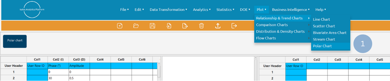
- Type the chart title (2).
- Click Add Column Pair(s) (3) and select the radius and angle variables (4). Click Add (5) to select multiple column pairs. When all column pairs are added click Add & Close (6).
- Click Execute to generate a polar chart (7).

Chart customization
Upon clicking Execute the polar chart appears in a separate window.
- Display the chart legend (1).
- Display the coordinates for each data point (2).
- Drag and select the points size (3).
- Select the background color (4).
- Select the series colors (5).

Output
To save the chart customization changes in Isalos, click File→ Save (1). To save the chart as a PNG image, select File→ Save as Image (2).
The downloadable, customized polar chart is presented below.

✧ Tips
- They are commonly used to visualize linear relationships between two variables, but other patterns can also be detected, e.g. sine, cosine, or quadratic relationships.
- Avoid including a vast number of observations on the scatter plot (oversampling), as it can lead to overlapping data points.
- Avoid displaying too many lines in a line chart (spaghetti chart) to ensure readability.
- For time series line charts, ensure time intervals are consistent to avoid misleading slopes.
- It is ideal for representing the relationships between periodical or cyclical data.
- A stream chart cannot simultaneously represent both positive and negative values, as the central axis is not a true zero baseline but rather a visual balancing point.
- Usually, it is difficult to accurately compare or subtract layer heights, so this type of chart should not be used to visualize quantitative information, but rather patterns and trends in an intuitive and engaging way.
Version History
Introduced in Isalos Analytics Platform v2.0.0
Instructions last updated on December 2025